Silent software updates led to issues with my Epson P800 Printer, prompting me to initiate a recovery plan and conduct a thorough analysis of the print process. Despite setbacks, including a technical issue and the COVID-19 lockdown forcing the cancellation of my exhibition, I remained adaptable and managed to complete my book within a shorter time frame.
This is a recurring problem caused when software updates. I’ve added an Annexe below to contain more detailed information relating to how I’ve setup for print.
User Resolution
1 Connect the Mac computer and printer by direct wire
2 Reinstate the link to Epson paper profiles by reinstalling the driver software. This triggers the choice of Epson driver over Apple Airprint for you to select
3 Select Printer Manages Colors
By filming the required page-turning video and creating a 3D model of the exhibition space, I demonstrated resilience in overcoming challenges. My experience highlighted the importance of being prepared for the unexpected and staying flexible when faced with unforeseen events.
However, the problem with ICC paper profile selection on the Epson P800 Printer persisted in the years that followed, as automatic software updates caused the printer to lose the link to the folder containing Epson ICC paper profiles. The default connection became AirPrint, which only recognized generic profiles supplied by Apple, rather than specific Epson paper types.
Advice
It sounds like you had a lot of challenges to overcome in order to complete your FMP. I’m glad that you were able to persevere and produce a high-quality piece of work.
I understand your frustration with the Epson P800 printer. It sounds like the software updates are causing problems with the ICC paper profiles. I’ve done some research, and it seems like this is a known issue with the printer.
There are a few things you can do to try to fix the problem. First, you can try uninstalling the printer driver and then reinstalling it. You can also try disabling the automatic software updates for the printer.
If those steps don’t work, you may need to contact Epson support for help. They may be able to provide you with a newer version of the printer driver that fixes the problem.
Where are the ICC profiles located for my printer on my Mac?
• Do the following to locate the files:
1. Open your hard drive, then select Library > Printers > EPSON > InkjetPrinter2 > ICCProfiles.
2. Press and hold the Control key on your keyboard while you click the profile package in the ICCProfiles folder. In the pop-up menu that appears, select Show Package Contents.
The profiles can also be found using the Colosync app.
Profile Naming Variations
Note when viewing the print paper profiles in a) the package (see above Where are the ICC profiles located) the file names are used. B) in ColorSync a description is used (contains some of the file name information but missing the printer ID SC-P800 and c) in the photo app (e.g. Photoshop) Print – media selection, there is another very similar description. Simply note the identification is the same but different depending on where you view the paper ICC.
Printer icons
On the computer, print icons existed for three devices: one for a Canon portable printer and two for the Epson P800. One is for the AirPrint driver (do not use) which is live as wifi is available, the other Epson P800 icon is for the direct cable connection. If the printer cable becomes disconnected that print option is offline.
Check:
1. A print cable is connected between computer and Epson P800
2. Ensure the direct connection icon is set as default.
The next step is to book a 121 meeting with my Supervisor.
Bibliography
Howard Rachel (2018) Repetition is truth via Dolorosa. Edited by A. C. Beard Jason. London: Other Criteria Books. Available at: newportstreetgallery.com.
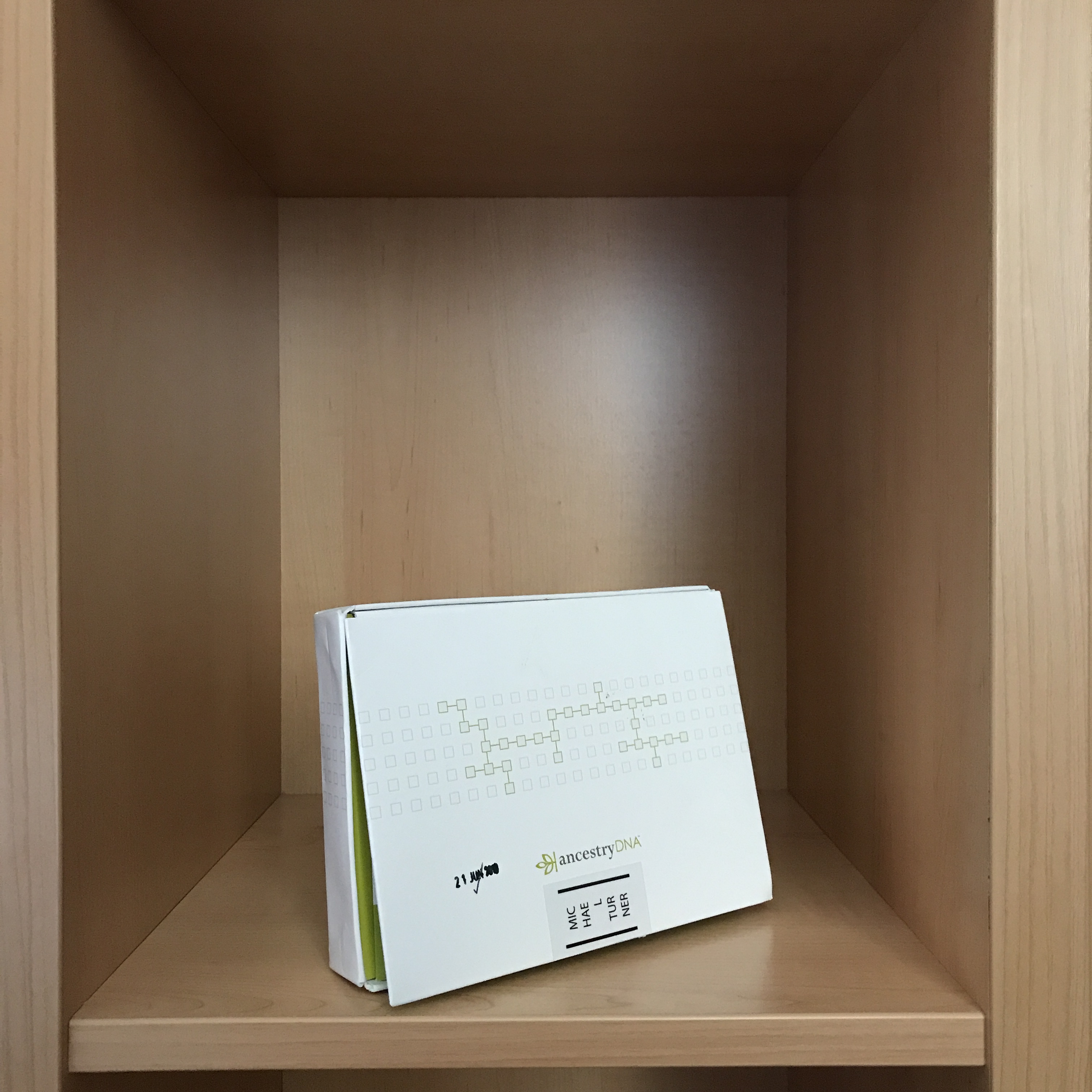
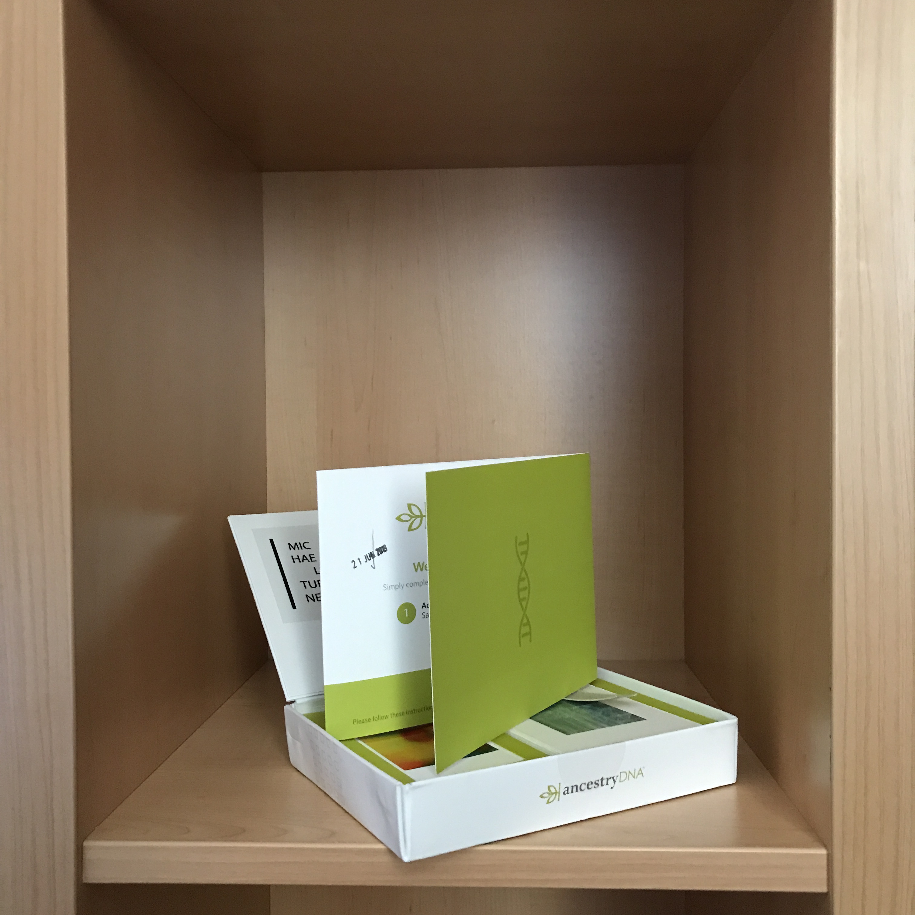
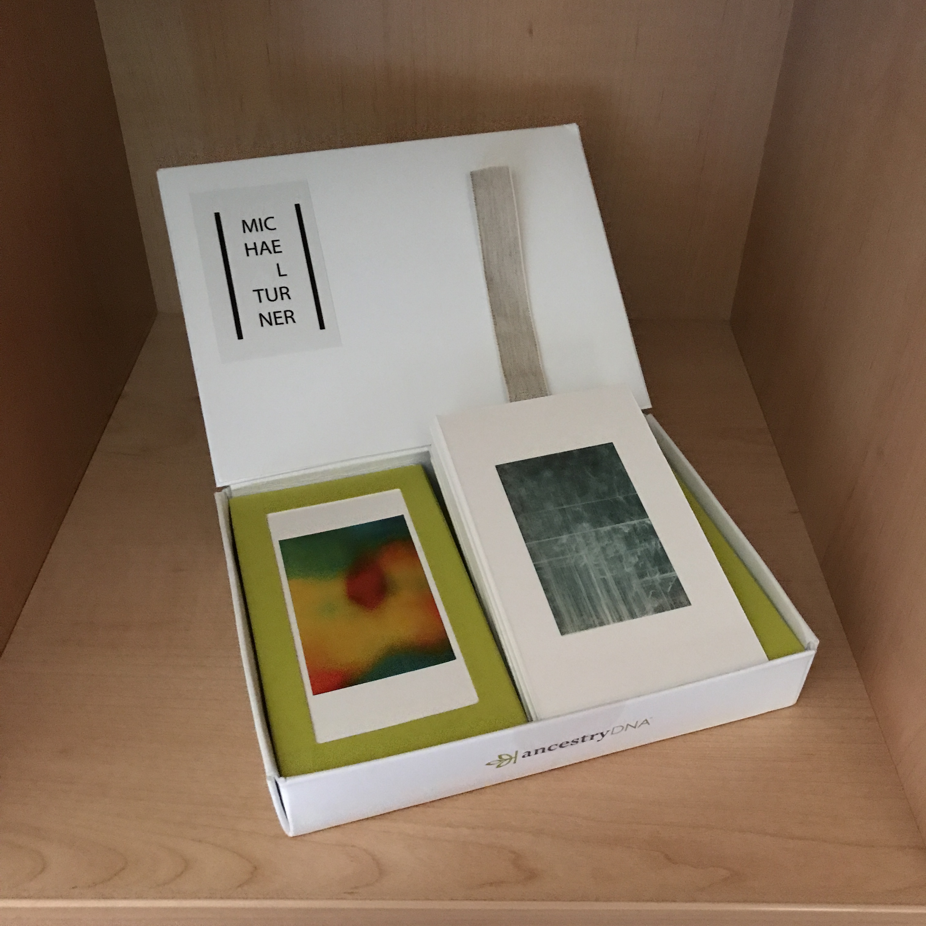
How does this day have a bearing on this blog? Simply put it is the link to the motherline theme. Motherline is based on the mother’s DNA. Her mitochondrial DNA in particular provides us with the means of creating life giving energy. The associated stability or unchanging structure within family members allows identification with ancestors. This DNA bridges across time for thousands of years. My project bridges just over a century.
When the current project is complete, attention can be turned to other families, to other past events, to be carried forward for future generations.
With an eye on commercialising art, the following is from AffinityDNA (AffinityDNA, 2020). This blog post demonstrates the contemporary and growing economic aspect of this genre allied to my photography. Perhaps by marketing photography, it could pay for the cost of the studies. Currently, there is communication taking place with another major DNA testing supplier on an introductory and more mundane level perhaps.
DNA Art Portraits
Display your DNA fingerprint as a unique personalised piece of genetic artwork! DNA art portraits from only £179
In terms of context this offering is available amongst other tests:
The exercise using word clouds worked/is working well according to the intended outcome and as such is being developed into another technological sphere of artsci known as Generative Design (Bohnacker, 2012) and the update (Gross, 2018). We are now at an intersection with computing.
Generative Design: Ghost with Lyrics – Michael Turner
Generative Art practice has a returned and is being made part of my MA Photography. The above image is one of the ghost pictures that arose from healing photography. It uses a graphics or more specifically a font from pixel values technique and is created with the lyrics of Robert Burns song, A Man’s a Man for A’ That. (Burns, 1795).
Bibliography
Bohnacker, H., Gross, B. and Laub, J. (2012) Generative Design Visualise, Program, and Create with Processing. English tr. Edited by C. Lazzeroni. New York: Princeton Architectural Press. Available at: www.papress.com.
Fross, B. et al. (2018) Generative Design Visualise, Program and Create with Javascript in P5.js. Edited by C. Lazzerolli. New York: Princeton Architectural Press. Available at: www.papress.com.
This week saw another Guest Lecture take place this time with Paul Clements Photojournalist.
GCC – Module Leader
There was also a Group Guest Critique GCC with the Module Leader and for some reason, probably to do with timing and project evolution the meeting was very much appreciated. A welcome relief.
I was able to announce the intended exhibition visit of a Contemporary Photographic Editor who I am pleased to have volunteered to take a new job with that is waiting until June. This is as a proofreader for a Contemporary Photography Journal. My earlier offer of managing a related ISSUU electronic magazine was something the photographic group couldn’t wait 8 months for and one of my colleagues from a group photographic project took it on. What this says is that the chosen attendee is someone I’d hope to work with.
The course remains the top priority above all else other than the mortal deeds and close relationships. The reason for reflecting on this is to demonstrate to anyone thinking of doing a course such as the Falmouth MA Photography that even at 10-hour study plus 10 hours photographic practice per week, it requires a high level of commitment. My admiration goes to those able to deliver at this level such as is likely of the really talented artist of whom there are many examples on our course. For me, I hail from STEM education and associated career and often worked from a blank sheet of paper through to architected solutions and adapt my experience to the MA.
Making
During the week attention turned to the facsimile / portable exhibition and a small sense of pride resulted from taking printable cardboard and making a dummy box. Printing the guides at A4 resulted in a miniature of only 2’x3′
Pencil marked dummy
An estimated card stock size of between A3 and A2 would be required. The 2″x3″ dimensions are only external for the pictured dummy box. The final box needs to be double the size to accommodate side-by-side mounted miniatures.
Size didn’t matter for the dummy as the intent was to work out the printed surfaces, the orientation of the print surfaces, the glue points and the folding sequence. An overall feel for how sturdy the box would be for the given card stock was also confirmed.
There is the other matter of now the box construction is would be feasible, how is it to be decorated? The theme of own DNA or historic archive? Design decisions need to be made.
Recombinant Rhymes
Recombinant Rhymes was an ArtSci feature on the radio that I’ve adapted to my project to aid context building.
A revisit was made to the literary element of adding contextualising text, specifically a list of dictionary entries for words that contain the base pair letters A, C, G and T.
Perhaps there is scope for extending individual words by concordance perhaps using SketchEngine (SketchEngine, 2020) to expand the text.
On the one hand, this can be categorised as being overly smart which detracts from communication but then again it does allow context to be built and we (I certainly do) know how important context building can be to a visual project especially in the surreal abstract.
Video (and Music)
Music was composed for a Ghost theme feature after a visit to a store that demonstrated the GarageBand music composition software.
A further video has been storyboarded as a follow on to a successful showing at the Summer Exhibition.
This post surprisingly is about layering and effects as it is starting to become late in the day for further development. Finished work will be required imminently.
Follow-on Work from Book Design Meeting
The meeting with book designer Victoria Forrest had taken the direction towards using own genomic data. A 700,000 sample of the human genome from my own test results has been downloaded and secured. It remains to decide how and how far to extend its use and this could be via layering as in three examples created to date.
Great grandmother and boy outdoor portrait with glow image overlapped
Grandmother posed by rock with glow image and DNA base pair layering
A tablet of DNA base pairs overlaid on mono glow image.
Other possibilities are an illustrative option for use for example to add content to a facing page. The theme can either punctuate change or run continuously. This compares with amending each work created to date to incorporate base pairs.
The DNA test data contains autosomal, Y-DNA and mtDNA data. Apparently the test no longer lead to the latter two being made available.
Themes and Use of Effects
Some of the image themes within the overall project lead to the possibility of going to the next level of visual presentation by working with Adobe After Effects. Specifically the Ghost persons themes work well with Spotlight enhancement with motion. Music has also been composed for this. The overall production should be very emotive. However much this is lining up as the next evolution of this work, it kind of was dropped from the project scope for now.
Another thematic element is the use of Effects alongside the inner/outer space visuals or cellular portrayal falling under the heading of Pan Cellular Ex Cellular – all cells are made from cells a reference to the DNA transcription process that enables life and link made to the past.
The cellular theme is ripe for working in Adobe After Effects with Trapcode Particular from Red Giant. Practice in this domain as part of a course or courses completed in advance of the this Falmouth MA Photography course.
For now, this blog post has to be limited to a record of strong intent as expansion into 3D and VFX must not detract from the Assignments. Keep to the plan and the timeline for now.
This blog post refers to the idea of taking the work outside of the white cube exhibition space, using facsimile mounted prints in a display box.
It was recommended at the Arles critique last year that a new box is made and while open to the idea, it was decided to investigate. This was done by researching the methods for making a clamshell and flip lid boxes.
Having handmade a box in the past it has been clear how much of a challenge such a simple intention can become. Research has been conducted and shows a range of techniques from simple paper folding through to the use of guillotine and cast iron press.
There are many minor considerations that affect the construction and finish – tiny triangular nicks and unexpected cuts and folds to cover corner spaces and raised section to keep out light and dust. This is quite an enterprise. The tooling is an expensive consideration as is attending a centre such as London Book Arts.
Design: woohoo
Box-making cut details
So what about drawing on the resources of a firm that offers custom made boxes. The factors come into play are cost etc. At a 5,000 piece run the box I’d need would be approximately £1 per box. That’s too many boxes and too high an outlay. At a single box the cost is £50 – it is almost better re-ordering the original DNA test kit.
To show how subtle the flip-top box is to make a PDF design has been attached:
Here is the dummy box using the above plan to work out print constraints, folding, scale, weight, strength and glueing:
While the focus of late has been on writing the Critical Review of Practice and on ‘plussing’ the visuals, this post relates to a switch back to the public presentation of the work.
Switching tasks like this may be less efficient than running each task to completion. Professional development of photographic work might call on multiple resources, but here for the MA Photography, the author becomes or has become the sole resource for all of the work.
Collaboration practised as a professional specialism has yet to flow into the making process, so it has become quite a busy time. Considering research turned to image-making only a month ago then a lot of ground has been covered.
The making in the digital darkroom had been akin to the process of creating a painting. Now with the change of methodology and processing, the mental task of visualising and the way time is consumed is closer to photographic sculpture.
A National Portrait Gallery Friday evening drawing session attended last year, was conducted with white pencil on black paper, the process of observation and drawing likened to making sculpture.
Guest Group Critique
In presenting the work it was noted how exciting the development of the project has become and how this easily extends the work beyond the time available to us on this MA Photography course. With practice development, the project is likely to undergo further extension and presentation beyond May 2020. It is very exciting at this stage
A minor comment was the all-important selection of the sans serif Granville light font for use in the book and in the PDFs – the Critical Review of Practice assignment PDF and the book PDF hand-in.
As for the work shown in the critique an original InDesign file was shown having evolved through a one to one session, to the recent book designer session, to the subsequent splitting out of themes into individual files and finally and importantly the addition of more new work.
The project had all along used but now re-presented as having a trace of author’s DNA both as glow and as a graphic sequence.
There was a call to make a model in order to experiment with the layout of images. This would be more of a demonstration or proof exercise. In practice, the author has ongoing access to the studio/exhibition space and so does not require the intermediate step of modelling layouts. In an earlier module, a summer exhibition was held in the same space over a period of 8 days, it will be four days this time.
What is different this time is that access has been gained to the material for constructing exhibition walls from a stand kit. In a one, to one review the author was advised to set this aside, for an unexplained reason. It would be easy advice to take as it makes life easier. It is felt that there was a misunderstanding in communication via the online medium used.
Style, Paper and Framing
The critique was missing much in the way of content as the reviewer needed to see actual prints in front of them. The previous comment was of the look of charcoal on antique paper and was an accurate description of the aesthetic. This is produced both as an adjusted filter and is reproduced as a homemade PS action.
The vignetted borders were said to act against normal framing methods and would require consideration.
A test print was made a little while ago, was on matte paper and set out on the surface of the stock off white mount board used in the Summer exhibition. It all went together well.
There was a call to make a pile of prints as the quality can be more readily viewed and prints allow the order and sequencing to be done. This is an imminent action.
The project is the same one from the start of the course and has recently taken on more of the surreal. As image making began little more than one month ago the thrust has been towards image-making to gain images in sufficient numbers, higher than in the past with quality and with enough spares to support an 18 image exhibition and a book.
Recombinant Rhymes
From recombinant DNA and an artsci process of creating poetry. A decision was made to discover all or as many dictionary words as possible containing base pair letters A, C, G and T together. In order to form two or three-word crossword sections, words were gathered into themes.
There are sufficient range and sophistication of meanings linked to the work as photographic, biological and socio-political. The book would be expanded with facing blank pages set to contain word pairs or triples. No rhymes are intended.
Word Cloud
A simpler approach is the word cloud.
A variation might be to take advantage of scale in order to emphasise selected words. Chosen words correspond with a facing image. The method can be used with my DNA results in two cases; autosomal and mtDNA
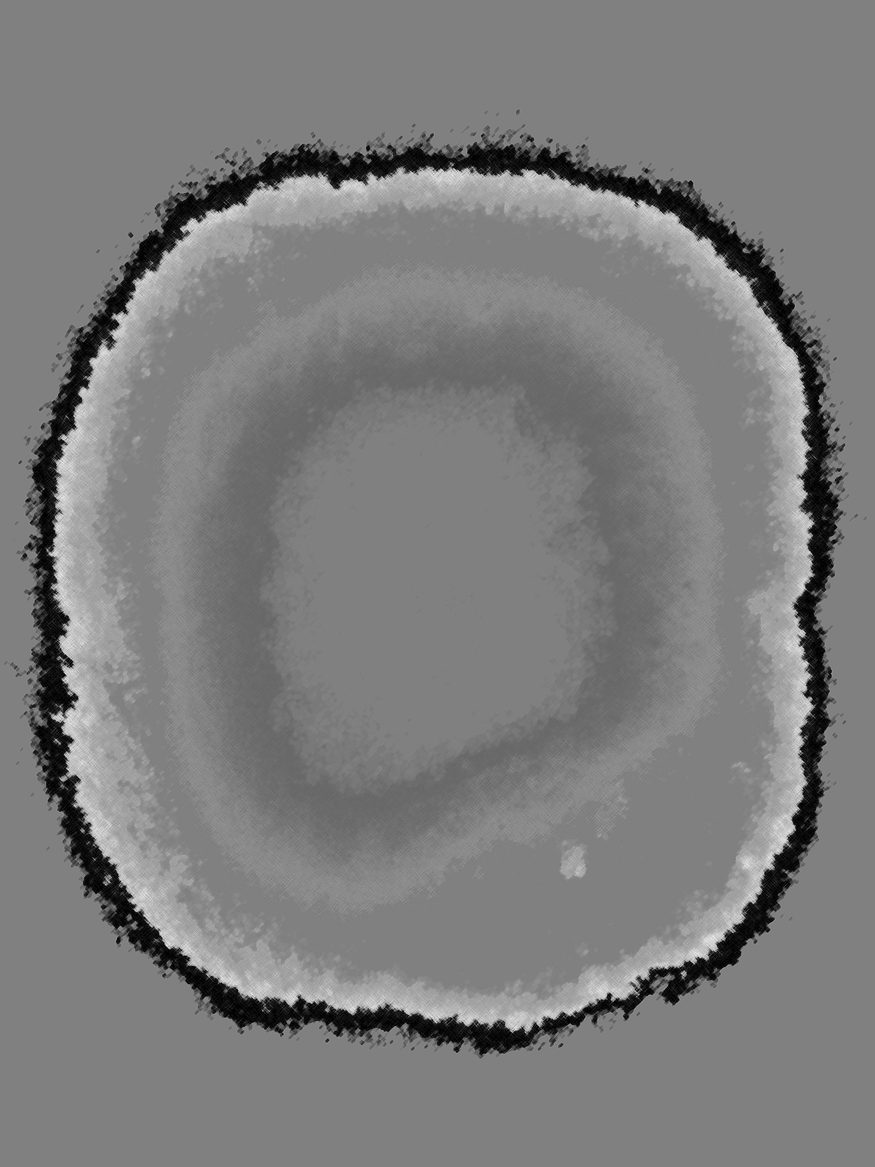
Author’s Autosomal DNA and error rate
The Autosomal DNA chromosomes 1-22 are over 99% identical to all other human beings. Above are the mismatch errors in a 600,000 sample from 1.3 trillion base pairs in each DNA strand.
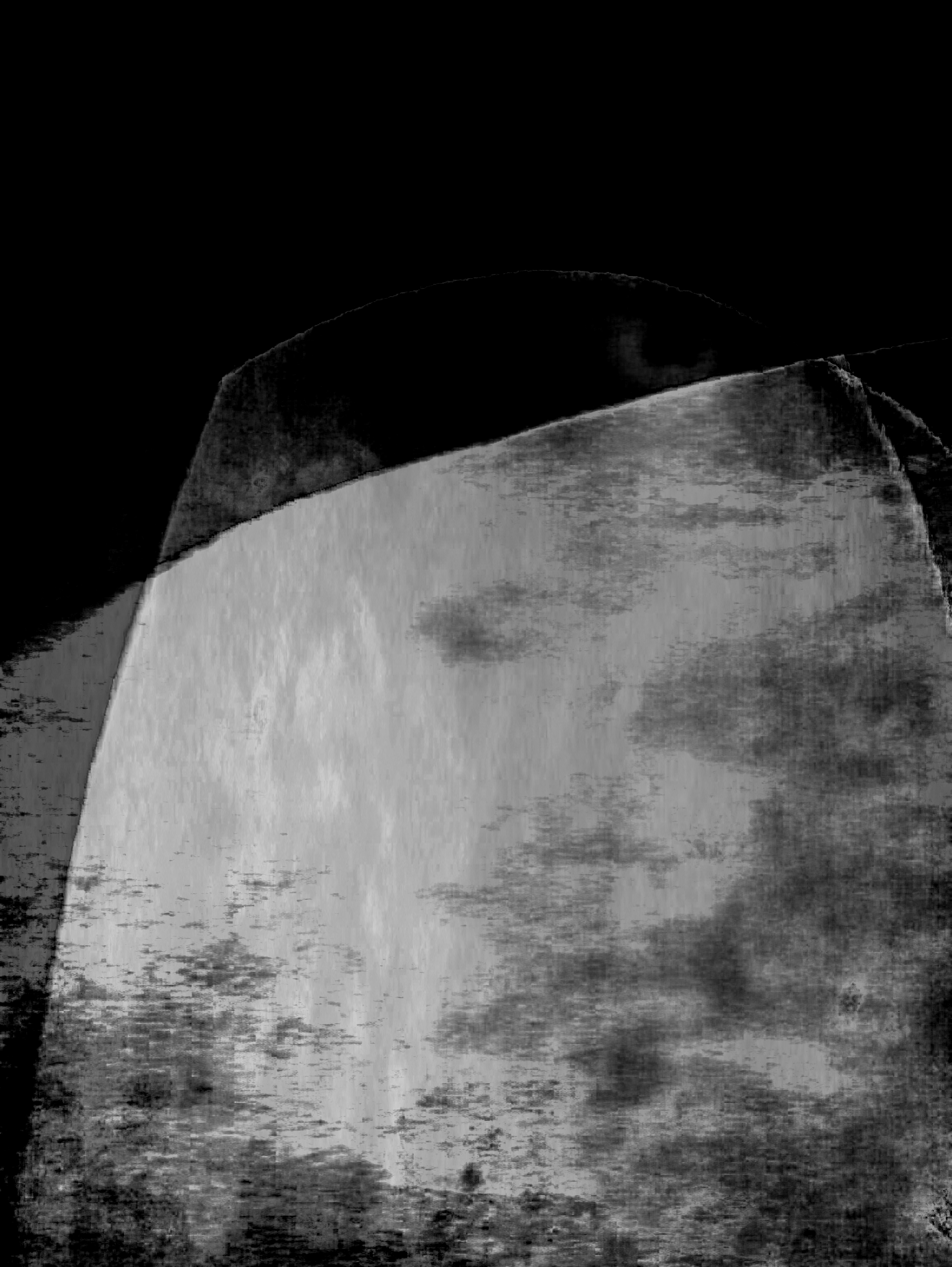
Author’s mtDNA
Mitochondrial DNA (mtDNA) samples for the author scaled by position in the DNA chain. mtDNA exists within the female line, is passed on to offspring female and male offspring and is very very stable. By remaining constant for thousands of years it easily spans the century of ancestors to whom the author identifies with. The Past Present.
Vision 2020
The forthcoming Vision 2020 Symposium and gathering at Falmouth University would have been a great opportunity to unveil the prints. However, the finite risk from the current virus spread and attending an international conference, combined with having caught a virus three times last year, making attendance undesirable.
Campaign
A social media campaign is planned and the first post made on social media using Instagram account foto_graphical. An Easter exhibition has been announced with the title: Past-Present.
Strands are coming together in consistent form.
Practitioner Comment
The advice given to another student was not to go overboard in obtaining practitioner input. A note I’d sent in earlier indicated that one remote critique was booked in, while a contemporary journal editor had responded as a potential attendee. A multi-genre, multi-award-winning professional had also volunteered to comment. Three others are on the back burner, so perhaps this is what was meant as going overboard – two of the three are recognised, art photographers.
The choice of font for FMP submission remains firm as Granville Light. A return to inspect the style after a cooling-off period only confirms this. The use of a Typography Insight App allowed a detailed comparison with a standard sans serif font. The Granville Light style is very much being enjoyed.
Original Post
Time has been spent researching san serif fonts for the FMP assignments and two fonts have shortlisted and have been installed and are being trialled:
Granville
Auster
Both fonts are very clear and Granville is being preferred on several counts including style which is more apparent on the lower case letters f and t, but also for being from a French designer at a Paris foundry given the project theme of loss in the Great War. The slight dagger-like flourishes in the lowercase letters f and t, also act as a metaphor for me as references to the Dirk and the Sgian Dubh, sheathed pointed daggers carried in Scottish national dress.
I won’t install the Granville font in this blog but provide a PDF example here:
Looking at this example a reservation emerges to do with font width, even as something that makes it more readable. Is it too wide? The answer becomes clear when the font is viewed at the required 1.5 line spacing where indeed it looks fresh and clean as seen in th ePDF above.
A detail was examined of the source of image glow in humans
Michael Turner based on UV image by Dr J Crowther
Access to imaging scientists led to emanation being discarded as it is undetectable. Instead, attention is brought to body reflection in the visible light spectrum. The scope was introduced for a secondary effect caused by visible light having triggered bacterial fluorescence.
Further research and reflection have guided change and resulted in the adaption of digital darkroom processing that now uses simpler steps that are easier to manage and more flexible in fine-tuning the healing wound image.
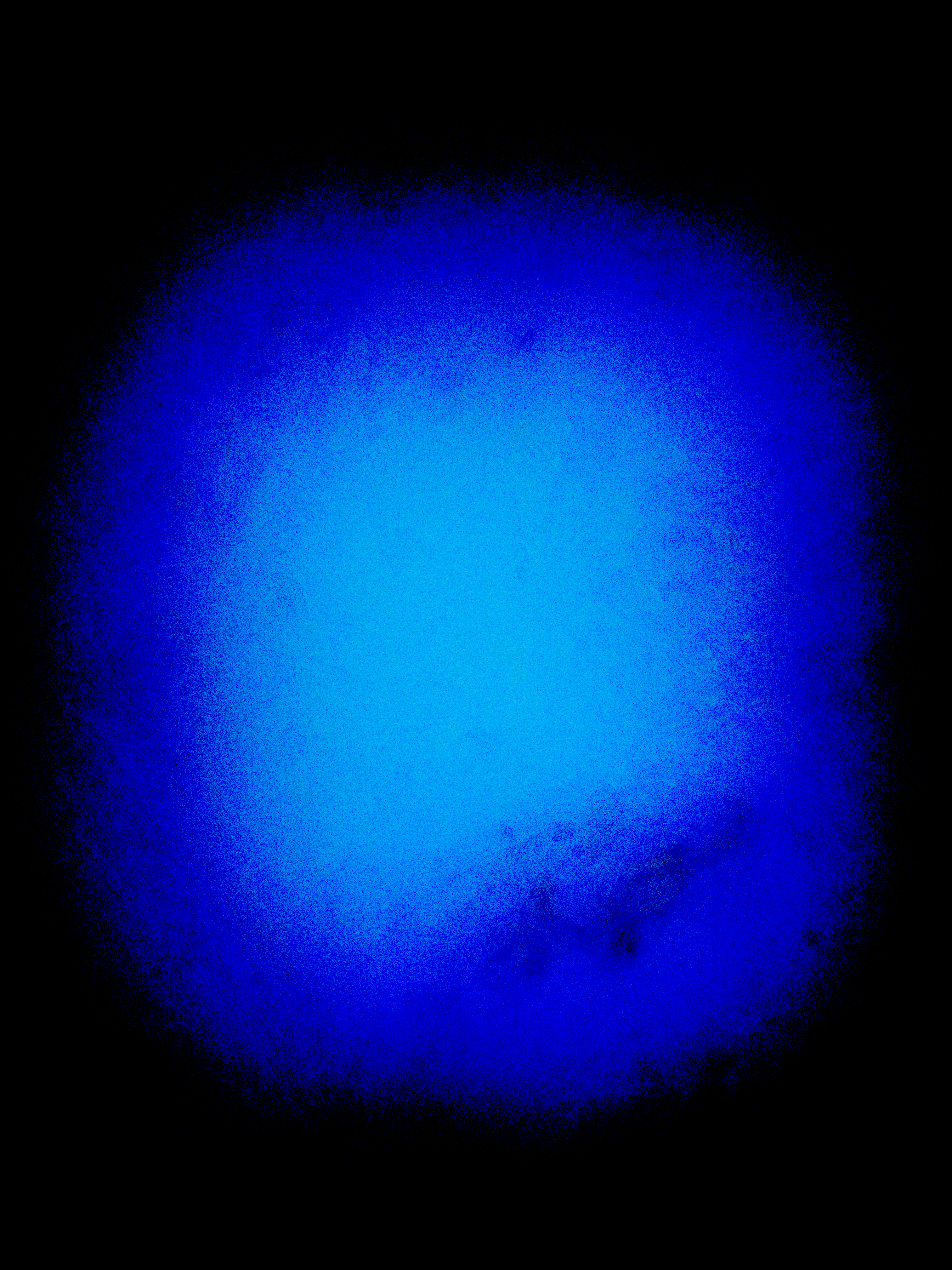
Motherline (mtDNA) and Glow
The ancestral basis of identification between individuals had been established through the Motherline as an image Aura or Emanation.
The method still stands, but as trace rather than direct emanation. Trace is in cellular heat created by mtDNA / ATP processes. This is largely through the increased blood supply at a healing wound. Blood contains levels of mtDNA as do all of the other cells but does not contain nuclear DNA. Direct emanation by humans is a measurable process but it is only detectable using scientific instruments.
We have to discount bacterial fluorescence. Bacteria are necessary to our existence and are present in great numbers alongside our human cells. However, bacteria are not genetically human and so the glow created by bacterial fluorescence cannot be attributed to the ancestral link but to the general population instead. Bacterial glow does not develop the psychological process of identification with ancestors.
Equivalence
Equivalence has been found between:
Process A
In HDR Tone
Compress (gamma) and simplify (slider)
In Levels
Spread and decompress (gamma)
Process B (new)
Simplify (ACR Clarity)
Colour layer | Luminance
In Levels
Spread
Comparison A versus B
The effects are equivalent and the number of steps the same. Method A can lose image data by compressing and decompressing where Method B preserves data. Method B. This gives more scope to subtly enhance the through colour channel (RGB) adjustments.
Conclusion
Processing Method A (HDR Tone) remains valid although there is no direct detection of IR. Method B can be adopted in its place for improved data retention and colour processing. The effect applied can be more readily followed.
Visible light detection is what is present and derives mainly from the blood supply to and around the healing wound and is connected to Motherline mtDNA although. As nuclear DNA is not presented in blood this makes the detection a close.
The name Motherline is introduced into blog usage below as it is now being adopted. Motherline refers to the photography of healing wounds and the resultant abstract glow images from a digital post method.
Imaging Science
Long-awaited, the Symposium on imaging science took place at the University of Westminster. on Saturday 14 December 2019.
The opportunity existed to be introduced and meet people from the scientific and medical community. A number of those present were from the Kodak or Ilford companies and from the Universities or other professional bodies.
Imaging science participants were generous in giving their time to listen to the Motherline image glow and the post-processing techniques used.
Michael Turner based on UV image by Dr J CrowtherMichael Turner based on UV image by Dr J Crowther
A processed image was created from a UV image portrait captured after the Symposium talk Imaging the Skin – UV, visible light and IR
As preparation for attending the conference, research was conducted into image compression and decompression, as the techniques used in enhancing glow in Motherline photographs.
It became possible to describe to a medical forensic imaging expert the art interpretations of glow in healing and in return obtain vital and conclusive feedback.
A detailed discussion was had on the processing steps for potential infrared detection. The wavelengths for emanations from healing wounds at human body temperature are very long wavelength, well beyond consumer camera detection capability. The conclusion was that there will be no detection of IR emanation.
Where IR is received by a smartphone camera, in the example of the domestic remote control, the wavelength is short enough to be detected depending on the exact optics of a specific camera, lens and bayesian filter.
Blood Supply |Bacterial Fluorescence
However, in the project photography there is a glow present, so where does it come from? A general news article explains (Hrala, 2016).
Foremost is the presence of blood supply around a healing wound.
Potentially there is fluorescence present. Bacteria gather in the region of a healing wound. When excited by an external light source a glow will appear in the visible spectrum. A Japanese research paper examines this in detail (Koboyashi, 2009)
Detection used a cooled CCD in conditions of complete darkness. With a prosumer camera, there is no detection of direct bodily emanation from a healing wound. Rather than emanation, an external light source excites the bacteria and produces fluorescence in the visible light spectrum.
Both of these effects are the likely cause of the glow that appears in the photo project images.
The intention is to deliver something art-based (rhyme or graphic text or image titles) over the upcoming period between terms as noted in the Final Proposal. An intention is to experiment to discover if contextualisation and visual language can be built with Recombinant Rhymes or DNA Art.
The idea is to use imagination in selecting words like TELEOLOGICAL that contain DNA base letters ACGT and combine them for effect, perhaps making a video with a reading of a rhyme. Words are intended to be selected for their connection to narratives of the project.
Select from the following ACGT words for some connected meaning:
Examples:
Advocating
Fracturing conflagrations
Countervailing
Lethargic contagiousness
Interestingly, the validated list contains the terms Abstracting and Photographic.
Project naming
In short, “Motherline” is the name presently chosen. This is less politically charged than the earlier proposed project name “Matriarchy”.
Matriarchy like patriarchy has political overtones, so is not so attuned to the themes of the work.
Themes occur in several sets subdivided. First, are the now consistent outputs of the work, and second, the themes of visual narrative explored and third the set of the subject matter placed before the camera.
In turn, we have:
Out of abstraction, the theme set subdivided into
place as landscape/seascape/mountains of heritage and theatre of war;
ghosts ever more recurring;
depictions of inner/outer space.
Out of the physical and psychoanalytical, the theme sets are around language/communication and intent:
science mitochondrial DNA,
war,
the phenomenological – the weird/eerie/uncanny
Examples of the above can be found in this portfolio:
Portfolio by Michael Turner
There is the theme set of the subject and photography:
healing wounds,
museum (military and medicine),
family archive,
video (gaming and broadcast)
Generative art.
Examples of some of the above are also in this portfolio.
Portfolio by Michael Turner
In retrospect, this presents the analytical. To think in deconstructivist terms as in Derrida, it would make sense to home in on that which conveys the main feelings. There again Art Science (Artsci) as described by Arthur Millar brings scientific method back into scope. The latter demands more resolution by the artist. Millar points to the history of the avant-garde. The art world and gallery system had rejected impressionism and the likes of Picasso as surrealist. Artists then built alliances later their work being more established it became more widely accepted. Millar might argue the case for art-science as the new avant-garde.
In the case of accepting Millar, then the project proceeds as
Family Constellations
Family Constellations have allowed freedom from entanglement with ancestors and their narratives of loss in a war.
FMP Experimental
View the following as experimental imagery that is work in progress. This is not the end product of publishable standard at this early point.
The work is intended to be positioned within Modernism PHO705: Modernism. As abstract it may fit into the Art-Science avant-garde as a branch of Modernism.
The implementation is still open at an early stage. Developments in one direction are towards overlapping archive ancestry images of motherline and mtDNA glow images.
To go ahead, work needs to be resolved. As these firm, vestiges are present in other approaches.
War imagery, either from Museum exhibits or from video archives footage. There is the style of Natalia Goncherova with angels and flying machines compressed into the frame in a very claustrophobic way (as in her lithographs).
Science, as molecular biology, animation and Generative Art.
Further influences begin with Albert Steiglitz and images similar to cloud formations. This is closest to my type of work of any of the above approaches.
by Steiglitz
There persists influence from Picasso, in breaking bounds then Rachel Howard in terms of the hidden brush of gravity abstract style.
Thoughts about Resolution
More wayward approaches need to be set aside where project intent risks being diluted i.e avoid any negative impact.
The strong influence going into the Final Major Project FMP has been to resolve the visual language to make the abstract accessible to the viewer. This was achieved in a summer exhibition although the martial narrative need not be enforced was a consideration.
Having just stated that though, the war theme is necessary otherwise we lose the linkage and orphan the themes of place foreign and theme of ghosts recurrent.
The previous portfolio settled on monochrome and red. It is interesting to re-discover the following quotation from an external to MA course, The Power of Colour. KLC School of Design.
The following colour interpretations are there to be agreed or disagreed with.
“According to Benjamin Whorf’s Linguistic Relativity Hypothesis, the language a person speaks determines how he or she experiences the world. This can affect how someone perceives colour. For example, the Shona language in Zimbabwe does not distinguish between red and orange. There seems to be a pattern, however, in the order in which all languages recognise colours: all languages appear to have a name for black and white, and if a third colour is recognised, that is red, and next comes yellow or green. “
“People who live in sunny climates prefer warm, bright colours, whereas those from places with less sunlight prefer cooler, less saturated colours.”
Quotations from KLC School of Design
There is a useful article What Colors Mean in Other Cultures. This proved useful in the past and so is brought into the scope of this blog post.
Colour Psychology has been extensively written about, and again here in Chivers and Wright. However, there is often a willingness to accept what is prescribed yet the verdict around any rules and interpretations is open in terms of there being no absolute scientific validity.
Attention was drawn to Irish artist Jake Wood Evans painting style.
Connected here is the use of Turner family archive photographs mixed with abstract art which has been trialled. Also, similar is the work of Susan Hiller – Aura, already referenced in this blog,
Paintings – Jake Wood Evans
There is something similar in intent. The final photo project images almost exclusively in black and white may benefit from hand colourization before mixing with mtDNA abstract art images. A basic sepia colouration might be a start.
What could be quite exciting would be the use of some muted or bold colour theory – this is getting quite exciting. Some practice and reading (Albers, 2013) and (Quiller, 2002), were conducted as part of the project research in an earlier module.
Also attended was a four-week course on The Power of Colour presented by the KLC School of Design. Colour theory also makes a regular appearance in Studio photography workshops at work.
Bibliography
Albers, J. (2013) Interaction of Color. 4th edn. Yale University Press. Available at: yalebooks.com/art.
Quiller, S. (2002) Color Choices Making Color Sense out of Color Theory. New York: Watson-Guptill Publications.
As current research continues into Phenomenology and mtDNA, a break is taken to cast ahead to publication. The work has to be taken to the public and is still experimental as shown in PHO705: WEEK 9 REFLECTION. Some of the making stages in the plan will arrive soon enough.
It makes sense to gather some direction even though the desire is there to complete work in progress reading as mentioned in PHO705: WEEK 10 REFLECTION.
Thinking through one idea here has a purpose of creating a Strawman. This will have enough form or structure or clarify the artistic design. This idea is about a book and starts with Ghost images. These creations appear fleetingly and have to be captured before they disappear. There is a need to conquer this and to avoid there being no work of this type to show. Apparitions are always welcome to this work but the nature of creating them is open to the random. A perhaps predictable but nevertheless still surprising element of this randomness occurred during a period of distraction in which Ghost images began to appear in other made work, outside of the main project. Perhaps these intrusions are just another type of Ghost, linked to the main project by occurring during the project timescale.
In the previous module, an attempt was made to help progress by restricting image scope to abstract Landscape. At first, this was a mistaken choice. As with Ghosts, Landscapes are also subject to random process but nevertheless, they regularly feature in the work.
The experience was somewhat worrying as having restricted scope to landscape the theme was worked towards for a solid two weeks and the worst – no Landscape could be made. Letting intuition take over the method of obtaining the desired result was finally fathomed. A way of making at will was settled on which largely depended on recognising the kind of processed starting image that might work. There is an earlier Landscape representation with horizontals and verticals that would have been readily obtained from the start, which may still feature as published work, but what it had led to was a more imaginative scene that required more sophisticated processing more akin to perspective images as compared to earlier flatter images.
All this is taken as a lesson learned around the intuitive making versus something closely allied to a ‘commissioned’ approach.
The Week 9 reflection above turned up a Ghost of the kind sought. But what if that was it? in this case, it might be necessary to showcase the image as a full-page and in a process of categorisation accompany it with earlier ghost images as a plate of smaller inserts.
There is a process of categorisation that would work equally as well with the works other representations (seascapes/mountainscapes and spaces inner/outer). Each theme is linked phenomenologically with narratives of the work but each would stand as page layouts again of main plate and plate of earlier images at a smaller scale.
This is not the final piece, but thus far it has an appeal. It leads to making and it does so in a structured way and way familiar to the author and in some respects reflective of Victorian categorisation schemes e.g. in Botany.
To take this a stage further is to keep a keen eye on an Exhibition element of publication. Having learned from visits of a knowledgeable public to a Summer exhibition of recent work, the idea would be to take from this experience the things that worked well with the audiences especially around sequenced narrative and incorporate it into the same book design mentioned above. A book section that parallels an Exhibition.
There then becomes a substantive element of making to propose and gather feedback on from the University regards the standards of the MA Photography course. It would also be necessary to maintain balance, i.e. not try and squeeze a long term project into the remaining time on the MA.
What this is about is the practicalities of making images of publishable standard, about a book and about an exhibition.
There are extras planned either to assist the design such as using ISSUU as a template for hand, bookbinding. Or, to help create impactfully contextualisation by making moving stills and or a video. This created the atmosphere at the earlier summer exhibition.
The exhibition has some elements that are rooted such as the available space and the possibility for lunchtime pop-ups during appropriate photographic training sessions. Some elements would be more aspirational at present, such as making society presentations at one or both societies with which there is an affiliation. This is a likely outcome but does not have to happen within the timeframe of the MA, it can follow on. Another group or in fact two groups have made approaches although generally so and not so much around a specific project.
The aspirational elements represent To-do action if something is to be achieved. For the purpose of the MA and continuity, it might make sense to negotiate with the various societies and groups, the further taking of the work to public view but time this to allow freedom to complete substantive work for the MA without too much self-imposed overload.
There are different commercial services that provide DNA testing connected with ancestry. One service is mentioned here as they have an option to have a personalised book and that fits well with researching visual language of DNA. Two services were inspected:
This is a continuation of earlier research. It looks at a specific book product of commercial DNA testing. The idea is to gain awareness of public perceptions around DNA by examining the visual language used by a company promoting DNA testing.
This current phase of research is prompted by the order and eventual arrival of a personalised analysis “Your DNA Adventure” (LivingDNA, 2019).
The content is predicated on three types of DNA we possess.
Family Ancestry (autosomal DNA)
Motherline Ancestry (mtDNA)
Fatherline Ancestry (Y-DNA)
As the photo project majors on the Motherline (a term now preferred to matriarchy as it softens potential for feminist bias.
The motherline is highly stable over thousands of years and once a change does occur it is passed down to descendants. The top-level term used is Haplogroup within which exist Subclades.
Descriptive language then takes over preventing opaqueness and is a strategy noted elsewhere for keeping others engaged.
There is a very good reference section to explore.
Within the publication the visual themes range across:
trees on African savanna (covers)
Note: The visual references are probably best viewed as a publication rather than my translate to text here.
Bibliography
LivingDNA (2019) Michael Turner – Your DNA Adventure.
Following the visit to the Wellcome Museum, it was clear that others must be working in an area where art is created from science.
Artsci is the term coined in the book (Miller, 2014) where Artsci acknowledges a convergence of Arts, Science and Technology.
Colliding Worlds – How Cutting-Edge Science is Redefining Contemporary Art (Miller 2014)
The work in bulk extensively sells the market for Artsci, by giving innumerable personal reflections on individual contributor after individual contributor, yet this is rebalanced in the final chapter by doubts over the acceptance of Artsci in restricted / specialist galleries being deemed almost gimmicky as an art form. However, examples are made in the ending of the rejection of Picasso and the Impressionists who had to set up their own groups. And so it is left to the reader as to whether or not to take up the “cause” of Artsci.
Millar describes the technical evolution of technology in computing in this book (Millar, 2014). So much resonates with my early career in technology as a world in which artist and scientist no longer are viewed strictly different disciplines. Art and science and engineering are disciplines seen as having a conceptual touchpoint in terms of methodologies e.g. minimalism and cubism.
An electronic signal called a butterfly transform, photographed on Polaroid film, was one of my earliest technical visualisations. I designed and built an electronic circuit to automatically tune to a signal frequency of a type used to communicate with deep space satellites. The active tuning process was viewed on an oscilloscope and the overall capture presented on film. During development one of the early characteristics was that of a squegging oscillator which pulsed on and off due to design tolerance issue in this automatic circuit. This was around the time that a successful MSc application was made to study the subject of Cybernetics that involves the control of machinery using feedback and software controllers. A funding issue arose that prevented the place from being taken up. Besides this, an economic downturn occurred that would certainly have blocked an immediate return to research and development within the industry.
The book runs a direct parallel to my early involvement in computing, discusses the various technological art movements and the establishment of schools for such art.
The book also discriminates between Media and Fine Art the former being linked to crafts and it notes the rejection that occurred on many fronts.
However, with repeated incursions of technology into art and advances in the modern world, it is argued that contemporary art can no longer exist without the structures and knowledge of the scientific world and they are seen to combine.
Artists are seen to look towards science and without getting directly involved with expensive equipment instead read the ideas and then through contemporary art communicate these ideas. Scientists look towards artists to understand how they approach a topic e.g. Nils Bhor and the wave-particle dichotomy of physics and the resolution of this through Picasso and the advent of Cubism, where it is fine to have multiple perspectives present all at once.
The question has to be where does this lead to in terms of the Final photo project? Well, it resolves why the author takes a technological view of art and provides an independent and solid standing. The intent of the work becomes understood in the wider context.
The book identifies the avant-garde as being the convergence of art, science and technology and it is seen as an exciting frontier in Contemporary art.
There is a summary for Antony Gormley, his influences including in science, and his work which was on display in London during visits there.
Another outcome is a strengthened resolve so as to honour or be true to one’s life experiences. Otherwise work would remain conflicted.
Had this work been uncovered earlier in the course, there would have been the time need to develop programmed work such as animations. These would be over and above the glow images attributed to mtDNA. What there is also are elements of identification (determined through psychoanalysis).
The book has been difficult to put down and yet the historical side has to stop at some point to allow time for project progress.
Computational Biology – Human Proteome Folding
Following a career in research and development in electronics and computing, sometime later, there was a formative even if only a side involvement in grid computing donating spare machine cycles to do then return completed calculations to researchers in computational biology. This was in the search for new drug treatments.
Specifically, spare machine cycles were donated to human proteome folding projects. These projects are highly visual as protein formation and attachment is shape-dependent.
These projects go back to around 2004 and there is little visual material remaining. In lieu of this, a TEDtalk was discovered that ably shows the visuals (Dill, 2013).
For 50 years, the “protein folding problem” has been a major mystery. How does a miniature string-like chemical — the protein molecule – encode the functions of living organisms: how our muscles exert force, how our immune systems reject pathogens, how our eyes see our surroundings, how plants convert solar energy, and all the rest. Huge progress is being made. Moreover, these amazing nano-machines could play important roles in health and disease and commerce in the future.
(Dill, 2013)
What this post identifies is what is behind the intent in making the photo project.
Art of Now
Research uncovered a BBC Radio 4 broadcast Art of Now. (McNamee, 2019)
Recombinant Rhymes and DNA Art
The successful sequencing of the human genome has not only had huge implications for medicine, bio-technology and the life sciences – but it has also provoked a great and growing reaction among artists and writers.
Anna McNamee meets poets, visual artists and scientists collaborating creatively on the frontiers of DNA science in a genre that Pulitzer Prize-nominated author of AI Renaissance Arthur Miller calls Art Sci.
In Melbourne, the bio-animator Drew Berry tells how his dramatic but scientifically exact visualizations of cellular and molecular processes have earned him fans around the world – including the musician Bjork.
The poet Sue Dymoke and the structural biologist Pietro Roversi reveal how their creative partnership has resulted in a three-dimensional, topsy turvy poem called DNA Time that mimics DNA’s unique and complex structure.
In his lab, the Canadian experimental poet Christian Bök has successfully encoded his work into the DNA of a bacterium creating what is essentially a living poem.
While at the European Bioinformatics Institute near Cambridge, the artist and filmmaker Charlotte Jarvis and the scientist Dr Nick Goldman have stored music in DNA which they then suspended in a soap solution and used to blow bubbles, quite literally, bathing their audiences in music.”
(McNamee, 2019)
Drew Berry
Drew Berry is a biomedical animator at the Walter and Eliza Hall Institute of Medical Research in Melbourne, Australia. He produces animations of proteins and protein complexes to illustrate cellular and molecular processes (Berry, 2011).
Wikipedia
Animation Development
Berry describes the molecular level being sub-light wavelength and how he gained inspiration from the accurate scale drawings of David Goodsell:
Beyond this Berry incorporates measurements of cell dynamics and microscopic observations of larger cell structures to create his animations. His intent is to make work that viewers can take-in with avoidance of technical descriptions and acronyms which otherwise make the subject opaque and turn off the viewer (Berry, 2012)
Animations from Berry and molecular biologists and cell biologists:
Miller, A. I. (2014) Colliding Worlds – How Cutting-Edge Science is Redefining Contemporary Art. New York and London: W. W. Norton and Company. Available at: www.wwnorton.com
Research has become focussed on the Psychoanalytical for example in terms of ghosts. And as below the ideas of Science in Art have been explored.
Work in Progress: There are some textbooks to finish researching.
To Do: Other books on the history and development of abstract art, hanging over from a previous module. The importance here is to more fully develop an understanding of the evolution of the art. Also, there is a desire to contrast and compare with other artists abstract work to fix in place the photo project.
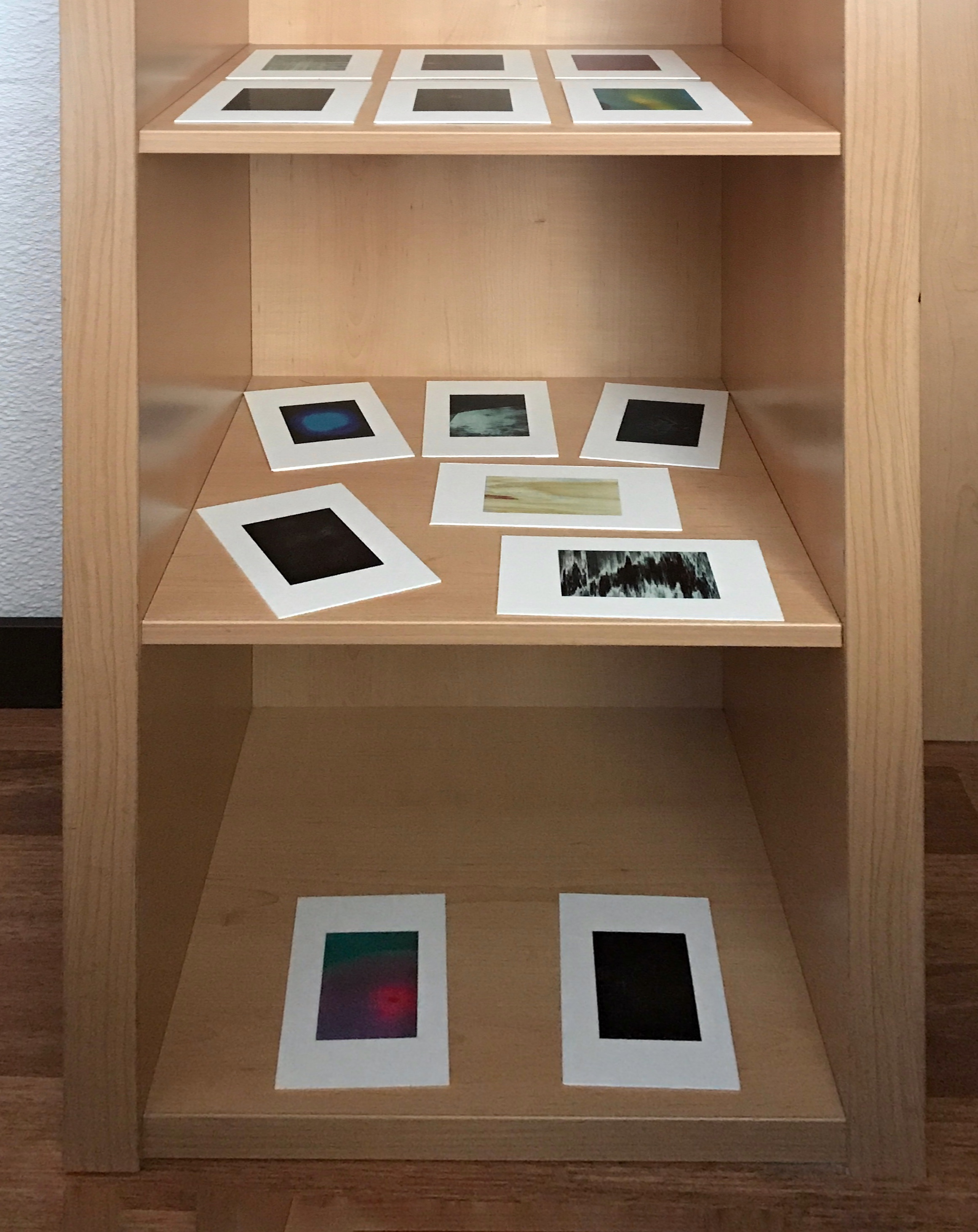
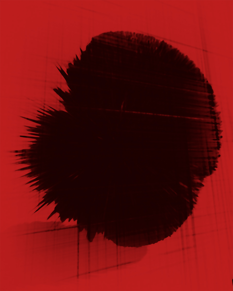
A collection of FMP photographs has been catalogued and are in the backlog queue and production rate has picked up. Photography of healing continues and images are being processed. In one case it was a relief to obtain the first Ghost image of this series:
Week 9 Revenant 1 by Michael Turner
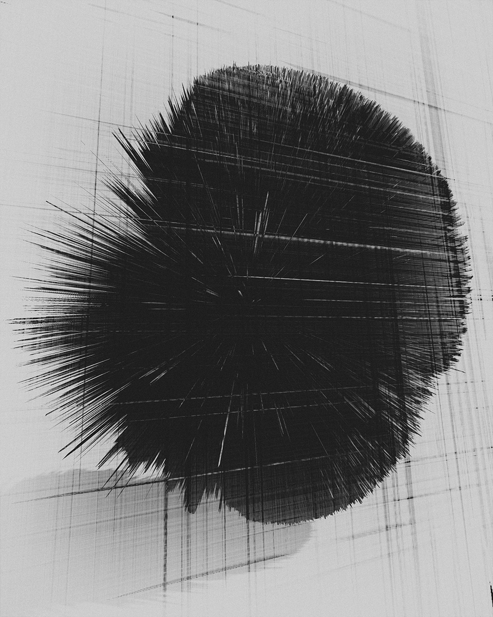
Another image is of a graphic type and serves as a representation from DNA testing and might be expected to form an image layer as part of the contextualising process.
Week 9 DNA Analysis by Michael Turner
Some colour images have also been made while ideas are being formed. As such they are individual examples of technique or aesthetic stylisation. The main priority has been to maintain practice – concentrated periods are need to explore and develop the image types.
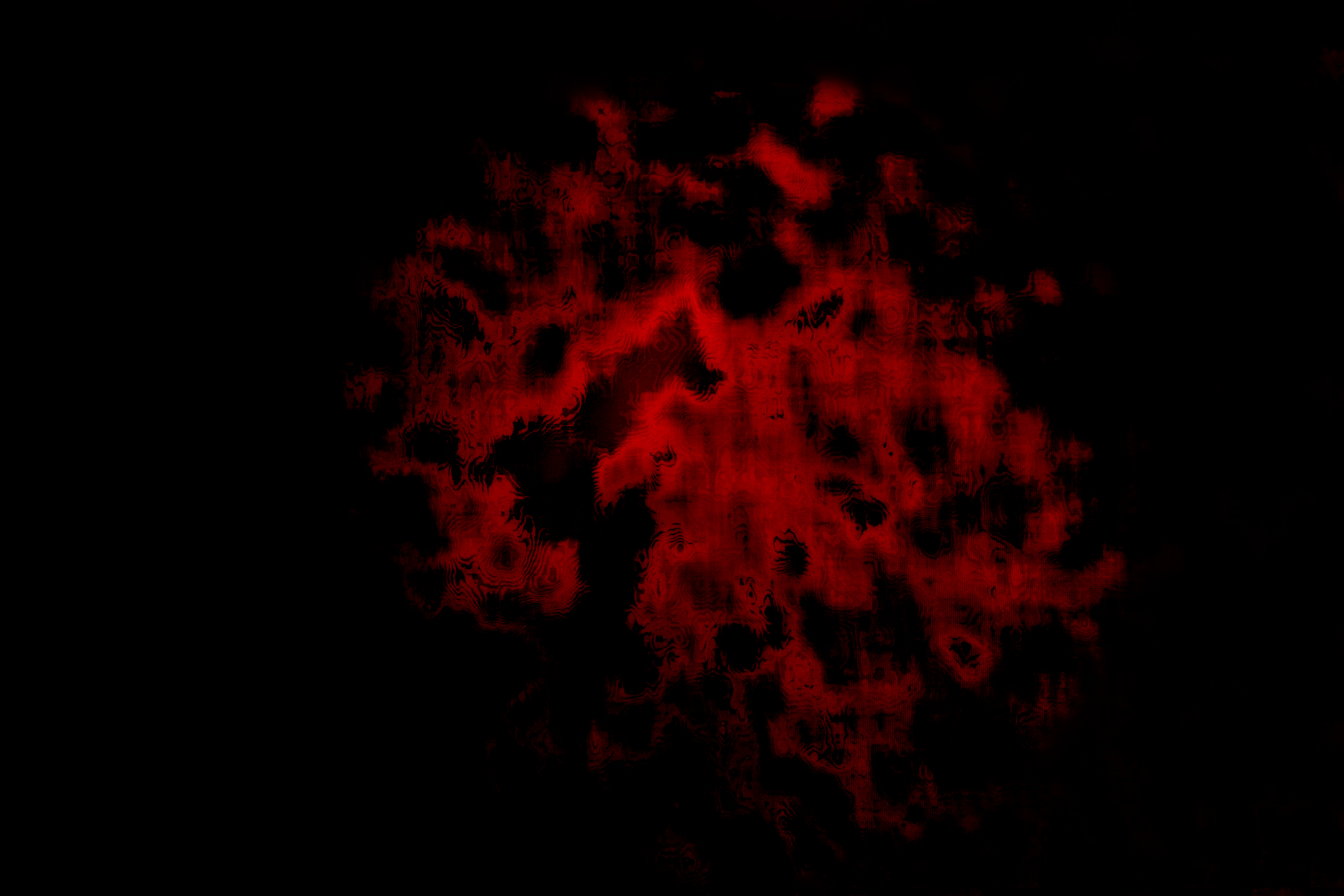
Here is this week’s example of a glow image:
Week 9 Untitled by Michael Turner
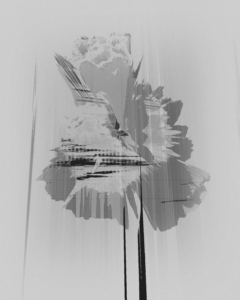
This week’s example of an abstract Landscape image:
Week 9 Landscape by Michael Turner
A rendition of a pure abstract in Week 8 harks back to the saturated colour theme from earlier portfolios. There is a personal joy to this image as at exhibition in the summer there were requests for two such images to be made complete with a third. This looks like the missing third image:
Week 9 Colour Abstract by Michael Turner
At present these are partial works and it is plain to see there is no attempt at consistency as ideas remain open. Once the direction is decided the work can properly proceed.
Social interaction occurred in making this week and was a joy too. This continues to be motivational. The making is also a pleasant break from the reading and research.
This post connects an earlier technological career with an analysis of this scene as a motivator in the current photo project and stands alongside the more psychoanalytical regarding the strangeness of abstract images created.
In creating the post the photo project became more connected. Answers were found to questions such as how animations at the cellular and molecular levels were resolved. Further validation and extension of an understanding of Biology occurred. This allows the topics to spoken of with greater clarity. The connection between Biology and Art was explored and parallels drawn with art forms such as poetry and music.
It is clear that recent medical progress is so significant that we have entered a new era and as we do so we witness the integration of Art, Science, Engineering and Technology into a new field simply described as Research.
Guest Lectures
One of two Guest Lectures was blogged as the Week 8 lecture was replayed in Week 9. Guest Lecture with Andy Hughes. Andy talked about the environment in terms of plastics and global warming as well as the making of a film using a gaming platform.
This research arises from a connection established with a geneticist. The value here is in the development of visual language for contextualisation of the photo project.
Mitotic Division is examined by augmented reality with the following app and educational workbook:
Note: Select English under the triple bar menu
The emphasis moved closer towards an interest in mitochondria explored in another recent blog post. While there is an abundance of archive images that explore the matriarchal lines of family, the visual context around genetics is being developed having been more restricted materially and in terms of ideas, which are constantly being expanded.
Use
The pdf says to print off the guidance – the app seems to work when reading the graphics directly from the screen graphics when Adobe Acrobat (or another reader is used).
In pursuing a World War 1 theme, or having done so, it would make sense to expand on the photo projects context by building a stock of images and other research. This was done earlier at IWM Duxford (IWM, 2019) and The Black Watch Castle and Museum Perth. These visits proved useful in contextualising abstract work.
Options have recently been generated to expand themes in new directions in other words, other than military. In the interests of keeping shooting, it would be useful to visit a number of sites.
The topic is an odd strand of research concerning how if at all, images from a gaming platform could be considered for use within an MA project. A look-see reveals a YouTube review. (Zommin, 2016)
Take-away points from this research are:
The most brutal war didn’t get much attention in gaming.
When it is represented, there is an element of caricature borrowed from gaming
Of the few games, there are rendering WW 1; the tendency is towards flying and air combat.
An early technology implementation of one flying game was put forward for crowdfunding but failed to raise sufficient funds
One game stands out as a modern technology representation, and that is The Battle of Verdun France, in the video game Verdun. (Blackmill Games, 2017) Pursuing Verdun as a game on XBox video console is likely to be unfruitful. Rather than be critical and halt the further investigation of video gaming, it would make sense to at least experience the game and see what can be found in the visuals. Already found is a reminder of the quote “You will be home by Christmas”.
Verdun as a video game proved relatively unpopular and can be taken as an indicator of the dying interest at least amongst the game-playing public.
Perhaps implied is an only minor public interest in the theme of WW 1. The observation is reflected in comments received during a review and again at an external presentation. For many current generations, there is no personal experience or recollection of WW1. It is a play on memory loss that caused the project to be taken up. Dry data records are transformed into tangible memories of people, of the remote family, before living contact is lost, and all that remains is data, certificates, files and the like with nothing to connect the these into a story.
The emphasis on flying for a publicly accessible game probably says something about a lower interest in land warfare. Thinking this through also expands the idea to other more standard forms of broadcast video as evidenced by various series of documentary programmes.
Video Documentary
Reference broadcast television.
World at War
They Shall Not Grow Old (Jackson, 2018)
The latter has helped address a problem of why close relatives did not mention their loss.
An assumption is challenged as to the cause being an immense sense of loss and need to protect well being and that of others. From the quotations below, the light is shone on the demobbed soldiers reports on the attitudes of civilians:
People never talked about the war. It was the thing that had no conversational value at all.
Most people were absolutely disinterested.
When I got home my mother and father didn’t seem the least interested in what had happened. They hadn’t any conception of what it was like.
There was no reason anyone of a million of us should get a thank you for getting a little bit muddy and having lost touch with good manners.
On occasions when I did talk about it, my father would argue points of fact that he couldn’t possibly have known about because he wasn’t there.
Every soldier I’ve spoken to has experienced the same thing. We were a race apart from these civilians and you could speak to your comrades and they understood but with civilians, it was just a waste of time.
However nice and sympathetic they were. The attempts of well-meaning people simply reflected the fact they didn’t really understand at all.
I thin the magnitude was just beyond there comprehension.
They didn’t understand that people you’d known and played football with were just killed beside you.
My friend who enlisted with me just lay there like a sack of rags until he went black before anyone thought to bury him.
They knew that people came back covered in mud and live. But they didn’t know the strain of sitting in a trench waiting for something to drop on one’s head.
You couldn’t convey the awful state of things where you lived like animals and behaved like animals.
People didn’t seem to realise what a terrible thing that war was. I think they felt that the war was one continual cavalry charge. They hadn’t any conception, and how could they?
It started off in a reasonable manner but with horseback with swords but they didn’t know it developed into something ghastly. People don’t realise the potential of military equipment.
A man’s life wasn’t worth anything at the end of the war.
None of us were heroes you know. We didn’t like this business of being killed at all.
We were talking amongst ourselves. We used to say Christ we won’t have any more wars like this.
How did we endure it? The answer must be partly the fear of fear. The fear of being found afraid. Another is a belief in human beings and colleagues and of not letting him down.
There may be right on both sides, but I think war is horrible. Everything should be done to avoid war.
I still can’t see the justification for it. It was all really rather horrible.
I think history will decide in the end it was not worthwhile.
The only thing that really did annoy me was when I went back to work after I got demobilised. I went down the stores and the bloke behind the counter was a bloke who I knew. He said where have you been? On nights?
From: They Shall Not Grow Old (Jackson, 2018)
Summary
The issues and the ethics of incorporating other work within a photographic project come to the fore. Balancing this is:
Acceptance that family archive material may be incorporated
This strand of research has lost out in the competition for resource during the course catch-up phase.
There is a theme that emerges from showing work. If the abstract images within the project that are the core of the work, are not understood by viewers, then there arises a need for the abstract images to be carried by archive figurative images.
Strands of research interest break down into:
The public visual perception around commercial DNA testing including branding and illustration
Metaphors around stability running parallel to mitochondria: flora and landscape.
Laboratory visual characterisation of chromosomes. Some of the work being done in Brazil by a researcher who has been contacted and given outline permission to use scientific imagery around the photographic project.
Visual language development from the laboratory or from science expands to the chemical expression of genes through epigenetics. This week, Week 5, inspiration was taken from the sourcing of visuals seen in War Primer 2 which uses archive material. It was decided to experiment as follows:
The Forth cohort attended a group critique, our first.
So to take forward something of the way of telling a story by a compositional layout of three parts or by layering an archive portrait with a glow picture. What feedback would the Module Leader and the audience give?
The PDF attached can be downloaded. It contains two frames, one for each method of interest.
This file displays correctly as two pages: View – Page Display – Two Page View for side by side comparison and to show a two-page spread.
Making a PDF was practice for the 1 May hand-in but at a small scale.
The intention is to obtain a PDF with the best resolution images saved as an Interactive PDF format. InDesign frames also ensured even sizing of the pages which of different dimensions from Word and Photoshop were made consistent.
(TBD Here is the work of the previous module:)
#Advice
Here is the update promised following today’s critique. The idea is to obtain greater clarity and something actionable.
We learned from each other’s presentations as much as our own. Five presentations were made:
Skye rushes
Balloon metaphor
Mitochondria
Book diptychs
Urban regeneration
Reaction to presentation – mitochondria
Preparation for the presentation was done well in advance and meantime it may have answered its questions on the layout options.
There were no audience comments. Module Leader comment went beyond layout, drawing attention to the importance of mitochondria as a theme. Agreed this is the foundation and deserves elevating.
The work could be helped along by adding a family tree. Privacy issues prevent this. However, a generic chart is something I would entertain.
David Fathi did some work concerning the impact on moral actions of using a genetic sample for modelling disease.
The family mitochondria theme does have a historical element as that is what stirs a feeling of identification with family. It is more of a driver or motivator than the actual purpose of the work which is forward-looking in terms of light reemerging as a means of detecting disease. It may be infeasible in the time to go too far with this science as the interest is really in creating art. The art is from the digital sensor capturing glow in a way the eye tends to ignore which given a style of processing can emphasise the hidden.
General learning points
The advice given related to the current point we are at on the course. Our work needs to be research-driven. So back to the books.
Also, no work is ever complete until we present it to the public as the audience. It is then we start to gain feedback.
Practical learning point
The student from the group, three months ahead of us was very informative in terms of their planning. They have already had their exhibition with six weeks to the end of their studies. They had 30 images and proposed editing them down to 20 for their portfolio but add in more for a book. They received interest in their work, and a videographer had even filmed their work.
This was a very useful 1-2-1 session guided by a true professional. Thank you for helping me to progress my work.
During the 1-2-1 there were some exciting and helpful turns, that I’d not expected. Thankfully I was able to address each point.
Referencing
Referencing had been deficient in my proposal. I’d not planned it to be a rushed job, but it was what it was, and I accept the comment. I’d since blogged my references, and was able to show these in my fully refreshed CRJ blog here.
In practice, my work is back on track, I just wasn’t able to assemble and organise references in time for the Proposal submission.
Proposal Organisation – Headings
A comment was made on the Proposal organisation. There was a need for more headings. The proposal was likened to a stream of consciousness, a comment which I love. There is a time and place I accept, but to be recognised as writing in the style of Roland Barthes, has to be an honour, surely?
Evidencing
Some assertions in my Proposal required evidencing. I can rectify the problem now, even if only for my own satisfaction. Points relate to detailing:
A planned Meeting with a Kodak scientist and specialist in digital imaging and medical imaging who works in the cosmetics industry.
A visit to a Digital Imaging Symposium in December – a Kodak scientist I’ve known since 2010 is set to give me an introduction. Note to self, I need to catch up with him on Friday.
My reviewer wanting to know more was encouraging. The project has been moving forward from interpretations of Biology theme and begins to enter a medical world of digital imaging. Why so? This originally was simply to validate a technical point around healing glow and Infrared emissions.
However, this research led me to investigate a bridge between Art and Science. especially following a Symposium back in September.
A further point that required evidencing concerned:
Creativity and the subconscious mind.
Direct evidence is present in the making of my work. The process is experiential. Appreciation of how abstract art is created cannot be assumed for the non-practitioner audience.
In academic terms, this is probably insufficient, or so I now realise. With the formal approach, I reference:
(Kandinsky, no date) Page ii on our spiritual relationship with the primitives, “… these artists sought to express in their work only internal truths, renouncing, in consequence, all considerations of external form”. So too I.
(Scarry 1987) page 21. “The human action of making entails two distinct phases – making up (mental imaging) and making-real (endowing the mental object with a material or verbal form).
Scarry ably described then, what became second nature in my work.
The Critical Review Journal CRJ (this blog)
As I’d shown my updated reference post and this later conjured interest in the CRJ. I was able to show a couple of relevant posts and by navigating to the bottom of the page, demonstrate the organisation:
Tag Cloud
Category selector and
Free text search
Next came the test, to retrieve a Portfolio from a prior module. That worked smoothly and was a testament to the preparations made. The search was a genuine thing as the Portfolio was then displayed and discussed. What followed was a connected piece on the next steps of project development. This at the time was a screen share of a prepared PDF on my computer desktop. Since the 1-2-1 the PDF has been posted here:
Bibliography
Kandinsky, W. (no date) Concerning the Spiritual in Art. Edited by M. Sadlier.
Scarry, E. (1987) The Body in Pain: The Making and Unmaking of the World. New York, London: Oxford University Press-23 978-0-19-504996-1.
The basis of my Abstract practice is the healing glow captured by the camera sensor enhanced in post-processing. In my endeavour to research appropriate visual language, I’ve looked towards the scientific and medical communities to determine how such work enters the wider consciousness including the public. Through investigation I’d hope to understand how my images might be viewed and how I might layer in certain types of graphic. For example representations of XY chromosome and DNA test strip.
The latter I’d used to give context to the viewer and I’m looking for creative ways to expand the visuals.
Clinical Photography Guidelines
When photographs of healing are digitally processed I often find expression through highly saturated colours. From the heat camera image below there is a similar palette and so there is a consistency. There is a tendency to work in monochrome which suppresses these colours. My research determines if colour trivialises my work or represents a wider consciousness.
Voluntary adoption of working guidelines of Clinical Photography. (Naylor, 2003) creates an association with medical photography. The method leads to a closer inspection of healing sites and sometimes observations are made which can trigger the curiosity but is sidelined. However, the heat camera article in the newspaper serves to remind that medical observation can follow.
The heat camera item is a newspaper article and doesn’t carry the same weight as funded medical research. The Medical Photography heading though, does have weight. A reading shows there to be a new or emerging science of light in diagnosis. Even as a visual only there is close correspondence to the art images I make within the project.
In conclusion, it seems valid that I should anchor my work to medical science at least on a visual basis. This gives hope that the viewer of abstract art may read and correctly interpret the signs given.
The last item below, In Conversation, brings attention to the crossover between biological sciences and art. I feel this validates my choice of subject of healing glow as it sits at the boundary of art and science.
Commercial Heat Cameras
What has triggered the post were two more coincidences. A newspaper article reported on heat detection of cancer (Parker, 2019)
Bal Gill / PA
Medical Photography
Notice has been sent out regarding How light “of many different colours and flavours” can be used to diagnose disease in a number of remarkable new ways. (Macdonald, 2019)
RPS Medical Group
In the photograph above the red coloured left-hand image is very similar to the appearance I create within my image sets. The structure also has a correspondence with my work. This means the abstract practice is quite well founded in colour and form.
In conversation: Viewing the Invisible
Scientist and artists were brought together to explore the similarities in their working methods in Viewing the Invisible. (NPG, 2019) I was able to talk with a number of scientists about my art perspective on mitochondrial DNA.
A video resource made available showed how the staff of Falmouth University approach a Critical Review Journal and especially during assessment, so it became clearer how I might adapt some details of my own blog.
A major update has been completed including a retrospective change to posts from the earlier modules that impact on my FMP.
#Advice
A video resource made available showed how the staff of Falmouth University approach a Critical Review Journal and especially during assessment, so it became clearer how I might adapt some details of my own blog.
A second video resource provides an example of one students work.
A result of using the above resources, videos and guidance document is that the FMP blog has now been restructured and is more professional. It should be easier to research as work continues.
At Week 5 the restructuring is basically complete:
tag cloud search is introduced
category filtering is introduced
FMP posts structured and scheduled (use tags and categories)
A direction change is to the revived interest in using the family archive of film prints. Again this is to do with developing my visual language. Initial indications are quite revealing:
Experience in scanning film negatives revived after my visit to the Falmouth University, Institute of Photography IoP. Prior to this, I’d done some archive film scanning of a reasonably low resolution using a portable scanner. This was enough to satisfy my interest at the time. At the IoP some current films were developed: three 35mm films and two 4 by 5 negatives. The film was processed both by hand and on a developing machine. A drum scanner was used to digitize the results.
Based on earlier experience using a portable scanner to create digital versions of a real archive, it seemed that a couple of years elapsed time might be involved in making a comprehensive capture. This had coloured my view on starting to scan another 5 or 6 generations of the family archive.
The estimate, making it infeasible for a full scan during an FMP, unless another approach was considered. What unfolded was a quick look through the archive, and a mass of images was captured on a smartphone in rapid time. This has different effects: it made selecting and using specific photos possible. These were printed photographs as opposed to film. What was clear was the content of pictures I was interested in making the process more focussed. I was looking at specific places: landscape, farms, buildings but also people in the maternal line or closely connected.
The downside of the initial session is to do with a consistent and controlled capture set-up that could be improved. As a first pass, this was highly successful, though. There are options: I can invest time in cleaning up the photographs in digital. My usual preference is digital retouching. I could revisit the archive and make new scans, either in a more controlled fashion or using expensive scanning equipment. A constraint I placed on the activity was the need to engage and have a discussion. It wasn’t a grab but a sensitively handled meeting.
I decided not to separate any of the prints of special interest from the archive for controlled scanning. The thing is that so much can be read from the grouping of prints and their order as it aids discussion when identifying people and places.
In the event, there was an engaging discussion during the inspection of prints and some good scanned results were obtained. Images of specific interest had been picked out and rephotographed. This was a collaborative effort and was quite swift. Another session may be arranged to reconfirm a few identities.
Categories were decided, and these fall into headings related to people and place:
Menfolk,
Women especially mothers,
Children,
Farming, Landscape, and Activities.
[metaslider id=2670 cssclass=””]
My project so far has been portrayed as connecting with the 1900s as I collapse time through an unchanging aspect of Biology, mitochondria.
Further suggestions arising from the Tuesday P2P meetings is to record an oral history. This suggestion related to another revival. From recent experience, it would introduce an atmosphere around any Exhibition and supplement information in taking it to the public as a Project book.
Part of this is the centenary commemoration 2014-2018.
Recent experience has underlined viewer interest in photographs containing people, exactly what these archive images contain. What must not be lost is the role these photographs play in providing supporting context to my main abstract work.
The archive turned up other gems such as a wartime identity card and a really old photograph envelope with markings that urge making extra prints.
I have to date maintained a close focus on a specific branch of the family but am now ready to spread a little wider during my FMP project.
There are several maternal lines. In a sense this makes the work more interesting to make and hopefully to view.
I have a cooling off period as I think through how all this affects my project.
A constraint I address is having enough images to proceed with an edit for an exhibition and for a book. A consequence is this early activity in gathering and taking pictures. I hope to have learned from my previous study module.
Having said this, I have already met distraction especially in restructuring this blog. The cost of doing so should be repaid later as it becomes easier to research from my CRJ.
Howard Rachel (2018) Repetition is truth via Dolorosa. Edited by A. C. Beard Jason. London: Other Criteria Books. Available at: newportstreetgallery.com.
The project direction is such that an alternative figurative image direction is being sought. At the end of PHO703 a resolved body of work was created.
An attempt is is now to be made to move on from Warfare to a theme of place. The purpose is to create new work for an existing practice whose intent is Identification with people and place past.
[metaslider id=2177 cssclass=””]
The place is that of coastal inland where the landscape and seascape will have altered little other than the ruin of abandoned buildings.
So to enhance abstract work using images of the fauna and flora of today as representation of that experienced by ancestors.
Photographs made now span or collapse into a single moment a timespan of over 100 years. This is the same for a Biology of female transmission of the highly stable mitochondrial DNA. The two themes form a parallel, strengthening the identification of specific family members today with specific others in the past.
I’d given a public talk on Photography in the past, around 2016, where I talked mainly about my focus on Abstract Art. I mention this not just because of the consistency in the practice choice but because more to the point I’d used an automatic slide advance approach to time my talk to an allotted time period.
That was very much like a Pecha Kucha, which differs in having a defined 20-second slide duration, but given I’d practised my talk, it turned out on the evening that apart from fairly blinding lights there was no lighting for my notes and so I proceeded to talk off the cuff. It went surprisingly well and the overall presentation was second perfect.
For the Falmouth FMP, preparation was somewhat different as for a start I’d been overseas, well to Amsterdam at least and with the many distractions of the Unseen exhibition, other exhibitions and travel.
Well, of course, I’d planned ahead and had set about an initial structuring alongside several goes at scripting from various angles to see what might work.
It only needed to be assembled and polished but for a bout of influenza that laid me low for a week, so there against all my plans I found myself cobbling the presentation together at the last moment. What with several confusions over my booking, I ended up with an earlier slot than anticipated. No time to record over audio and file on YouTube but made it in the end for another off the cuff presentation.
Develop your photographic practice through the synthesis of practical work, contextual research and professional activities, and with the integration of other disciplines.
Make personal observations and form critical opinions to analyse and appraise your own work, as well as the work of your peers and other practitioners.
Establish an understanding of the range of professional contexts for the dissemination and consumption of contemporary photographic practice, and identify opportunities to engage with audiences and markets.
Apply a critical awareness of the diversity of contemporary photographic practice to the development of your own work, and inform your practice through historical, philosophical, ethical and economic contextualization.
Exercise discernment in the making, resolution and presentation of practical work, and an ability to communicate ideas through creative visual strategies.
Demonstrate an awareness of a range of photographic and image-making processes, and display accomplishment of photographic skills relevant to your practice specialism.
I reported in Week 11 the learnings from a dry run of my exhibition versus portable facsimile that allows to carry the exhibition to audiences where my work receives almost constant attention in a number of social situations.
Although I sound like I prefer the accessibility of the portable exhibition, I have a full eight day run of studio exhibition to learn more about context. I do have a challenge in managing the building as well as the exhibition.
Announcements have gone out on social media channels to the wider area in which it is taking place. Notices have gone out to two local photography societies, one of which has its own exhibition running that I’ll need to attend. Lets see if it is a clash or a strength – I imagine the two exhibitions will support each other. I was invited to the other.
Of course on social media channels I’ve gone live across Instagram and several Facebook groups.
Here is the shape of the announcement with details:
Landings 2019 exhibition at Amersham Photographic Studios 16 Aug – 24 Aug 2019
After a delay or mix up in communications (a message I never received), I had not seen some feedback. Given how rapidly my (and others) work has evolved in my case in little more than a week, it proved rather vital. I forever remind of the time and attention that goes into my work being akin to painting.
Anyway, improvements continue as I now separate out from my work the colour work or celebration of life. I’m now focussed down on war and loss and also have a more consistent colour palette, mostly black and white and the red of blood.
There is so much more balance than at any point during the whole 12 weeks of the module. The change was straightforward to implement as it meant reducing to 18 prints, these now I decided to group as triptychs.
I’m sure I will return to my saturated colour work, if that theme takes off in future.
The print in the figure above is a bit small to read so here is the website link. This gives a statement alongside the images.
I found I was never entirely certain as to the bounds of acceptability to the University of mix and presentation of images. It is basically clear. Near the end I overproduced on prints and could tell from a dry run of my Landings 2019 exhibition. This provided interesting interaction especially as my facsimile of the exhibition in a portable box gathered quite a lot of attention.
Learning was about how other photographers read some of the images and the hanging plan. The black and white exhibition catalogue received positive comment.
As it was an informal look at the work I learned it is best to set out the large prints first as a string of one very informed question after another on top of other competing interactions meant I didn’t get as far as a full hanging of either the prints or miniatures. As an impromptu show it was very lively indeed which played to my interests in the social interaction around photography in general.
Given the consolidation down to 18 prints I should be able to show all of the miniatures on a table top, instead of having to actively handle them – not enough hands. I’m undecided on two points. I would like to replicate the miniatures with a back binding, to tie each triptych into a set of three. I’ve had demands for both and I know what works best for me as I get lesser activity while trying to answer questions (binding would suit me). In critique the loose miniatures with some spare images in reserve I find always works better for the reviewer. If I have time I’ll have both. I couldn’t have done this before today due to fixing the narrative line.
I will report back as I gather more learning of gallery versus portable context of how different surfaces work.
As for my abstract re-photography those three images fell out of the mix at this point in time. I couldn’t shoehorn them in without visibly weakening the portfolio.
A case of work ethic versus visual sensitivity and decision making.
A final point, is will I get back to that abstract only world that I truly favour? A case of growing specialisation. I have a increasing number of my colour abstract images and have a growing hints of commercial value to them this past 9 months. I don’t think that can be ignored given the limited returns gained in general photography.
I think of the greatest Scottish landscape photographer and maker of stereograph cards, George Washington Wilson who created a very successful business and reputation before health failed him and the Inland Revenue ravaged the business handed on to his family in a major test case in which almost all was sadly lost then tide and time and technology moved on.
Reflections on Surfaces
There are numerous learning points regarding the making. The intent was to place the surfaces on a trajectory that led to the deliverable assignments for the Surfaces and Strategies module of the MA Photography course.
So how is learning shaping up in terms of the different production methods and contexts I’ve engaged in?
Now I can make publications in dummy form. Additional time and effort would allow many of the finishing touched to be added e.g. page numbers and cover jacket etc.
It has been a real pleasure to take the images from the digital domain and see them in print. I used ZINK 2×3 prints in a portable version of the exhibition, black and white print on matte paper which was also a joy and on gloss paper for the main exhibition.
I had an intent to use backlighting and was halted by the cost of LED light boxes. However, I discoverd that my gloss prints on 280 weight paper allows light to pass through from the back. As a result of this discovery I’ll take two examples and print and mount them for backlighting using studio lights.
During a visit to Arles Les Recontres del la Photographie I recorded many examples of backlighting and hanging and display methods and now have my own accessible and cost effective method.
I plan to use my ready made videos. One is an old vimeo recording that is very short that creates an ambience. The second is the Week 2 Hollywood style trailer I made that [rovides additional context. It’ll be great to see all these parts collected together. I have a feeling of theatre in the making.
What I look forward to is unexpected reactions and comments from and interactions with visitors to the exhibition space. I have to thank my Studio Owner for providing access to the space.
The practicalities of running the the exhibition as staff is that I’ll be overloaded with managing the studio space and fronting the work. It will be a stretch but is going to be exciting.
The exhibition in a box with its new content, I plan to take out on the road. It will go to Bristol for crtique and I have several other venues to go to including groups of walking friends who probably wouldn’t make the journey to the Studio. There is an art interest amongst these folks which I enjoy in conversation and I’m always being asked to show more work. Another visit I’d like to take the box is to a hospital. I can if appropriate interact with someone who has now been a long time there.
I question the culture of gallery exhibition in making the portable version and already I can see how much farther it can reach at the same time as being more tangible than web based presentation.
I have a set of 2×3 prints as handouts or for charitable sale. The mini printer I use and a set of precut cards have been prepared for printing and mounting as orders on demand. I will see how this additional interaction fares – I predict it should go really well although it is another job on top of everything else. It will be very worthwhile.
I’m experimenting with something I was advised to drop, that of pointing a smartphone at an image to play a 15 second video. Were into bells, whistles and I have to work out how well considered this is. Given the biology involved in my work maybe I can get away with the 15 second video of a protein cell research using computational biology. It is easy to pass over, but I think I want to find out how audience reacts.
Image grouping is a late addition to the visual language used. A third gallery template has been selected that nearly works. By dropping the heavy borders that crept in for black and white printing of the exhibition catalogue the web. I’ve taken on board the need for file variants esentially for each surface of display.
The challenge in using Portfoliobox relates to variable sizing as can be see clearly here: WIP Portfolio. The sizing is overcome in the figure below by creating one large summary file of the hanging plan.
Surface – Exhibition
fig: Title: Glow – Hanging Plan for Landings 2019
Artist statement
In this work, the characteristic glow we emit in healing and bodily repair helps identify with ancestors who perished in a Great War. The work is at the intersection of biology, photography and art.
Archive images develop a visual language for the work.
Career experience in analogue, digital and computing technologies is a constant in the subject area of this photographic imagery. Career also placed me in the theatre exploited in this imagery.
Fold-out book of exhibition prints
And so to make a fold-out book of the above hanging plan.
Surface – Publications
I’ve modelled publication four in my series of adventures this module.
practice handbinding of perfect bound block
my book of locks for the Ed Ruscha activity
my exhibition catalogue (black and white)
my exhibition prints as fold-out (colour)
I’ve imposed the page order and structure and printed the folding sheets. It is loose bound at the minute as it is secondary to the assignements and I can see how much time and care is needed to cut and sew and glue.
At this stage I’m pleased with the weight of the assembled printed papers but predict the structure might be unweildy on the binding. Already I’m thinking that I should move to A2 paper and fold that in a more sympathetic manner towards a secure binding. Put it all down to practice and learning experience.
Surface – Presentation
My attempt at using the Pareto or 80:20 principle was an optimistic way of engaging my time. The presentation surface was not exactly culled but has had to progress really informally. I’m bound to get a moment during the exhibition and especially after assignment hand-in.
I have practice at doing this informally in the studio environment and I’ll presenbt as the opportunity warrants. The idea would be to demonstrate an end to end image capture through processing to print.
I’d describe also how I use DNA as my theme of information carrier if there was interest and explain how collaboration can be made to work.
Outreach
Something I want to do when I find the space in my schedule is to longer term look out for others (friends) who specialise in abstract painting and photography and friends who like to make books (or portable exhibitions).
Rather than mingle with a wider general audience, it could be set the world on fire to meet other specialists.
Is it just me that reaches an epiphany so close to the end of each module?
In suddenly getting how to resolve the visual language in my portfolio the concern is I’ve gone too far in introducing archive images.
I’ve avoided costly stock pricing and user licensing issues. I declare reuse of a key image. Archive and abstract imagery intermingle and need to be listed out for marking. I’ll take advice as I’ve noticed a wavering in course advice depending on the content, who you speak to and some inconsistency when clarifying and reclarifying.
Week 10 Individual Tutorial
I’d strengthened my research into the subject of place, the spiritual and in science and art to help contextualise my portfolio.
I saw how context fits in book format especially having looked again at the book (exhibition catalogue) produced for Repetition is Truth Via Dolo Rosa, by painter Rachel Howard. Her photo, an interview and an essay with contextualising black and white images. Then there is the bulk of her abstract paintings and contact sheet layout with some text.
I had something prepared that worked over two portfolio web pages but it needed to be one. This was soon spotted in the discussion and there was an epiphany as an archive image and an abstract were paired. Visually, the images talked. I’ve since gone to an archive source and my project archive processed image style and sequenced a smattering of these throughout the web page and changed the template accordingly. I’ve tried to introduce a rhythmical visual style. If it works there are exciting possibilities for book page layout.
For the usual reasons it is taking a big risk, introducing fresh material this late in the module. The risk has been taken and some scope remains for review and rethink/amendment. I have to work smart to prevent making and remaking of material outputs (new book dummy, exhibition in a box and large prints).
figure: Portfolio 7 Aug 19
The contact sheet is a mix of reworked archive images and modernist abstract expressionistic images. Visually the intention is to provide the viewer with a way into the work.
Week 10 Peer Webinar
In my experience of past modules, peer to peer review works well as an extension of the weekly webinars.
It will be late in the week before I can record a draft Oral Presentation, a review of which would be the most useful thing at the moment.
The portfolio has progressed to having the context added to aid the viewer.
Making is on the plan to be done over the next couple of days (book and remake the exhibition in a box).
Realistically, Monday 13 Aug is best or earliest for me.
I’d be happy to discuss the WIP Portfolio before then.
Week 10 Introduction Keep Going
A summary of my plans for this week.
I began the week making sure I covered off the activities with 3 Aug closing date as this stops the build-up or backlog. It also helped with CRJ maintenance
I started writing for the Oral Presentation, but my mind got challenged over context, decision making and risk. With Abstract practice, it takes time to gather knowledge and gain experience. I resolved a creative block, in making abstract landscapes while also having gone to Arles 2019. Work thankfully started flowing but not soon enough for Landings 2019.
Update on Wednesday
Attend Monday Office Hours. Done. There was an enlightening discussion about built-in pressures of the module. And a helpful mention of decision making and risk-taking which we are encouraged to do.
Priority:
Process enough images to start my edit. Done.
Conclude research/implement (more) visual context to abstract work to aid the viewer. Ready for review.
also
Do some rephotography in the spirit of the module. Done
Read more history of photography and concerning The Spiritual in Art (Kandinsky) to contextualise my work in the abstract (Rexer and MoMA). Ongoing
I had considered and finally decided to build an installation in a box and I took it to crit in Arles. It provides a tactile presentation – viewers pick up mounted 2 by 3 Zink prints (Lifeprint Zink links to server and 20sec videos not used at the moment as this is new work and is not yet fully considered.
The viewer unavoidably is exposed to the graphics/visuals of the public for commercially marketed products. This is part of my strategy to bridge to the viewer.
The commercial side of DNA testing is public, we can all participate where it is of interest.
I have waited for results and now have artefacts the viewer can touch. A visual introduction occurs by using the installation box.
First left hand image is of Healing.
Categories installed
Ghost images
Landscape / seascape
Glow images
Inner space / outer space
Week 9 Webinar
I’m resolved to concentrate on making enough abstract work for my WIP Portfolio.
I decided to enrol in two sessions this week, one with my tutor to give an update on visuals progress and making since we met last a fortnight earlier (the Arles visit intervened): then I had a second session this time with our Modernist Abstract photography specialist.
Very recently my work has come under increasing fire from non abstract practitioners. And again the general demands of the course call for finished work ahead of the Final Major Project Modules.
My intent with an abstract portfolio is to work on a plane that crosses over between photography and art. It is more demanding intellectually and naturally more difficult for many to access. Imagine a Shakespeare work being reduced to a boy fancied a girl and their families fell out. Easier to understand yes, but such a loss, I say.
As owners of our work we obviously maintain artistic control over our practice. As for us being increasingly challenged, a springboard diver performing, does not accept a late input from their coach to add a somersault to the run up.
For the upcoming Oral Presentation and as support to the WIP Portfolio, it became clear that an Artist Statement was missing. The normal pitch is succinct and so to a longer statement. I shall edit down from this:
Artist Statement
In this work, I use the characteristic glow we emit in healing and bodily repair to identify with ancestors who perished in a Great War. The work is at the intersection of biology, photography and art.
Archive images I made are used to develop a visual language for the work.
The concept that guides the work is one of exploiting the lens-based digital camera and processing software. I make the invisible, visible and modern capability to identify with a time past.
Landscape portrayal when sought links to my heritage left behind in Scotland, yet ghost images or signs of belief are found in a glow.
Earlier career experience at the sharp end of technology is a constant influence alongside design authority experience in the subject area of my photographic imagery.
Methodology: Challenging the Limits
Three components of light are my interest. Surface reflected light, surface penetration light and my greatest interest, light emanations from the (heat) of the body. I alter the balance between the latter and the former. I consider the environment with the subject, the lens-based digital camera and the digital processing in post as an integrated whole. Taking this together with elements of chance in the data capture and my imagination leads to the final results.
In summary and in line with the thinking of Flusser what I do is subvert the process of image making.
Stage 1
The lens creates a shallow depth of field for the close-up work I do, So I control the lighting for balance and luminance and work at higher DoF, which actually is still quite shallow. I focus stack to bring the contours of my recent work into sharper focus.. Without controlled lighting, I stacked 61 individual photographs which caused me to adapt the lighting and lens aperture. In my portfolio, some images are 6 photographs. The reason I mention this is because I define that as one type of re-photography albeit with a very short time interval between shots. The tripod position is exact. There are correctable and minute differences in perspective as the lens motor is commanded to ever closer position of the glass. This is handled in the automatic software.
Stage 2
Next, I subvert the digital sensor and the associated filter. Sensors readily detect infra-red IR spectrum light and manufacturers install a filter to cut out as much as if practically possible. Filters have technical limitations in a drop off of effectiveness. The fraction of IR passed can be viewed for example in holding a tv controller up to a smartphone camera. The IR is made visible live on screen.
Stage 3
I subvert the processing software. My professional experience has been in algorithm design as well as in more recently in generative digital art. I have a sense of where coded features will break down and readily observe the effects. Analogies might be in television with the style of picture breakup on the original analogue sets and again on modern digital platforms.
Results
There is no surprise that odd things happen to images by chance, but the magical thing for me is that it is the original data in the photograph that drives the final image output, albeit with a high degree of subversion applied by the author.
Unlike glitching techniques, which which are popular with some, I do not undermine file integrity as in searching and replacing bytes to mix it up and potentially break the file. I use the high power of modern computing to create abstracted glow layers I combine.
I apply a level of digital art to enhance the magic of what I can see in the subverted image. Maybe this is characteristic of the photographer as a frustrated painter. I land up with a consistent mix of re-presentations of landscape or seascape or mountains, or simply glow effects, or of inner space and outer space and more recently a growing series of images of ghosts. Something subconscious must drive the outcomes.
Week 10
With enough images made I could now contemplate an edit and apply myself with some seriousness to the viewer and the impact of mixing archive and abstract work.
It took me several steps including examining how the painter Rachel Howard approached the problem in the exhibition guide/book for Repetition is Truth via Dolo Rosa. It is a good example and I can use it in my book, but I need to figure out what to do for my web portfolio of images.
I now have something worth review.
Here on ISSUU is the latest mix of my portfolio work. I’ve introduced archive images to break out the visual language and give an access point for the viewer.
I had a break in productivity by engaging in abstract re-photography.
I took my subject matter for photography, that of healing wounds and with the original person and new healing (from mosquito bites) I recreated the methods of producing saturated colour abstracts of a type from an earlier module.
This gives a stark comparison with my current work is the first thing. The second had to do with recreating steps for what is a destructive editing process. So I got to compare the working method with that in the earlier module.
Commercial Production and Standardisation of Process versus Creativity
What is plain now is how hard I’ve tried to contain the wilder aspects of abstraction bringing technique under control to allow reproducibility. It was great for knocking out sets of images that go together or at least it improved the chances of such. However, I’d forgotten how much freedom I used to express with my earlier imagery and how much of the enjoyment I’d lost. Freedom and joy returned with this attempt at abstract re-photography.
A downside of absolute consistency I have discovered is to do with viewer focus. When they see a stream of consistent work I understand that they might stop looking any further and give up on the work. By being more expressive, I take a chance and reintroduce variety.
Week 8
I had at this stage created a large catalogue of photographs as abstract material. With one foot in photography and another in art, it does take me appreciable time to “paint” from the original.
I needed to work quickly and it seemed a good idea to stop myself from spreading out into too many areas by setting a constraint. I opted to do abstract landscapes, but in the event, inspiration had dried up or I’d lost something on the intuitive selection of the right photographs to work on and maybe through my learning instead of making, I was lacking practice.
It took me a whole week of concentrated effort and finally, I got back the inspiration. Along the way, every other subject type appeared in my week’s work and so I had to use once more a variety of abstract topics.
Time pressure and learning activities and making a book and an exhibition in box were probably the distraction behind this.
My work was still short of images for a portfolio and given the importance of this in the MA Photography marking scheme I had no choice but to continue on. Meanwhile, crits (somehow I fitted in a 5) placed me under increasing pressure to adapt to the viewer and I was being encouraged to task risks. Not quite yet though.
Week 7
Abstract Landscape
Improbabilities and chance (file size, false colour and fringing)
A long term fascination of processing in the abstract for the author concerns the direction obtained on examination of the data within an image. A deliberate engagement in this activity provides eternal fascination and is allied with my other practice as a technologist. With experience, it is possible to pre-visualise then begin to press an image in a given direction. It is about seeking out the effects of non-linearities when working in post. Seen when extracting the red healing glow of the subject matter. Some might view these actions in terms of unintended use.
This week I implemented resolution improvements to my working methods. This was previously avoided but needed to be addressed for large scale print. Why avoided? It is known that standard filters respond less well or not at all with modern higher resolution equipment and resulting images. I don’t use standard filters but nevertheless, the software response holds true. The glow images I seek, through levelling now contain a lot more fine detail and this visual style persists across images that are subject to the new method.
In summary, I began improving my method and unintentionally obtained previously unseen effects and I now observe new branches in visual direction.
Outcomes regularly relate to chance hence my past comments about non-repeatability and my resorting to batch processing to get consistent images within these sets of images. My attempt to get images that go together.
The methods of improving resolution naturally lead to larger file sizes. What I didn’t expect was a 1.2GB layered file of what on the surface amounted to a black tile.
There is scope for rationalising this down to a smaller file by removing layers that can readily be added back. Maybe I need to stage my work by keeping all of the original processing but make a subsidiary flattened file. I’ve not been caused to (forced to) go down this route just yet as machine and network performance can cope. The slightly slower performance is acceptable given the retained flexibility to create (I’m in a phase of exploration of abstract landscapes) retained
I now get images with the look of black sandpaper. What I pre-visualise has more structure, something to lead the viewer’s eye. That has now gone it seems.
I tried downscaling to lower resolution. No success so far.
In my search for abstract landscapes, a colour effect (false colour) and fringing effect (moire) appeared on the screen. The effect was literally that, on-screen. It could not be saved or copied to a layer. The fringing is not present at higher magnification. When visible fringing is fixed at other magnifications. Moire fringing might be expected to produce continually altering patterns not a fixed pattern. Anyway, I need to think about what is going on and meanwhile, I captured the effect by taking a photograph of the screen.
figure: transient fringing effect (magnify to view full effect)
The false colour is not the false colour found in infra-red photography, but more like a selection mask style (without invoking a selection mask and not responding to commands to remove the mask if that is what it is). I’ll investigate. There was a software error that affected an earlier portfolio where a small red rectangle appeared in Lightroom images and persisted. A software update resolved the error in my images. I did take inspiration from the effect as at the time I sought to layer in glyphs and other effects as a visual narrative construction.
Week 6
My work is seen through another lens as I start to churn out work for this module. I’ve sorted through and tagged 310 photographs. These are candidates for processing into abstract landscapes.
I changed or should I say improved my method. Using a more configurable tripod and computer software for a remote live view, I can now obtain even inaccessible shots with improved resolution and focus. I do this in a conflicted situation where I need to be able to scale to very large (art as an experience sized) prints, starting from a small scale subject matter. No one wants or wishes for large scale injury or healing sites. While I know that my methodology calls for removing details in favour of glow. I’m forever destined to be conflicted.
Week 5
Two things have gained influence. Now I’ve created a trailer I realise the importance of imagined landscapes in my work. I also realise how much work there is ahead and so decided to use the Pareto 80 to 20 principle as it should allow me the scope to engage with all three surfaces: Exhibition, Publication and Workshop to gain valuable experience ahead of the FMP modules.
The discussion also grew around the visual language of science. Side by side stereograms has a closer match to my work than red/cyan anaglyphs. The incorporation of photos of some of the apparatus I concocted could be of interest. I’d have to make sure it didn’t dominate. I’m still not resolved as to what to do around glyph layers. I found these quite effective in my last module work. I have been distracted by moving towards then away from text captioning of abstract work. There is resolution required over the narrative.
Collaboration has been present in the background of my work and came to the fore as I created the video trailer. I’ve never seen such excitement. This does have future or should I say immediate scope for inclusion.
Week 4
During this week, I explored the relation of science, the biology I refer to in my work, and this allowed me to explore a new visual language. A side by side stereogram fitted better alongside my work than anaglyphs. For large scale presentation, I would prefer anaglyphs. I do understand that red and cyan edge representation does grate against black and white work.
Where does this leave me? I think I have to be mindful of the facts concerning visual language.
Update: subsequent conversations lead me to unpack my actions (our / student actions) when working between black and white and colour. I also begin to bring to the fore collaboration.
Week 3
The narrative development of my abstract visuals is intended to take on an element of political and social direction as I identify with roots in Scotland I share with brothers Andrew and Richard and others from the soldier ranks who made the greatest sacrifice and go unrecognised for their bravery in the worst of condition that was the Great War.
We are from the same lands where there is a quiet beauty and shared cultural identity and so I look to add something to my work, either as a brief essay or as supporting installation. It is still early in the project development as I have three modules in which to gain resolution. I have yet to figure this out and critique how it fits. Well, it fits, but how so with abstract work?
Introduction
figure Week 3 my first attempt at reestablishing colour in my practice
Having been through a development stage of portraying monochrome images, which I admit support the sombre, my instincts cause me to return to a celebration of life and of course, this brings back colour. For me, it is a respite and is a valid expression of my second narrative (celebration) that has been on hold for a couple of months.
However, monochrome is not dead.
Working with black-and-white, I can confirm, is an important skill and I continue to develop this through:
a. Metering.
b. Camerawork (fine-tuning settings)
c. Post-processing (dodge and burn, contrast enhancement).
I’m currently publishing black and white mainly to Instagram and colour can be found back inside my project.
As mentioned before in my CRJ blog, I continue to process like images together, to get the consistency I seek. Using this with colour is different as it allows me to pick the best of the bunch by this method, then edit groups of colour images. I have to find out how successful this method will be across a portfolio.
Week 2
I have a number of new photographs to process. On this occasion bodily impressions are used. These were originally substituted in the past, for a minor injury and as a technique works as the effect of glow is the same as for minor injury. I need to post-process.
I began looking at my work in wider ways and discussed this in Module Leader Office Hours. I need to be careful that I understand where my work comes from and maintain the resolved nature rather than take my work and cause it to fray at the edges. Resolved means resolved.
Week 1
For me an unexciting start this week. I lack orientation over what the present new module will lead me to. This is my base image process and is at least serves as a baseline for comparison with future weeks. The contact sheet images are in effect part processed. Update: by Week 5 I had elected to create more imaginings of landscapes. In which case I can return to do further layering.
Unbeknown to myself as author I was keeping two blog posts running on this topic. How can this even happen?! Anyway the other post can be found at the following WebPage URL.
Week 12
Social and cultural elements underpinning my work concern place and absence of persons related, the loss of able-bodied young men from a farming family. Outpouring withheld, those who remained quietly lived out their lives in peace.
Two things happened within the social structure: local migration, west to east; settlement within Burn’s poetic landscape; focus on a place of Christian adoption and fishing employment; early globalisation with travel reaching out to Canada, United States and India,
Themes exist within my practice and work expanded in Week 11 to cover an underlying basis of social connection based on biology represented as epigenesis. Here are the themes corresponding to the structure of my Critical Review and edit of my Work in Progress WIP Portfolio:
Commemorative – somber mood
Celebration of life – unseeing eye
Faded memory
Narrative – photogram and captioning
Biology – epigenesis
I realise now I need to order this list and in the CR introduce these and us subheading to add structure at the outset then proceed having scoped this for the reader. No big surprises or unexplained diversions.
At present I improve contextualisation practice as all the learning and all the reading begin to take hold. My moments of realisation become intensified but deadlines do loom. Keeping a balance between assignments is paramount, acting before everything has sunk in better. Suddenly from a smouldering the course as experience has once more ignited and again engagement is on fire.
Week 11
In the past weeks (Week 5 to 10), experimental inputs have been included in my work motivated by portfolio creation rather than collection of single images. I return now to capture a new concept about making based on my philosophical research into life as represented by our healing glow. Perhaps what follows can be classified as wild idea or maybe free thinking. On this occasion instead of letting intuition have full reign I plan out the making steps ahead of time – a discipline encouraged by the existence of the blog. I have yet to make and see the visual result – it might not work out, let me see. Images created better be good or I will have wasted my time.
Poppies are Red
Poppies are Red?
I’d be excited to experiment with an interchange between form and shape. I have it in mind to revisit some separate abstraction from the past and use it to stage the work. The reason for wanting to try this out is to extend the intent of taking photographic representation deplete or deconstruct it further. I capture glow and remove details but trace remains, and some viewers recognise it. So make a radial 3D image (I need to remember how I did this before). It is derived from the camera sensor. The end result is a 2D surface or print. In clinical terms there is a comparison between the images from an MRI scan built up in slices and the microscope sample as a single slice. I find that a little off-putting for some reason so will stick to my image making.
Image Deconstruction to Trace of Glow
Normalise the colour balance (key to moving from single image to images that collocate), process in strips of 5 (I get two or three matching successes), processes out the distractions and emphasise the warmth and glow.
Introduce a processing step into this beginning workflow. Translate the image into a radial 3D form as I’ve practiced in the past (as a sideline to a small worlds project).
Conduct the invisible paint brush work and layering. A recent move here has been to introduce a high resolution tablet. There is better scope for artistry – I have to prove I’m capable. I know people who are and even though I love to collaborate I’d never convince them and besides, for now I insist on my own original work. Maybe after the MA I can collaborate.
These deconstructionist effects now disguise the trace but it is still there more as an emotional element that direct physical one. Some abstractionists maintain photographic trace. In philosophical terms, there is a metaphor here for epigenesis, that complex state of human development where the genotype (DNA) is converted into the phenotype (the physical organism that we become). So this is a nod to the complex bio/chemical transformation that no one in human endeavour has yet been able to map. The new making step, step 2 as deconstruction is maybe the reverse of human development phenotype back to genotype. Nevertheless it is metaphor of so called prosaic isomorphism. DNA strands do map to the physical as in family resemblance transmitted, hence the isomorphic. We can’t follow the mapping, but there has to be a map of some sort. That much established, if only it were prosaic – a dull process. Instead it is highly complex and full of obscuring details, overwhelmed by unknowns. Hence the exotic and so, the term exotic isomorphism.
I set this observation aside and concentrate on the craft of making a visual metaphor. There is scope to apply with Occam’s razor.
Light Transmission
Something that settled with me that I didn’t make explicit and that stared back at me after a face to face critique held in Falmouth, is to do with reflected light versus transmitted light.
It goes like this. From a photograph usually of a wound or marking, I go into the digital darkroom and do all my processing as transmitted light. This is where I get first evidence of glow. If I continue to work the image and try to be creative in introducing depth and marks then in that environment it is still transmitted light. Control is exercised over environmental lighting and screen calibration here.
Turning for a moment to the taking of the photograph. Again there is environment and much more controlled these days. A mix of external light and flash light directed at the subject do two things a) reflect from surface and b) penetrate the surface, pick up colour there, then reflect back at the lens. Then when there is a wound there is an additional concentration of blood supply infused into the damaged area as part of the repair. It feels warm to the touch and emits a glow. This later bit is what manages to sidestep the filter designed to cut out infra red from entering the camera sensor.
So you might ask, why not shoot with an IR conversion? Apart from not wanting to destroy a perfectly good camera and besides, which wavelength conversion should be selected – it is a bit left to chance. What I actually use is a natural blend of visible and IR in my picture aesthetic. Another development I’m starting is to use light metering to measure natural and flash exposure and obtain a measure of colour temperature.
So some photographic artists construct the sets of their images with weeks of effort. I’m starting down a clinical route of gaining consistency. It offers the possibility of tracking healing as other factors than the wound progress are eliminated or at least controlled. Do I really want to do this? Well, I don’t want to shut out the possibility.
Finally, if you follow all this, then it is only natural that the images sing in the context of a display monitor or light box I suppose. This becomes more readily apparent in comparing print to monitor. The monitor forces enough light through and with enough dynamic range to make an effective job of exhibiting.
That’s not to give up on the paper medium. It’s enough to get a result on display at the moment without diverting off into repeat printing on a vast range of paper types. I’m thinking metal print might be worth a go. I’ve no clue at present it being only 18 months from my being a print virgin, as they say, whoever they are.
Week 5 to 10
I’m not going to pretend that I updated project development, religiously each week. I got up a head of steam and set to in making progress. I return at the end of a burst of activity to reflect on developments.
In reverse or mixed order, order doesn’t matter here:
Make hand drawn glyphs that emphasise symmetry and blend into the image. Symmetry is pleasing to the eye and helps disguise an inability to sketch to a high standard – my practice is more geometric than aesthetic. I let the camera provide the aesthetic input by pointing and framing. Symmetry is also metaphor for the double helix structure of DNA. Semiology through this introduction of signs is an aid to guiding the viewer to help them get some narrative from what might otherwise be a series of smudges or indefinite smokey forms with call and response captions.
From the visit to the Institute of Photography I’d shot 35mm and 5 by 4 film and processed and scanned the films. I returned to digital and started to process strips of my digital images. Why? I always processed individual images and got widely varying results and now wanted to go beyond square crop as a link, to images processed together that have an increased likelihood of being able to collocate. This actually works quite well. I used to find as single image. maybe 1 in 6 would respond well to my actions. Now with consistent lighting and processing as strips I go on to produce 2 or three images that do go together each time. So far so good. In my portfolio, I have an established pattern of three images then blank to break the sequence and so on, so this production method works for me.
I restarted image creation in Week 2 of the module and at first got decorative results. They were good – I thought so but in review I was being persuaded to the sombre style of Mark Rothko. I appreciate his work highly, and I gain a consistent look and feel from this but cant fully let go as I am conflicted by my intent of representing the fact that they (ancestors) lived out their lives in colour and yet representations in book and film are mainly in black and white. Here the image is a separate thing to the subjects who once lived. I prefer the image to have closer connection to their lives.
I process an image into several layers and recombine. With a bit of luck it works and creates a sense of foreground depth with layers of patterning or marks. When this is successful the viewer response it terrific. Very encouraging. However, I’m also aware that mastering the aesthetic can produce fantastic image collections, yet it is all for nought if there is no evidence of underlying purpose or strong narrative sequence.
Something that occurred and really inspired and has yet to take shape is to go back to an inspirational scientific film of viral invasion of the human body. My link to this is the pictorial aspect of healing glow. In this film, what unfolds is a takeover of the cell nucleus through spoofing, followed by the defences we mount shown as body constructs of tiny molecular machines. This battle has raged since bacteria first inhabited the earth and our mitochondria, the very same, has fought its corner for millions of years and survived, and so we developed and continue to live on. Such is the power of scientific development the it can be shown. I’ve put this very imaginative inspiration on the back burner until I find out what to do with it. In film format, maybe that job has already been done by someone else and doesn’t need me to translate it to stills. Never say never.
Week 4
This weeks developments have much more to do with culture and communication and takes from advertising the direct ways in which dominant readings are created. Having said that the ideas work for literature, and pictorial imagery and whilst it is not immediately apparent for Abstract work the same ideas apply and as author I simply need to consider this and apply myself. As a self confessed rejectionist of advertising which of course is impossible to fully be, I begin to acknowledge the effect of advertising and from my reading this week, realise there is a lot my practice can gain from being more savvy about ads, so for now I’m a convert to advertising. For me this is a turnaround.
The following question and responses below are based on the Week 4 Webinar preparation form.
In the webinar this week you will be considering the intent and authorship of your own practice and how you construct your work for a presumed audience and context.
Intent – the work I do makes common over family as diaspora. This is where it starts and continues from.
Under the MA, there is influence to take this forward and expand context.
A major element of the taught work I thought initially I could not use in my work at least until I translate what I’ve learnt from pictorial work into abstract imagery.
Authorship – this for me has been a challenge for some visual projects.
Although some reasonably successful approaches have been developed (see abstract categories below), there remains the next big challenge, to continue to home in on and author a consistent set of images. To some photographers this might be natural. For me it is a key developmental point and this week’s studies have drawn back a veil.
Presumed audience – this starts out as family and extended family
Context – recently the book returned as strong context (I had tried to move the work way beyond this to challenge myself. I have to consider the signification in other contexts). A possible exhibition is a strong maybe.
You will informally present your thoughts and relevant examples of your practice to your peers and tutor. You should try to contextualise your reflections with other relevant visual material and critical ideas.
<examples> portfolio is best example for now
Identify aspects of this week’s content that have / could influence your own developing practice.
Main influence this week is reading of Photography and Cinema – David Campney, two key aspect arising from discussion of
Narrative, photo presentation film La Jette
Also, moved to the fore by Representation – Stuart Hall – strengthens my ideas around culture, society, communication
For example, you might choose to:
Examine your own work in the context of any common / disparate interpretations emerging in the forum: So Where is the Author Now?
The taught part was on case studies around advertising. I rejected advertising up until now as a poorly regulated/implemented endeavour. I might change if adverts teach me how to get my work to transmit signifiers guided by author intent.
Reflect on any important peer feedback you received in the forum: Viewers Make Meaning.
A photograph was posted without title or explanation and was commented upon by a fellow student. Although compared to my norm this was different photography – different abstraction – different intent – yet same theme emerged! This confirms author interpretation carries forward naturally into work.
Provide examples of relevant practices you think are successful in achieving their intent.
Abstract method 1 is readily supported and works. It works again in combination with further layering and it is trace. It connects with critical reviewer is the sense I get. As commented recently, I can create such representations quite simply now and for the MA I was looking do achieve something more challenging.
Abstract method 2 is successful in creating visually stimulating (beautiful) images. It works in combination with Abstract method 1 in toning down. These images tend not to fit the theme in call and response titling of trauma and are more inclined to celebration of a theme of life’s force.
From ongoing experimentation variations in abstract style have been introduced this week
Abstract method 3 monochromatic from 1 or 2 with optional colour filter.
In the time the current form of work has run, we encounter the first spillage of artist blood from a little mishap. Trauma – Minor – Ignore i.e. get back on with things. In fact there were two separate mishaps. No injury whatsoever throughout the quiet winter period then suddenly, ouch and ouch.
First occurrence – Artist Blood with Water (dramatic presentation loses some delicate edge texture)First occurrence – Artist Blood with Water (preferred representation) Trauma – Minor – IgnoreTrauma – Minor – Ignore
and
Abstract method 4 monochrome from 1 or 2 with spot colour.
Trauma – Minor – Ignore
Narrative Call and Response works really well: brief, dramatic in rhythm and to the point. Allows depiction of mental trauma.
Lighting the skin – discussion took place in a studio context of gelled lighting and skin tone (for different models). Actually, I might bring out the gels as a way of enhancing my work.
Explain why you think this is.
Images don’t naturally make narrative, but video does. Book with written narrative and photographs with text does create narrative. Abstractions with landscape appearance is a form of imagery readily signified to viewers and takes om more effect with layering (as depth).
Discuss the intent of your own work and reflect on how successful you think this is.
Recognise gaps in childhood communication loved ones to child. Complete those gaps many decades later.
Analyse the audience and context in which your work should be viewed.
Family or by identification other families.
Education
Evaluate how meaning might change with context.
Let’s get the core solidly set and plan for other contexts what I term MA “influenced” contextualisation.
Week 3
So work was made that develops the imagery but looking back from Week 4 the author has still to target signifier-signified when placing before the viewer.
Disparate thoughts at this stage were initial panic at not shooting trauma (there simply was none). A fallback position of physical impressions came about through Alumni influencers. The same influencers triggered ideas on layering which I felt was a necessary future inclusion to more clearly transmit intent. A formative idea that needs thinking through properly for plausible contexts.
Each image has a summary comment in the title as a reminder to the author of discussion in three reviews.
Glow ! At last the glow is back. Perhaps novelty styled but image elements can be used.Combined abstraction – creates interest and consistent signification
Glow – low key effect
Impression – mismatches trauma theme (but colours loved by author)
Too decorative
Week 2
Materiality
In terms of development my ideas became much more unconstrained and I hesitate to say wild. Here for now I’ll mention my anti-frame perspective as clearly photographs are conventionally framed but I try for creative reasons to resist this. Whether that is a good thing must depend on the distraction caused versus the support it gives to the work.
Other ideas of form may or may not relate to framing. Printing on silk I want to try out. The fact I could wear my work would be the ultimate identification.
Printing somehow on a ball must be possible although involve tricky convolution. But why, that would be making a self serving point of trying to be too clever and ought to be resisted. Too many such diversions will surely dilute my work and make it gadgety.
I’d like to make my own installation by way of a gallery model. The return to the material. This could work and I could distribute my gallery top others rather than expect them to travel to a location. There would be scope for relevant technology with weblink to media via QR code.
On framing I diverted into a photograph as Mobius strip. That would need to be carefully designed but again is this a distraction? Trying to be too creative, in effect trying to show off? This type presentation would be a bit structured and really I’d prefer the print on silk method.
A subsequent wilder thought I probably wouldn’t take further would be robotic presentation of images like a juke box effect. At least though here there is link to the narrative as the War concerned was in my interpretation a war enabled by mechanisation.
Do please excuse these wild musings and feel free to comment.
Review of images and Artists intent
I need to cross refer here to the section on Barrett. This is where the practice ideas evolved within the Contextualisation section.
Week 1 Forum: Where Are You Now?
A summary response was given with links out to my text and images. Tutor feedback (thank you) led to a longer reply. Here we go:
The blog post from me, created during the assessment period is given in text form here .
I started out with Commemorative Historical work implemented as Close-up and Conceptual photography. The same theme moved to Abstract Impressionism. I continue to refine the technique to increase the standard of finish and consistency. Meanwhile, I continue to photograph intuitively for a change whilst exploring different avenues.
Feedback: Had I looked at the work of Mark Rothko? I have now. Also there was comment about giving consideration to moving image and sound. My reply is next.
I had added to the blog a Week 1 section in preparation for meeting and mention it here as there is a section on psychological impact as experienced when in discussion about the intentional hidden meaning in my work.
Mark Rothko I looked up and I immediately get why you mention his still or silent Abstract Expressionism.I love the work of painters and always thought if my work could almost be passed off as painting then the job was well done.
I waver now in this objective. Why? I am learning through the course the additive and subtractive nature of these visual media and so discern between them having become more informed. I hope this doesn’t spoil my enthusiasm.
I have begun to realise the impossibility of making groundbreaking creative work. I always later find someone else has also explored the technique. This is to say I work with a freedom without knowing of these other works, without taking influence from them. As I learn more and gain greater discernment this will close off my chances of creating something entirely new.
Contrary to this, I’m always tuned to the possibility of collaborating although this is not absolutely the correct term here.
Let me look deeper into Rothko’s work.
Sound, yes sound. I created a short moving stills piece with rational way back in our first module. It was raw, but I found it so compelling. I’ve looked since at the ability of the mind to create colour in response to sound. Sound and moving stills can be such a useful thing to work with. I did learn about it on a course but haven’t practised much, but would love to. I’ve since heard live and experienced the work of former painter and now performance artist Bill Jackson photographer whom I met last year. By chance, he picked up on my work on Instagram. He is one of two artists who follow me, which I find amazing. I always get why they like certain items I post.
Let me look up the link to the short (short) I mentioned. It is on Vimeo. Here we are, there were two items I created:
Title: Taster this was devised to set the emotional context of my project. It was rough and ready then dropped for the assignments as we are discouraged from using sound, and I understand the explanations as to why. I’d definitely want to include sound in any future work as an exhibition though.
Photography the Shape Shifter
Modernism and Postmodernism
Vincent Van Gogh is the father of Modernism in Art ? True or False ?
True for Painting (e.g. by way of making marks), but not for Photography (e.g. reproducibility)
Introduction
I have two purposes immediately below: to appraise my practice and to prepare work ahead of this week’s Tutor meeting.
My Practice
My portfolio developed during the last module is evidently work in progress and certainly would benefit from more thought and analysis.
When I look at this, I immediately bias towards editing and technical refinement as I seek a common visual consistency.
Also though from the thematic standpoint, I need to resolve some things. I wrestle with these thoughts going into Informing Contexts module. This is my opportunity to test for worthwhile endeavour.
My work has addressed physical trauma as healing. As they (ancestors) became wounded and healed we pick up injury and heal. This parallels to create feelings of personal identification with those who were lost, and the loss, and maybe not the exact right word, the concealed loss. I refer to the gaps in communication made to self as child but which I now understand. Communication completing thus, decades after the event is a powerful and magical experience, or at least as personal experience.
Visually a particular kind of abstraction generally results in my work and is distinct. The origin of the injury is not apparent.
Before moving on, before going much deeper into this with a second important form of visual representation, something challenging has emerged. A successful project will have a message that is simple and clear. The viewer should get it.
Repeated attempts my making direct communication are not complete. A few months ago my expression of the emergent work ran deep. I’m not surprised as the work is deep, emotionally deep.
Through simplified expression, and a selective silence, I reduce the risk of the viewer (listener/reviewer) making an Oppositional Reading. However, a root cause is still there. The challenge is not solved.
There is a learning prospect as the MA unfolds. That’s on the positive side. If a continuous process of adaption on my part doesn’t help the viewer get it i.e. not get the message of the purpose of the work, it will become increasingly difficult to sustain.
Returning to the project as is, the other branch of development relates to images styled in terms of Life’s Glow witnessed at body surface level and detected by a camera sensor where invisible to the eye and brought out in processing through the digital darkroom. There is an intentional hidden level of meaning, whereby a descendant – ancestor linkage is identified in which materially and in energy production (e.g. warmth) is a direct one to one manifestation is established or some part of.
I don’t expect audience to get this without being primed. From my involvement in it I initially associated with ancestors missing from my life but whose siblings I’d met. That was an act of bonding. However I learned I had no connection in terms of Life’s Force. When I checked further, it was my father who had that connection, not me, and he is a direct biological descendant.
Then I learned, that my sisters had a fractional linkage of common connection.
Finally, I could steer back through my mothers line for my own direct connection. With some researcher input I discovered I did have a direct connection with relatives in the same world event, the Great War.
This shifted my attention to one of information based of records and on science and now I connect with other ancestors exploits and have learned of a different set of narratives including from newspaper articles of the time.
Although a different aspect of life, I could liken the experience to a (lesser) form of adopted child uncovering knowledge of their true birth parents. I use this description to illustrate the weight of the subject and eiher for feelings of acceptance or rejection. Those other than people we bond or connect with are brought into our lives with a stronger relevance and they may have as in my case simply been missing – I refer to gaps.
This latter piece led to initial ideas on the value as education. Here there is a problem as taking a person who has well formed bonds and then linking them in ways not previously accepted, could have repercussions.
In one discussion I had it was evident that the idea once conveyed allowed an exploration of thought. The individual concerned ranged across bonds in their own life and quickly made connections regarding their loss of loved ones. That had not been my intention and I’d not been ready for it so it was just as well we have a long term friendship. Potentially I had triggered raw thoughts and feelings. You just don’t know how these things will turn out. When it comes to individuals psychological resilience it is tricky and no doubt varies with proximity to loss and other connections such as births and other things like anniversaries. There are so many potential triggers.
Moment of Realisation
We know there are family interests that others outside the immediate family have no interest in, yet these others may be interested in comparing with their own family. I found this when presenting the early work to an audience. The group did not hold back and made helpful suggestions – things I could embellish the work with. As far as that goes, yes there are embellishments that can be made, so the audience showed support, a willing to say things to encourage project progression. This input in part came from an Arts Council sponsored University Lecturer and other eminent and respected individuals.
During my presentation I looked out at the audience in sensing and gained interaction with one individual. With a little interplay, conversation lit up after an initial reluctance. We related to their connection in their own family. Then a second audience member joined us and the wider audience looked on in interest.
On winding up for the break, someone came over and discussion continued as our experiences intersected. Then a magazine editor and book publisher/educational reviewer rallied to further discussion. They smilingly set me the challenge to develop the work to be published in their magazine.
Clearly work given freely and of a standard is of interest to them. They’d of course gotten in their pitch.
What I learnt:
Communication worked by seeking out grounds of common experience.
I’d uncovered about a 10% slice of the audience who engaged, that day.
Most others were neutral and appeared to enjoy witnessing the interaction.
Around 10% appeared oppositional, this given away in their clever questioning strategies. They were readily disarmed by the response.
Another individual told me their favourite image – always nice. That was encouraging. I’ll put that alongside a request for prints from another context, and prints in the style of another subject.
Original Scope
Before this project runs away with itself it seems prudent to recall the original scope as being family, who as a diaspora get this reach into the past and towards their culture as children. Beyond this a museum seemed interested at least in the text research (illustration photographs were not available to show at the time of meeting in the Curator department back in July 2018).
Comparison
I was going to make comparison with a simpler to explain project I have on the go then remembered a golden benchmark, Chloe Dewe Mathews work, Shot at Dawn.
The title says what it is about. Then everything photographed directly connects with the title. Everything said relates back to the same theme. We can argue, is that enough for successful work? Well no. It also has to be substantive. And of course the work is substantive.
If only my project had such clarity of thought and of presentation. I’ve got to determine if the gap can be closed.
All Pervasive Nature???
I have to comment on this and to be honest will need to go back over this weeks work to figure out where this comes from and understand what is required.
Week 11 Activity Peer Review Presentations and Feedback
Transcript
I talk about my abstract expressionistic, even surreal work originally related to commemoration. I cover aspects of our existence around our glow which I record and relate to others. I mention care over unintended consequence of identification with events present, in the past and laid open to the future. I mention only a few of the painters or photographers I draw on, then break down the making, into different branches of intent and include the main trade-offs made at for me this halfway point in the course.
This work in the abstract, serves to commemorate family unknown to me as a child. They were never spoken of having died during the Great War, yet I knew their close relatives and I lived within the same culture of Southern Scotland.
I detect and visualise the glow that we emit, myself and close family members and trace back into history each of our various links and this led me to special narratives of the circumstances of the land they left behind and the circumstances they met with, in France and Flanders.
I take photographs of healing and the glow of life aided by the camera and how it detects this when the eye may not, and I remove distraction by removing detail, a kind of insect eye view perhaps just as other species tune into light and heat differently to humans. In the digital darkroom through processing I meet my intent. Detail is distraction. It is the glow I seek out.
If I shake a hand and feel a warmth, that becomes a physical experience that links through biology to certain ancestors long past. In this way I identify with them and experience a connection. Within my project I can portray that connection as an image, and it serves to remind me of them. As a conceptual work it is replicable across other individuals and their own histories. A selfish interest becomes generic. In my experience this work has already had a uniting effect on a family as it had become widely dispersed. It has reacquired focus.
I discovered an unintended psychological impact. In the present, a person I know well enquired then was caused to think of the recent loss of close ones. They were brave as the feeling was raw, and yet they gained solace as their own life force had propagated to ensure survival.
There is a highly complex analysis and yet the discovery was made of a simpler connection that people can use to guide their perceptions of family. We incline to such social constructs as patriarchy for example. The work makes visible lines of social connection at variance with bonds made through close biological connection.
Unlike the work of Chloe Dewe Mathews commissioned by Ruskin College ahead of a centenary commemoration, passed in November, my work started 20 years earlier and with this conceptual work and imagery it will reach far into the future and has the power to bond people who wish to take it up.
Branches of the work exist:
Some images I make, take on horizontals (for me of landscape) and verticals (again for me linked to environment) and there can at times be an uncanny linkage to the paintings of Rachel Howard, from Repetition is Truth via Dolorosa – Newport Street Gallery 2018.
An intent of my theme becomes subtle as it is partly lost in layering and in the development of the work but still can reoccur. These are linked to Scottish cultural themes of blue as a national colour and of tartan as worn by family today and in the past. This is becoming less obvious and less enforced in the work as time goes on.
Another branch of work has become conflicted. They lived their lives in colour and colour represents in us today a vibrancy of our lives and begins to make way to more sombre tone in keeping with sad events.
I used monochrome within a colour sequence to acknowledge moments of mental trauma. I accompany portfolio work with call and response captions and intend this be developed in a rhythmical sense almost as if chant. The interruption of the sequence with monochrome imagery was an alert to mental trauma.
I implement such things almost as intentional hidden layers of meaning. I resist over-simplification as say demonstrated in advertising when an actor as Wordsworth scribbled down, “I went outside and walked about a bit” which after sipping the featured beverage transformed to “I wandered lonely as a cloud”. We’d have to say too that Shakespeare’s work would be a lot easier to read if written in standard Daily Mirror newspaper language.
My visual work is not meant to be pretentious, so moderate layering of meaning only is allowed in order to add some discernment.
Another recent branch of imagery is the sombre monochrome mentioned now sees the addition of glyphs or photograms as original intent. I find now that visual consistency is created throughout when using the sombre style. Before I’d introduced consistency through a square crop which may see a return. It will take some reckoning to fully accept this divergence from original intent from “they lived out their lives in colour”. At present I’m conflicted over adoption of art as an experience, the theme in Rothko’s work. Whilst there seems to be choice, I continue to address the small markings of floor to ceiling height painting (Rothko Chapel) compared to small subject photography and limitations of clinical style photographic matter. Microscopy has been tried, then improved and consistent lighting, yet for what I am doing there are the compromises we all get in close-up work where there is movement.
As my work is not made in camera, and I have a lot of images now comprising mild injury or latterly when injury ran out, memory of impressions on body. I can process more images for the edit (always sensible) before finally resolving the sombre versus celebration.
A further branch of my current work are images as imaginings of faded memory. These serve several viewpoints. From home those remain look out over the sea and remember. Those in the theatre of war gain faded memories of home alongside murky imagery of the battlefield resolved in the mind of myself as author across a century elapsed.
Experience in the presence of artillery gives me special insight into this as surreal. I repeatedly saw a shell explode, then heard the explosion but then heard the gun fire. It is indeed a strange environment far removed from our normal experiences. I cannot but help this relating me to my project. Such things may intuitively help my work along, and in all hope transfer to the viewer through a feeling of authenticity. It does not have to be spelled out.
Another part of Rothko’s work compared to my own is he chose to paint in a partial monobloc style going from edge to canvas edge, right into the corners without central focus. Whereas my work adopts injury or marking as metaphor for the soldier’s experience and serves a purpose of guiding the viewers eye.
As I engage more with the academic side of the course, I find the message I give over the motivation for the work, sometimes becomes mixed with themes of celebration of life of the healing and the glow.
I need time to resolve my decision of sombre and consistent versus celebration and colour. As of today, I will have a portfolio of work in progress which may conflict. If I remain true to myself, I would not be overly happy to start emulating Rothko yet why reject the learning opportunity of this even if it turns out to be a temporary diversion from plan?
I can demonstrate a consistency based on Rothko yet risk a mixed portfolio. At this moment I show a willingness to take onboard learning. Even if it looks like a setback for now at a halfway point, full resolution is still a year away and so I take the risk and the learning opportunity.
As always, the more recent introductions are less settled. With growing practice in making I can hone the visual language. This is true of the introduction of glyphs. They are intended as signs to guide the viewer and help create some visual narrative.
When I look back, I started with natural philosophy as a base, with ideas of the spatial and temporal with themes of information bearing and light and heat detection entering in.
I can recognise algorithm characteristics in digital and I attempt to exploit these when taking a photograph and making an image. In doing so I follow intuition as I seek to make my own art.
I’m very committed to this work as a highly personalised family experience and hope to develop it into book form, with plans of opening it out and generalising the work as an educational piece for entry into a museum context. Here individual narratives of relatives bring to life otherwise dry historical records making any museum visit more engaging to the visitor. Already the principles established create a level of resistance to change in thinking, is what I sense, yet in winning through it soon becomes apparent there is a method here that guides further research into history. It is unique in connecting people through initial lines of enquiry that are seen to expand areas of historical research.
The present time seems opportune for making the work as modern methods get used nowadays in the making of images and again in the support of research. Even in quite recent times, only large institutions could have afforded the means which are more widely distributed today.
I hope you have enjoyed some or perhaps most of this presentation and in anticipation thank you for listening through to the end and I would most certainly value any insights you may be able to give to help me improve my work.
Above is the attempt at the task I decided to submit. Ideally it would have been scheduled to happen during the week to allow a second pass edit, slide re-sequence and captioning.
Although the blog may appear to have a gap, I discover I had written in two blog posts on this topic – here is the WebPage URL for the parallel post. Also, I did in fact become very busy in my image making and development of technique. Throughout this period I was conflicted over colour versus sombre black and white wthe latter I found difficult to accept until taking onboard the Death of the Author as predicted by Barthes. As reviewers took more to the black and white images I gave up resisting the obvioius move from colour.
During these weeks I made over 350 images. The photographs alone are not complete as I processed them individually through the digital darkroom to extract glow from the mix of reflected light, penetrating light that reflects from internal structure and residual Infra Red emission from wound or from body impression.
I’d adopted the latter after a slow winter start. However, various minor incidents including from sport then the warmer weather, all contributed to a deluge of photographs.
During this time I refined the control of lighting in taking photographs as now I was voluntarily following clinical guidelines. Colour casts in shadows in earlier photographs contributed to the range of vibrant colours my initial images became known for.
I also returned from a Face to Face meeting at Falmouth University. Through the Institute of Photography there I got to work with 35mm and 4 by 5 large format film. I also did a session of Mamiya Leaf digital medium format, but it was the film processing that led to my digital work moving over to processing of “image strips”. This led to greater consistency between images so from a set of 5 images 2 or 3 were likely to go together, I found. This was an amazing step forward from the classic single abstract image I used to obtain for my efforts. This helped too as the number of photographs in a portfolio has steadily increased, now standing at 20 images.
Another aspect researched is the use of artificial intelligence software in the form of a Topaz Gigapixel AI plug-in to help scale my small scale photographic subject to the large scale I now would need to meet the d of the Art as an Experience approach exemplified in Mark Rothko’s work I have been looking ever closer at. I’m getting there, but ultimately is a 3 minute of arc resolution for human sight with sensor and printer resoltutions may lead to a viewer standing back to see the image in which case the enveloping experience will be lost. This is an ongoing challenge.
Following an initiative between the EllisHall Gallery in Amsterdam and the University at Falmouth, I decided to re-purpose some photography from the intersectionof man and nature I’d made originally for a =n Instagram takeover. That work is now part of the initial website that is being created. Although an aside to my abstract expressionistic work, it did serve to re-inforce a principle. I had decided to use a commercial plug-in filter and generated a painterly look I enjoy (and so too others). However, I prefer to use my own bespoke settings over the ready made.
I guess this was aimed at extending work from the set of single abstract images to a body of work. After the Falmouth visit this had been overtaken by now processing digital images as a strip of images.
A very fruitful time, especially considering the high demands of reading art history alongside learning principles of critical review. The saving grace was in finding application to current practice. So too was obtaining an Amazon Prime account and giving in and buying books that proved tricky to access otherwise. Many of these are standard works and should serve well in the rest of the course. This has been a very demanding period and progress has only been maintained by a strict policy of placing priority on the MA Photography course over (almost) all else.
Week 3 Making Work
There has been an occurrence of injury this week, this being the first in three weeks of the current module. The injury was not my own but related and in tune with the theme of my practice.
As always, biological hereditary connection is key and for the subject photographed their line diverges.
As a development, starting this week, the title, Sons of the Matriarchy is used to simplify mapping to those caught up in a past major world events.
All three tiers of my work are exercised and as experiment these images are subject to future edit. The square format as in the last module helps unite. However, as presented here it is possible for images to work against each other. An intention of an edit will include placing images, as yet to finished and selected, in a straight line horizontal layout.
Healing variationsMix
These images are what they are, what derives from following the direction an image wants to move in whilst guided by the themes held in the authors mind. At this stage no control has been exercised over colour grading, a key element of development picked up during the previous module.
As a strategy I’d like to create the next set of images on an extended canvas. In the digital darkroom, any process step applied would apply to all. I cant say it would help gain consistency.
Week 2 Making Work
I started making work and prior to the weekly Tutor review had not quite got this far. Prompted by the meeting and seeing progress has been made by others I put down the reading of which there has been much and re-entered the digital Darkroom. Here is the first work I’m reasonably pleased with.
I have a subject hierarchy:
Trauma (healing)
Life’s Glow (life’s force)
When there is no trauma and during winter inactivity there has been none during term time, then there is no subject matter. Work then moves to a second level as complement usually or substitute. The kind of starting image I wanted was sparse. Both these methods maintain authenticity as the biology still underlies the imagery. What is viewable is trace from subject to photograph to image. Key is that the digital sensor sees where the eye does not pick up information. Colour is from within the photograph at levels that are low and brought out. I sometimes think by analogy how insect vision may have a much more lurid colour palette.
During this week I picked up on aspects of the Alumni projects and my work added another level. I capture Physical trace of marking on self, captured before it subsides (a footprint in the sand ready to be washed away). The added potency here is the action being fleetingly captured is meant to be analogous to photography – normally reflected light from the subject leaves an indexical trace in the photograph.
So now a third level / option as abstract and body/skin remains as subject
impression as image capture.
Inspiration came from an Alumni presentation I saw of portraiture with mask then as face markings then another presentation of photograms of bee material as a contact method. From these if it is possible to follow we arrive at body contact/impression as analogy of indexicality.
Needless to say, effort turned to practice and preparation rather than blogging about it as three (heavy) assignments needed to be prepared.
As I discovered from earlier course modules, this is where the deadlines loom and as the work goes into the melting pot alongside the multitude of readings and course learnings then work starts to alter again. Up until this point in a module we have the luxury of testing out ideas in a reasonably relaxed manner, taking onboard as much review critique as is available. Suddenly, in a flash of inspiration the hard lessons are learned and put into practice. For my work this meant giving up flagship colour work infavour of black and white imagery that was getting increasingly better readings.
Also too, I find I the experts get to the point rather quickly and I now recognise the essence of advice where before I was confounded by my own personal interpretation. I’m glad to be changing in my outlook and as a result I at least feel I am making great strides in progress.
In the lead to this point I have engaged fully in the video presentations. At first I thought I was perhaps helping others and quickly began to realise that engagement was helping me as much as anyone else. I had so many reminders of recent lessons we’d been taught.
I did seem to get into a controversy at antoehr couple of places on the course. One involved views on censorship that I left open to different interpretation – you can’t do that without repercussion or should I say lively debate.
Another point of controversy related to a stubborn I suppose resistance to adopting ideas of Mark Rothko. What is was, was my work had become highly emotionally taxing at the beginning of the course and it was only through abstraction that I felt I could carry the work. Various superstitions had crossed my path and then I started to learn of those with highly creative minds who finally decided to depart this world through suicide. Whilst for example I appreciated the work of Mark Rothko, did I really want to follow in his steps when I prefer to create y ideas independently and did not want it affected by issues of suicide that in no way fitted with the spirit of those whom I relate to in my commemorative work.
Ultimately I needed to take inspiration from Rothko, and I remain satisfied that if my practice again becomes overwhelmingly taxing emotionally, I do have other projects I can turn to that are much less demanding in that respect.
Developments were made in different areas of the project: Print, Macro/Microscopy, End to end image file management, Post improvements in technique, Colour Calibration and Colour Management. I planned to work on colour and have started to make inroads now that I routinely measure it as a standard practice. I currently make custom filters to add or remove casts. There is more to do as are there are other methods. There has to be a purpose, and for me, it is to build consistency across a portfolio, to pull images towards a signature direction. That is coming along.
I also questioned rectangular (square) framing and developed a method of more directly guiding the gaze. I’m not happy yet with this as a widespread effect The idea was bubbling away, and I was waiting for an opportunity to reframe like this, and when I chanced upon the work to Ellen Carey, I decided to act. Carey reframes as a result of the Polaroid push-pull method and creates an attractive surfboard look in some of her (colour) monochrome prints. So far I’ve opted for a sort of keyhole kind of approach, but having developed the technical method that scales (photographing and tracing in Illustrator and passing the result as a layer into post), then it is down to homing in on a durable style. It can even derive from freehand sketching rather than starting with the making of a framed photograph. There are two examples in my portfolio:
Narrative development has also taken place. Abstracts in my collection are displayed in a line to prevent overload or clashing of images. The metaphor I heard in tutor group meetings was of poetry or song or from writing punctuation. I went ahead and as a start now group in threes with white tile rests. That tackle visual narrative.
A further development designed for impact is call and response captioning, which can be seen in my portfolio. Repetition in the captions helps the narrative, and as a trial, I recorded audio of the captions, and it begins to add drama as it starts to drive the images along in slideshow.
I’m surprised how much this has come along. I still work with stage 1 abstract and stage 2 abstract, and overall, it is still down to developing further skill and judgement basically through practice.
The personal nature and physical inaccessibility for the subject matter led to the trial of a smartphone camera (clip-on lens), articulated mirrorless bridge and DSLR with autofocus bracketing. I want to use the latter for quality, but the smartphone versatility wins out consistently. I don’t really want to have a smartphone-based portfolio if it can be helped. Practical considerations may constrain what is practicable. There are techniques for smartphone use that can be improved get the results I’m looking for in an image before I abstract it in the now usual way.
Week 4
Work diverted off into a minor project and freed up my thinking for a short while. This was much appreciated, having been focussed so intensely on my main work abstracting images of which more below too.
Microscopy Experiment
Fig W4 – 1 Microscopy project
I’d intended to work in the garden in a certain way expecting to create long exposure images. So much for having a plan in the end though. I was influenced by a commercial course I reviewed for the Studios and Training Centre, where I hang out as Studio Manager.
After some test shots, I changed tack to microscopy instead.
I was surprised by how working freely allowed intuition to take over. It pulled together several strands of practice. After a recent period of abstracting, I felt the need to shoot straight images for a while if only for some relief. Photography has to be fun at least at this stage and hopefully later in time too.
A chat I had during the summer at the Institute of Photography at the Penryn Campus hinted towards microscopy. This was arrived at through my discussing Cellular repair and DNA. I wasn’t thinking scanning electron microscope so much as solving the more practical consideration of print size for small areas of physical trauma abstracted.
The technique thus moved over to a smartphone fitted with an x15 clip-on lens. I practised this with much joy using: an x15 magnification lens combined with x10 optical zoom along with a method of steadying and remote release and I was good to go. I’ve stuck with x1 optics for now as it gives enough magnification for my purpose.
As for the results, well you can see above.
Working outdoors at high magnification and in a breeze was a technical challenge, and the images were medium/good quality. It made sense though to add an oil filter effect as a post process with sympathetic treatment. This too helped to further tie together the images as a set. In terms of my practice, this represented progress in gaining a consistent collection of photographs.
I could have diverted for a lot longer to gain a much more extensive catalogue to create a body of work. Mindful of time, I stopped. I had what I wanted. As the season continues to change the source subject material has now drifted towards decay with the approaching winter.
Long Exposure Experiment
My thoughts on long exposure resulted in some abstract work later in the week.
Fig W4 – 2 Long Exposure
Fig W4 – 3 Long Exposure
I feel this kind of technique could work alongside the Great War theme behind my work. I’ll see if it fits my project or not.
Project Abstract Development
Abstracted images this week adding to the ever-growing catalogue of this work.
Fig W4 – 4 Abstract Collection
Bottom row – minor trauma/healing abstracted
Top row – experimental abstract images
Week 3
This week I was highly conscious of getting a rush out of recent developments in my work which so far had gone without Tutor or fellow student review. Up until this week, I was still challenged by issues affecting the VLE and so the change I made in my direction in the last week of the previous module meant I had an increased investment and increased volume of work that had not been seen or commented upon.
The Digital Possibilities challenge using Instagram gave the ideal opportunity to go out to the broader world. This combined with two reviews, a Tutor review and a presentation I gave to the Contemporary Group of the RPS at Regents University. I took the risk and let the world see what I was creating and was fully prepared for all of the feedback.
Fig Wk 3 -1 Early Project Abstracts Reviewed
Developmental comments were gratefully received and were consistent across Tutor review group and RPS Contemporary Group. While a number of the images gain appreciation including via @fotographical at Instagram the trouble is in the complexity arising in talking to the pictures as scope stretches across commemorative historical, narratives, Scottish regiments, mDNA, X-chromosome.
Development suggestions range from captioning, including some prose or poetry. The main point is the realisation of the need to simplify the intent. A great example is Chloe Dewe Mathews work Shot at Dawn, A straightforward concept everything talked about relates directly back to the title, and the pictures are also directly link to the title.
The research behind the work is also substantive, and the viewer is left to imagine the persons missing.
Week 2
Past Event Connected through DNA
A significant development occurred only quite late on in my chosen project (in the last fortnight of the term).
This was when chance and research led me to link to the past via family DNA. This substantive change in strategy gives something significant to list in this section of my CRJ blog. I have begun to link past trauma to minor cuts and bruises and bodily repair processes, experimenting with making abstract art from this.
At this stage of writing, I only log the development and intend later on to think further on this. The subject is already covered in my recently submitted project proposal in August 2018. Events moved rather fast, and I reached publication ahead of going through this part of the blog.
I was faced with choosing amongst options that could have overtaken this approach.
Separate Options for Project
I’ll list here the other options and give some of the contexts as these ideas developed before I abruptly shut them off. It is feasible that the possibilities might become reinstated is one thought but would need to go through a critique process before adoption as the subject matter needs to be appropriate to the academic course, the MA Photography that I’m taking.
OTNT: Old Town – New Town contrasted with the same for a location on the edge of Metroland.
I had tried to get something going on my Old Town – New Town OTNT work for a town on the edge of Metro-land and another nearby pairing. I did shoot for this and at first found I could almost summarise the work in a single session – of course, this would have been hopelessly optimistic but not too far removed, perhaps. I didn’t see the subject extending to a final major project. I was in part put off by discovering a contact who worked as a professional journalist and who had blogged on one half of the subject I’d arrived at.
Their blog has become relatively inactive, and they had no problem with my processing my work even if there is a location overlap.
Emotional Charge
I use this heading to indicate an element I feel has to be in some measure a vital part of my project work and which can carry a toll when intensity is maintained. For the Commemorative Historical project, this has proven to be high impact positively up to the point of introducing the DNA signposting element as I call it, which steers the work much more towards the analytical. For the OTNT option, the work has not carried any toll and is mostly a photojournalistic in approach. That’s not to say that photojournalism is neutral. Clearly, in some circumstances it can give a great deal of risk or danger.
From practice, in working the Commemorative Historical project, the experience of sustained or recurring emotion does create strain.
As the Commemorative project is heavily loaded emotionally, it can create a great feeling of authenticity. The OTNT juxtaposition, by comparison, lacks the bite.
Sustainability Factors
The Final Major Project needs to be chosen to support continuous shooting. This can average up to 10 hours per week. This did seem feasible with the OTNT option. All of the subject matter, mainly the locations are close to hand and available to shoot all year round. Shooting schedules can be controlled for outdoor lighting, seasonal or other environmental conditions. By comparison, the original Commemorative work depended heavily on distant location visits to build the narrative.
OTNT is more easily sustainable while providing more day to day shooting opportunities.
In the interests of time and knowing I have to complete the original project either within or outside of the MA then I had or was forced to cut down options to create a more intense focus and so stood down further thought of OTNT.
Other Considerations
Another consideration ( and mentioned elsewhere) was being associated with a freelance journalist who already blogs in one of the areas so our work might overlap.
I also felt that a single shoot as already done would characterise the areas reasonably well without too much additional shooting be required. Here is an example edit. Images were made in the Positions and Practice module.
A National Charity Based Locally and a New Way Forward from the Old Town – New Town OTNT Project
OTNT started to develop towards consideration of my embedding, that is working within a national charity based locally. From a period of research conducted earlier out of interest, I could now envisage creating narratives an aspect I’ve grown to accept as an essential part of my proposed work.
While in the interests of time this work was suspended. OTNT had not gone away though and has now moved focus.
During the Assessment Period between Modules, I was able to reconsider this again. In fact, as the charity publicity kept falling before my eyes and an open day was planned that fell happily with my busy routine, I did get to make the next step. On a location visit, I’d planned for a quiet end of the day, I had the great fortune to meet and spend an extended period with the marketing manager.
We had a wide-ranging discussion around a photographic project I had in mind and almost “had my hand bitten off”. From the reaction, the proposal appealed to them very much indeed, and they were very willing to open up avenues of narrative for consideration.
I had also wanted to know the richness of the visual environment (drab browns and dull grass as it happened) and I wanted to learn of any photographic challenges that might be met. With earlier techniques in mind from a museum visit (Perth), I took along my camera, remote release and tripod.
Even with a bright day outside, the workshop environment provided a different challenge to an earlier museum shoot and in a way demanded different kit. I’ve been able to re-assess in part regarding natural lighting and would need to return to try again then if still a challenge I’d need to take in lighting and possibly battery powered to avoid trips on any leads. I might also move over to tethered shooting and use focus stacking to manage DoF.
The Effect of the Camera – Adapting to the environment
The camera had the effect of drawing in an eager helper when really the subject called for slowing down and concentration. This is simply part of photographic life and calls for tact when there is a need to maintain focus on the task.
Way Forward
I’m now waiting for the start of the new module and communicated this to the charity. I need time to review this prospect within the MA. I have done a lot of research on operations, and narratives and so on, and naturally, I discovered even more on my visit. The keys to progressing this are getting some critique and being able to manage my time when focussing on project work. There is quite a lot of developmental work I can see is needed for success and in reality, as my work evolves, there are potentially three projects hanging here in the balance.
Although this has been a difficult aspect of the course for me to hone, it is clear now that the project would need to meet the course requirement but specifically enable me to work week by week adding more work to the portfolio, shooting, editing and generally developing the work whilst creating engaging work to a very good standard.
I say this given my first selection of project which initially was deemed to imply multiple location visits, many more than would be practical to conduct within economic and other constraints. Being prepared to explore and research a wider range of possibilities, yes something much more local and accessible had to have a great deal of practical appeal yet maybe the possibilities lacked the initial motivation and engagement and may be produce lower levels of viewer interest.
So far then, I relate to a very personal family story, 100 years on from the loss of two brothers from southern Scotland who died on the battlefields along the Belgian and French border in 1914 and in 1918. I felt this had such deep-seated and personal impact at first that this had to be the wrong choice for a project that required wider acceptance. But going back over it there is a genuine level of engagement and a sense of authenticity, that I would hope other families remembering their lost ones may perhaps relate to. I’ll return to this further on after a look at the reserve option. Yes two projects, each in competition with the other whilst I determine the true feasibility of them.
My more local option of contrasting a town in Metro land with its Old Town, compared with another town close by that also has an Old Town. These are not to be confused with areas that implement government strategy for new town development. These are towns that have old towns. An experimental shoot seemed quickly to draw out comparison so potentially not a large enough body of work here. Originality was a challenge because further research showed the work of a professional freelance journalist had already taken place nearby and so the kind of template design I wish to work to I saw had already been used.
When looking at this as a potential cluster project, a series of smaller projects taken together, another option emerged relating to a UK wide charity with workshops and a shop in the area and for which I was predisposed to engage with having loosely researched the topic over a two-year timeframe. I’d once made contact and would need to re-establish this to determine if I could be embedded as a photographer at their location, whilst also trying to assess the value of the work that could be made and whether this would be strong enough. As smoothly as I would wish this to go, there is a challenge already apparent. Within the area I had stumbled across one of their meetings with a thriving audience and professional presentation setup, whilst I also noted promotional aspects displayed locally, and saw their presence again, this time on the web where they employed a storytelling approach. Finally, they turned up in a feature within a local village publication. Summing these observations indicates a strong publicity element is already present and indeed this is essential to their continued operation. So perhaps less scope existed than I originally thought to make a valued contribution through image making and narrative. Also, the work would involve a documentary or photojournalistic approach and for me these might end the project with less creative work than I’d wish and that would be needed to satisfy our postgraduate degree level requirement.
What I’ve resolved to do is as indicated, hedge my bets and take both the centenary and the charity options forward into a feasibility assessment and decide on a more focused and singular direction based on further interaction with the subjects including trialling the image making at a practical level.
As noted, here is some further evolution of the centenary project. The first intention is to create art from photographic practice, through image manipulation, and handpainting on layers. This from practice efforts had already and quite obviously proven to be time-consuming and I regularly find myself quoting a success or hit rate of let’s say one in 20 photographs which prove to be amenable to such processing given that a good result is needed. I now take this as part of the centenary project and liken the proposed art to chapter divider pages although at one stage mistakenly I compared the introduction of these images to be somehow equivalent to illuminated texts where the initial page character is in fact a drawing, but this was going a stretch too far. However, another likening occurred to me from the filmmaking world and film shorts that led me to a photographic theme that could run parallel within the centenary project. No nothing to do with actually making a film, but just a lesson learned from watching shorts. Stay with this and I’ll explain. There are common visual constraints shared. If I were to photograph artefacts representing pieces from a century ago I’m likely to be scuppered by the background present whether that be a museum environment or even studio. The film I’m thinking of not unlike others I’d seen chose a post-apocalyptic theme. Well of course this handily masks the background as trees and shadows and an element of mist quite obviously save the student filmmaker the cost of implementing a more extensive backdrop. In my case I decided on working close-up. The effect is similar, it’s just that here I’m eliminating distracting backgrounds. This can be done by hard cropping although I plan to use a high quality macro lens for close-ups.
Whilst this is all very convenient and actually quite practical, there has to be more to it and this is what I envisaged and seems to fit. When we’re placed in a wide-open environment whether it be the fields of France or the fields of Galloway my take is that our minds cut out those wonderful landscapes and our attention is drawn to the detail. In the context of an army fighting in WW I these details would be many, so many as to provide almost endless material. It could be the rifling of a barrel from an artillery piece, spokes from its wheels, even the eyelets and laces of a soldier’s boots. This is more than a mere convenience it is how we focus, that thumbnail sized area at arms length. That’s how much we really see and what we see and what they saw on this scale are the things that really matter, visual images that define their world. I’ve taken some initial photographs as proof of concept and hope this supplementary work will in fact become additive to any art produced and hopefully I can exhibit my own style of picture taking and create interest for the image viewer or indeed book reader.
Getting to this point has not been easy at all. Having received a jolt from shortened timescales and clashing priorities of a location shoot in Scotland and the re-planning that has been necessary, I feel now that I have a plan even if I have hedged, and the next challenge is the oral assessment. More of that elsewhere. I know the project element is perhaps only a one third part of the assessment but for me there was a conflict in priorities which first had to be resolved. I now believe I can explain with a certain coherence my development in digital photography, its influences and now an onward progression into the project discussion.