Week 11
For the upcoming Oral Presentation and as support to the WIP Portfolio, it became clear that an Artist Statement was missing. The normal pitch is succinct and so to a longer statement. I shall edit down from this:
Artist Statement
In this work, I use the characteristic glow we emit in healing and bodily repair to identify with ancestors who perished in a Great War. The work is at the intersection of biology, photography and art.
Archive images I made are used to develop a visual language for the work.
The concept that guides the work is one of exploiting the lens-based digital camera and processing software. I make the invisible, visible and modern capability to identify with a time past.
Landscape portrayal when sought links to my heritage left behind in Scotland, yet ghost images or signs of belief are found in a glow.
Earlier career experience at the sharp end of technology is a constant influence alongside design authority experience in the subject area of my photographic imagery.
Methodology: Challenging the Limits
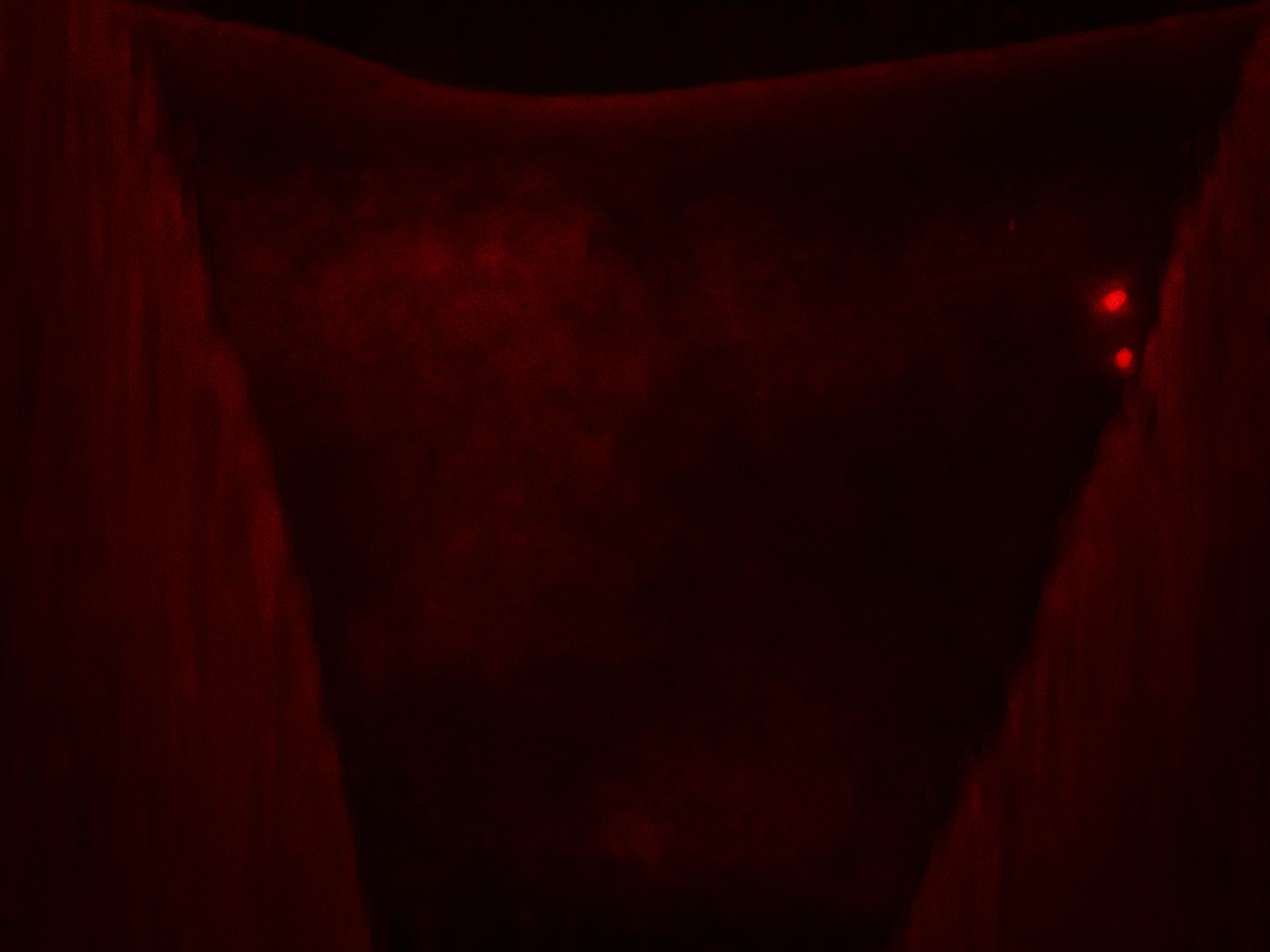
Three components of light are my interest. Surface reflected light, surface penetration light and my greatest interest, light emanations from the (heat) of the body. I alter the balance between the latter and the former. I consider the environment with the subject, the lens-based digital camera and the digital processing in post as an integrated whole. Taking this together with elements of chance in the data capture and my imagination leads to the final results.
In summary and in line with the thinking of Flusser what I do is subvert the process of image making.
Stage 1
The lens creates a shallow depth of field for the close-up work I do, So I control the lighting for balance and luminance and work at higher DoF, which actually is still quite shallow. I focus stack to bring the contours of my recent work into sharper focus.. Without controlled lighting, I stacked 61 individual photographs which caused me to adapt the lighting and lens aperture. In my portfolio, some images are 6 photographs. The reason I mention this is because I define that as one type of re-photography albeit with a very short time interval between shots. The tripod position is exact. There are correctable and minute differences in perspective as the lens motor is commanded to ever closer position of the glass. This is handled in the automatic software.
Stage 2
Next, I subvert the digital sensor and the associated filter. Sensors readily detect infra-red IR spectrum light and manufacturers install a filter to cut out as much as if practically possible. Filters have technical limitations in a drop off of effectiveness. The fraction of IR passed can be viewed for example in holding a tv controller up to a smartphone camera. The IR is made visible live on screen.
Stage 3
I subvert the processing software. My professional experience has been in algorithm design as well as in more recently in generative digital art. I have a sense of where coded features will break down and readily observe the effects. Analogies might be in television with the style of picture breakup on the original analogue sets and again on modern digital platforms.
Results
There is no surprise that odd things happen to images by chance, but the magical thing for me is that it is the original data in the photograph that drives the final image output, albeit with a high degree of subversion applied by the author.
Unlike glitching techniques, which which are popular with some, I do not undermine file integrity as in searching and replacing bytes to mix it up and potentially break the file. I use the high power of modern computing to create abstracted glow layers I combine.
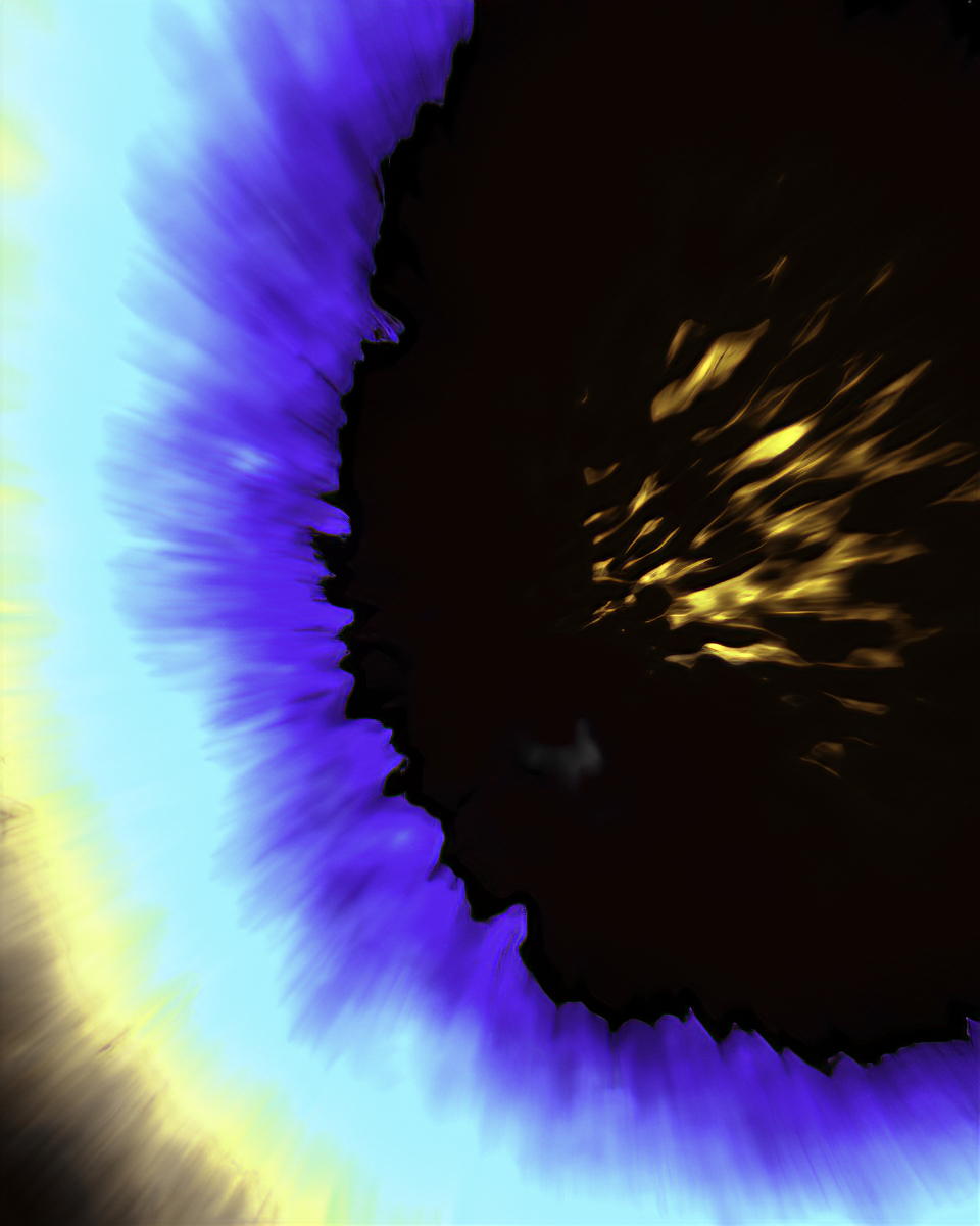
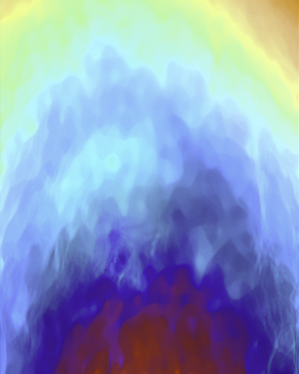
I apply a level of digital art to enhance the magic of what I can see in the subverted image. Maybe this is characteristic of the photographer as a frustrated painter. I land up with a consistent mix of re-presentations of landscape or seascape or mountains, or simply glow effects, or of inner space and outer space and more recently a growing series of images of ghosts. Something subconscious must drive the outcomes.
Week 10
With enough images made I could now contemplate an edit and apply myself with some seriousness to the viewer and the impact of mixing archive and abstract work.
It took me several steps including examining how the painter Rachel Howard approached the problem in the exhibition guide/book for Repetition is Truth via Dolo Rosa. It is a good example and I can use it in my book, but I need to figure out what to do for my web portfolio of images.
I now have something worth review.
Here on ISSUU is the latest mix of my portfolio work. I’ve introduced archive images to break out the visual language and give an access point for the viewer.
Portfolio on ISSUU as of 7 Aug 2019
Week 9
I had a break in productivity by engaging in abstract re-photography.
I took my subject matter for photography, that of healing wounds and with the original person and new healing (from mosquito bites) I recreated the methods of producing saturated colour abstracts of a type from an earlier module.
This gives a stark comparison with my current work is the first thing. The second had to do with recreating steps for what is a destructive editing process. So I got to compare the working method with that in the earlier module.
Commercial Production and Standardisation of Process versus Creativity
What is plain now is how hard I’ve tried to contain the wilder aspects of abstraction bringing technique under control to allow reproducibility. It was great for knocking out sets of images that go together or at least it improved the chances of such. However, I’d forgotten how much freedom I used to express with my earlier imagery and how much of the enjoyment I’d lost. Freedom and joy returned with this attempt at abstract re-photography.
A downside of absolute consistency I have discovered is to do with viewer focus. When they see a stream of consistent work I understand that they might stop looking any further and give up on the work. By being more expressive, I take a chance and reintroduce variety.
Week 8
I had at this stage created a large catalogue of photographs as abstract material. With one foot in photography and another in art, it does take me appreciable time to “paint” from the original.
I needed to work quickly and it seemed a good idea to stop myself from spreading out into too many areas by setting a constraint. I opted to do abstract landscapes, but in the event, inspiration had dried up or I’d lost something on the intuitive selection of the right photographs to work on and maybe through my learning instead of making, I was lacking practice.
It took me a whole week of concentrated effort and finally, I got back the inspiration. Along the way, every other subject type appeared in my week’s work and so I had to use once more a variety of abstract topics.
Time pressure and learning activities and making a book and an exhibition in box were probably the distraction behind this.
My work was still short of images for a portfolio and given the importance of this in the MA Photography marking scheme I had no choice but to continue on. Meanwhile, crits (somehow I fitted in a 5) placed me under increasing pressure to adapt to the viewer and I was being encouraged to task risks. Not quite yet though.
Week 7
Abstract Landscape
Improbabilities and chance (file size, false colour and fringing)
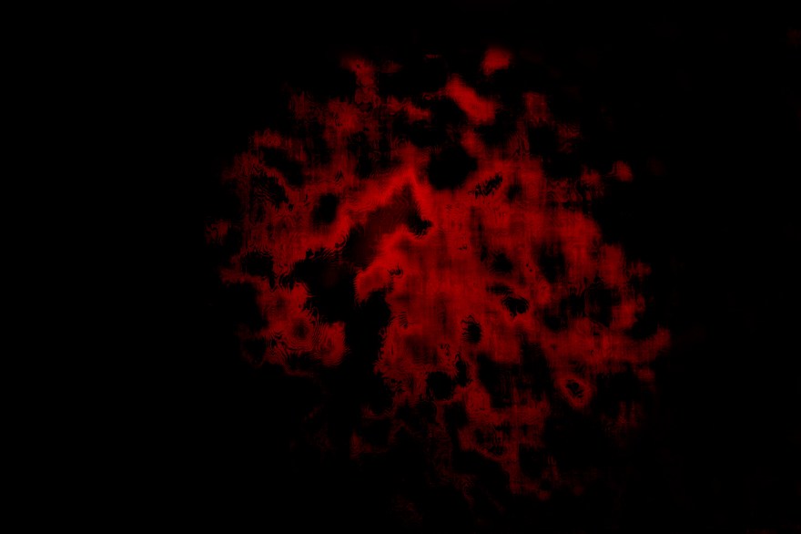
A long term fascination of processing in the abstract for the author concerns the direction obtained on examination of the data within an image. A deliberate engagement in this activity provides eternal fascination and is allied with my other practice as a technologist. With experience, it is possible to pre-visualise then begin to press an image in a given direction. It is about seeking out the effects of non-linearities when working in post. Seen when extracting the red healing glow of the subject matter. Some might view these actions in terms of unintended use.
This week I implemented resolution improvements to my working methods. This was previously avoided but needed to be addressed for large scale print. Why avoided? It is known that standard filters respond less well or not at all with modern higher resolution equipment and resulting images. I don’t use standard filters but nevertheless, the software response holds true. The glow images I seek, through levelling now contain a lot more fine detail and this visual style persists across images that are subject to the new method.
In summary, I began improving my method and unintentionally obtained previously unseen effects and I now observe new branches in visual direction.
Outcomes regularly relate to chance hence my past comments about non-repeatability and my resorting to batch processing to get consistent images within these sets of images. My attempt to get images that go together.
The methods of improving resolution naturally lead to larger file sizes. What I didn’t expect was a 1.2GB layered file of what on the surface amounted to a black tile.
There is scope for rationalising this down to a smaller file by removing layers that can readily be added back. Maybe I need to stage my work by keeping all of the original processing but make a subsidiary flattened file. I’ve not been caused to (forced to) go down this route just yet as machine and network performance can cope. The slightly slower performance is acceptable given the retained flexibility to create (I’m in a phase of exploration of abstract landscapes) retained
I now get images with the look of black sandpaper. What I pre-visualise has more structure, something to lead the viewer’s eye. That has now gone it seems.
I tried downscaling to lower resolution. No success so far.
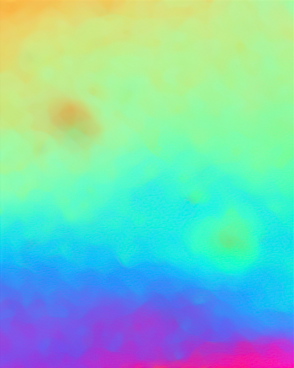
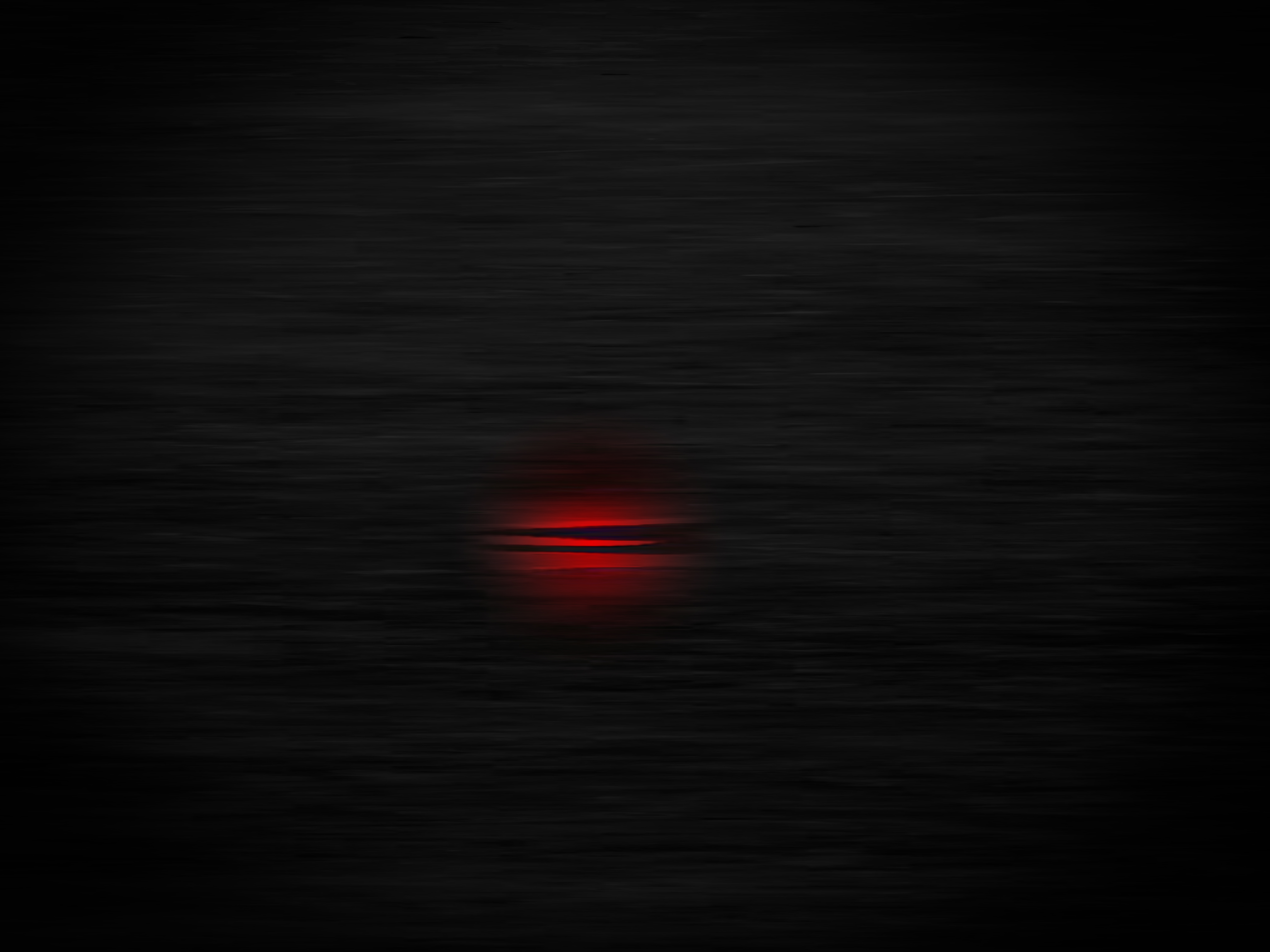
In my search for abstract landscapes, a colour effect (false colour) and fringing effect (moire) appeared on the screen. The effect was literally that, on-screen. It could not be saved or copied to a layer. The fringing is not present at higher magnification. When visible fringing is fixed at other magnifications. Moire fringing might be expected to produce continually altering patterns not a fixed pattern. Anyway, I need to think about what is going on and meanwhile, I captured the effect by taking a photograph of the screen.
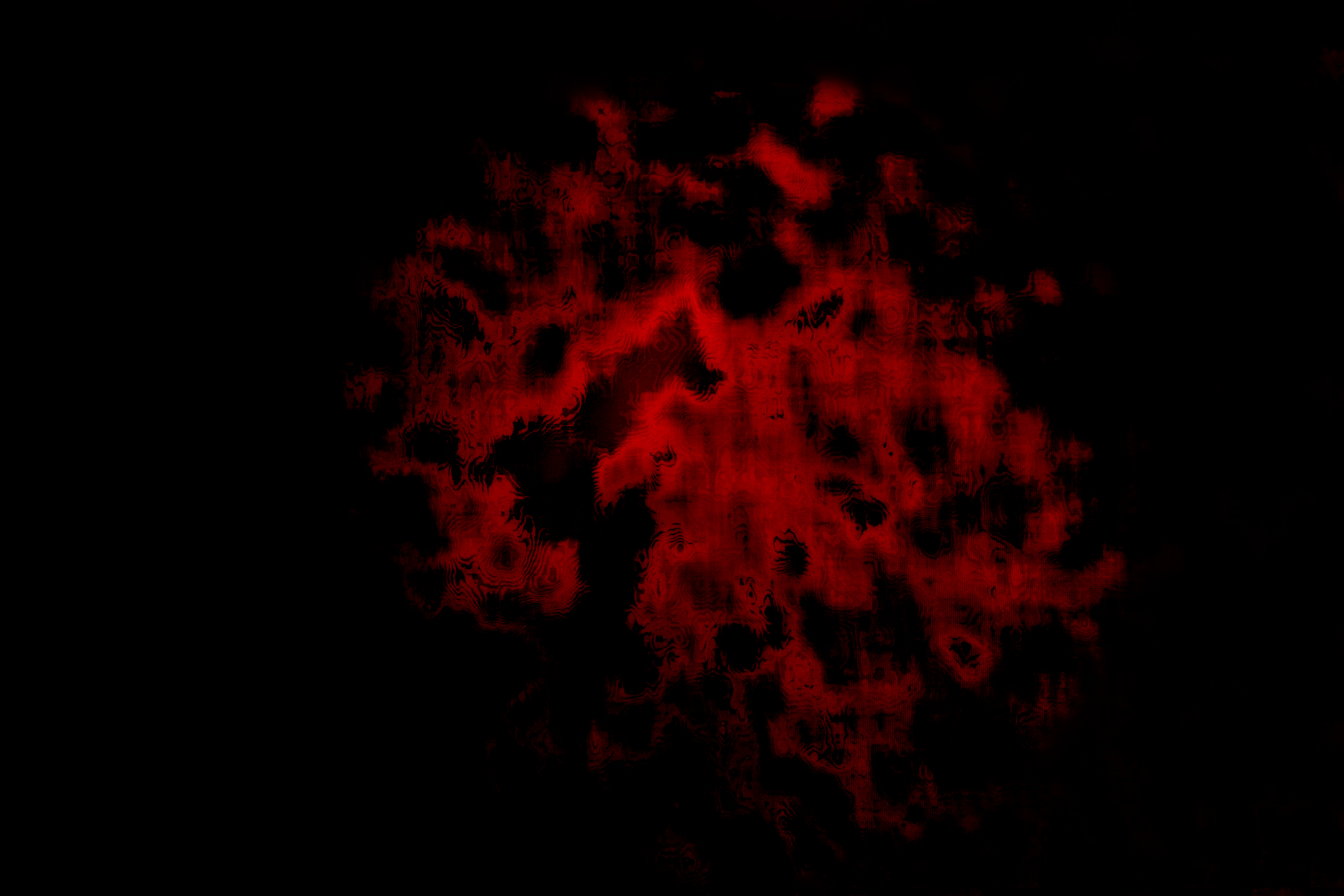
figure: transient fringing effect (magnify to view full effect)
The false colour is not the false colour found in infra-red photography, but more like a selection mask style (without invoking a selection mask and not responding to commands to remove the mask if that is what it is). I’ll investigate. There was a software error that affected an earlier portfolio where a small red rectangle appeared in Lightroom images and persisted. A software update resolved the error in my images. I did take inspiration from the effect as at the time I sought to layer in glyphs and other effects as a visual narrative construction.
Week 6
My work is seen through another lens as I start to churn out work for this module. I’ve sorted through and tagged 310 photographs. These are candidates for processing into abstract landscapes.
I changed or should I say improved my method. Using a more configurable tripod and computer software for a remote live view, I can now obtain even inaccessible shots with improved resolution and focus. I do this in a conflicted situation where I need to be able to scale to very large (art as an experience sized) prints, starting from a small scale subject matter. No one wants or wishes for large scale injury or healing sites. While I know that my methodology calls for removing details in favour of glow. I’m forever destined to be conflicted.
Week 5
Two things have gained influence. Now I’ve created a trailer I realise the importance of imagined landscapes in my work. I also realise how much work there is ahead and so decided to use the Pareto 80 to 20 principle as it should allow me the scope to engage with all three surfaces: Exhibition, Publication and Workshop to gain valuable experience ahead of the FMP modules.
The discussion also grew around the visual language of science. Side by side stereograms has a closer match to my work than red/cyan anaglyphs. The incorporation of photos of some of the apparatus I concocted could be of interest. I’d have to make sure it didn’t dominate. I’m still not resolved as to what to do around glyph layers. I found these quite effective in my last module work. I have been distracted by moving towards then away from text captioning of abstract work. There is resolution required over the narrative.
Collaboration has been present in the background of my work and came to the fore as I created the video trailer. I’ve never seen such excitement. This does have future or should I say immediate scope for inclusion.
Week 4
During this week, I explored the relation of science, the biology I refer to in my work, and this allowed me to explore a new visual language. A side by side stereogram fitted better alongside my work than anaglyphs. For large scale presentation, I would prefer anaglyphs. I do understand that red and cyan edge representation does grate against black and white work.
Where does this leave me? I think I have to be mindful of the facts concerning visual language.
Update: subsequent conversations lead me to unpack my actions (our / student actions) when working between black and white and colour. I also begin to bring to the fore collaboration.
Week 3
The narrative development of my abstract visuals is intended to take on an element of political and social direction as I identify with roots in Scotland I share with brothers Andrew and Richard and others from the soldier ranks who made the greatest sacrifice and go unrecognised for their bravery in the worst of condition that was the Great War.
We are from the same lands where there is a quiet beauty and shared cultural identity and so I look to add something to my work, either as a brief essay or as supporting installation. It is still early in the project development as I have three modules in which to gain resolution. I have yet to figure this out and critique how it fits. Well, it fits, but how so with abstract work?
Introduction

Having been through a development stage of portraying monochrome images, which I admit support the sombre, my instincts cause me to return to a celebration of life and of course, this brings back colour. For me, it is a respite and is a valid expression of my second narrative (celebration) that has been on hold for a couple of months.
However, monochrome is not dead.
Working with black-and-white, I can confirm, is an important skill and I continue to develop this through:
a. Metering.
b. Camerawork (fine-tuning settings)
c. Post-processing (dodge and burn, contrast enhancement).
I’m currently publishing black and white mainly to Instagram and colour can be found back inside my project.
As mentioned before in my CRJ blog, I continue to process like images together, to get the consistency I seek. Using this with colour is different as it allows me to pick the best of the bunch by this method, then edit groups of colour images. I have to find out how successful this method will be across a portfolio.
Week 2
I have a number of new photographs to process. On this occasion bodily impressions are used. These were originally substituted in the past, for a minor injury and as a technique works as the effect of glow is the same as for minor injury. I need to post-process.
I began looking at my work in wider ways and discussed this in Module Leader Office Hours. I need to be careful that I understand where my work comes from and maintain the resolved nature rather than take my work and cause it to fray at the edges. Resolved means resolved.
Week 1
For me an unexciting start this week. I lack orientation over what the present new module will lead me to. This is my base image process and is at least serves as a baseline for comparison with future weeks. The contact sheet images are in effect part processed. Update: by Week 5 I had elected to create more imaginings of landscapes. In which case I can return to do further layering.
