PHO705: Incorrect Print Result – initially colour off and green cast. Subsequently a ‘silent’ swap to the restricted paper choice with the AirPrint driver

Silent software updates led to issues with my Epson P800 Printer, prompting me to initiate a recovery plan and conduct a thorough analysis of the print process. Despite setbacks, including a technical issue and the COVID-19 lockdown forcing the cancellation of my exhibition, I remained adaptable and managed to complete my book within a shorter time frame.

This is a recurring problem caused when software updates. I’ve added an Annexe below to contain more detailed information relating to how I’ve setup for print.

User Resolution

1 Connect the Mac computer and printer by direct wire

2 Reinstate the link to Epson paper profiles by reinstalling the driver software. This triggers the choice of Epson driver over Apple Airprint for you to select

3 Select Printer Manages Colors

By filming the required page-turning video and creating a 3D model of the exhibition space, I demonstrated resilience in overcoming challenges. My experience highlighted the importance of being prepared for the unexpected and staying flexible when faced with unforeseen events.

However, the problem with ICC paper profile selection on the Epson P800 Printer persisted in the years that followed, as automatic software updates caused the printer to lose the link to the folder containing Epson ICC paper profiles. The default connection became AirPrint, which only recognized generic profiles supplied by Apple, rather than specific Epson paper types.

Advice

It sounds like you had a lot of challenges to overcome in order to complete your FMP. I’m glad that you were able to persevere and produce a high-quality piece of work.

I understand your frustration with the Epson P800 printer. It sounds like the software updates are causing problems with the ICC paper profiles. I’ve done some research, and it seems like this is a known issue with the printer.

There are a few things you can do to try to fix the problem. First, you can try uninstalling the printer driver and then reinstalling it. You can also try disabling the automatic software updates for the printer.

If those steps don’t work, you may need to contact Epson support for help. They may be able to provide you with a newer version of the printer driver that fixes the problem.

I hope this helps!

References in case required:

https://www.redrivercatalog.com/infocenter/tips/how-to-fix-missing-paper-media-type-selection-OSX.html

https://community.adobe.com/t5/color-management/printer-profiles-missing-for-epson-sc-p800/m-p/10870908#M3033

Annexe A – Print setup additional information.

Where are the ICC profiles located for my printer on my Mac?

• Do the following to locate the files:

1. Open your hard drive, then select Library > Printers > EPSON > InkjetPrinter2 > ICCProfiles.

2. Press and hold the Control key on your keyboard while you click the profile package in the ICCProfiles folder. In the pop-up menu that appears, select Show Package Contents.

3. Select Contents > Resources.

https://epson.com/faq/SPT_SCP9000SE~faq-00009ed-shared?faq_cat=faq-topFaqs#:~:text=Do%20the%20following%20to%20locate,%3E%20EPSON%20%3E%20InkjetPrinter2%20%3E%20ICCProfiles.

ColorSync

The profiles can also be found using the Colosync app.

Profile Naming Variations

Note when viewing the print paper profiles in a) the package (see above Where are the ICC profiles located) the file names are used. B) in ColorSync a description is used (contains some of the file name information but missing the printer ID SC-P800 and c) in the photo app (e.g. Photoshop) Print – media selection, there is another very similar description. Simply note the identification is the same but different depending on where you view the paper ICC.

Printer icons

On the computer, print icons existed for three devices: one for a Canon portable printer and two for the Epson P800. One is for the AirPrint driver (do not use) which is live as wifi is available, the other Epson P800 icon is for the direct cable connection. If the printer cable becomes disconnected that print option is offline.

Check:

1. A print cable is connected between computer and Epson P800

2. Ensure the direct connection icon is set as default.

This is to avoid a silent swap to the AirPrint.

PHO705: Week 24 Reflection

Done. The work has been done. Everything was handed in well in advance or in advance.

It proved important to leave enough time for checking as the inevitable was ready to happen – the screen freeze and colour printing going all wrong with an unexpectedly deep dive into ColorSync print technology.

Restart work on the Exhibition items put on ice

The video refresh, the music, the exhibition in a box were all in work but lost out as publication turned to book when the exhibition was postponed. Now there is time to prepare for a new date.

I’ll continue to check this blog for any mistakes. I know there a few.

Reflection

At the current point, much has been taken from the course. Starting with a new passion for bookbinding. Things there are going wild with three more hand bindings lined up.

Practice in using media tools with a vengeance was a highlight too.

Fulfilling the objective of making a portfolio of publishable work was the aim at the outset and how that has been helped along.

Making pictures as Art based on cutting edge Science ArtSci became a revelation in the area of genetics This genre is ripe for new picture making.

PHO705: Assignment Final Major Project (PDF)

Submit Assignment here

Depending on the nature of your practice, your resolved project may take one of a variety of forms, however, and it will be an original, authored piece of creative practice, of a publishable standard. It will have been developed over the FMP module and will extend from or otherwise draw upon work created throughout the course.

The FMP submission will evidence and document your critically informed project that is resolved to a professional and publishable standard.

The form that your project takes will depend on the nature of your practice and should reflect your creative intent. It should be resolved as appropriate to the work itself and with considered purpose. As the consideration of audiences and markets are key concerns throughout the course, you are strongly encouraged to present it to an appropriate public audience.

This may include, but not be limited to:

  • An installation
  • Solo or group exhibition;
  • Editorial feature;
  • Book;
  • Online project;
  • Workshop;
  • Performance, screening or talk;
  • Symposium or conference presentation.

These artefacts and/or activities should be clearly evidenced in your FMP submission.

The document should include:

  • A concise description of the work,
  • The final images of the project or an edit thereof,
  • Documentation of the publication (e.g. installation shots, tear sheets),
  • Critical feedback or analysis from other professionals (if applicable),
  • URLs to relevant video or other supporting material.

You may wish to remind yourself on guidance for documenting your FMP submission.

Format

It should be:

  • A colour, page-numbered, PDF document
  • Text should be 1.5 line spaced and use a 12 point, sans serif font
  • Fully Harvard referenced throughout, where applicable
  • All images should be fully titled and referenced
  • No more than 15MB

Assessment

The Final Major Project accounts for 60% of the final grade for the FMP module. It will be assessed on the following Learning Outcomes:

LO1: Technical and Visual Skills

Demonstrate an awareness of a range of photographic and image-making processes, and display accomplishment of photographic skills relevant to your practice specialism.

LO2: Visual Communication and Decision-Making

Exercise discernment in the making, resolution and presentation of practical work, and an ability to communicate ideas through creative visual strategies.

LO3     Critical Contextualization of Practice

Apply a critical awareness of the diversity of contemporary photographic practice to the development of your own work, and inform your practice through historical, philosophical, ethical and economic contextualization.

PHO705: Week 4 Assignment Final Project Proposal

This was a week for handing in the FMP Project Proposal

Proposal PDF

The next step is to book a 121 meeting with my Supervisor.

Bibliography

Howard Rachel (2018) Repetition is truth via Dolorosa. Edited by A. C. Beard Jason. London: Other Criteria Books. Available at: newportstreetgallery.com.

PHO705: Book Designer Meeting

We had privileged access to Book Designer Victoria Forrest in a group session. It was useful for me although I’m erring towards a handbound artist book dummy and an exhibition in a box, a repeat of a successful approach from tyhe summer exhibition.

So what was learned:

  • focus on my DNA – I’d downloaded it pivoted it and searched it for transcription errors. It is an interesting error rate. There is some research out there about various diseases and these kinds of errors. My genome is good though as it is 99% shared with other human beings.
  • there’s the work I mentioned before on making visuals from base-pair sequences. As mentioned, there is a legal requirement to look after the genome data for my own protection and that of my offspring. Dry data is a bit too graphic for my liking but can be made to work by skilful handling. I prefer it as a blank verso decoration. Too much of it will be samey or overwhelmingly and potentially take away from the visuals I reckon. 
  • develop an offshoot of an artistic work recombinant rhymes. My take is I’ve gathered all the words containing a letter A, C G and T (base pair letters in DNA) and pick salient words in pairs or threes to describe a context around the project (photography, Great War, etc. but the layout of a crossword puzzle element. 
  • don’t associate with the Berger quote I made for being too inflammatory. Very strange on a Visual Arts course that the subject of reversing Berger’s observation should seem difficult. Surely art should challenge its own foundations. There is nothing illegal that couldn’t be published and after all, why waste a founding pillar and key inspiration to my work?

What else?

  • something on paper gsm was answered 300 gsm is too much and 175gsm is preferred
  • mtDNA is something Victoria is comfortable understanding but leave it out in preference to using own genome work
  • Victoria wanted to know details of my method of making. Seemed a bit cheeky a question in a public forum but unless the person you are working with really knows your work how can it be successful?

That was it in a nutshell, and very good considering five students were on in under two hours. Victoria must have been exhausted by us but thank you.

PHO705: Fonts

Supporting Discussion

The choice of font for FMP submission remains firm as Granville Light. A return to inspect the style after a cooling-off period only confirms this. The use of a Typography Insight App allowed a detailed comparison with a standard sans serif font. The Granville Light style is very much being enjoyed.

Original Post

Time has been spent researching san serif fonts for the FMP assignments and two fonts have shortlisted and have been installed and are being trialled:

  • Granville
  • Auster

Both fonts are very clear and Granville is being preferred on several counts including style which is more apparent on the lower case letters f and t, but also for being from a French designer at a Paris foundry given the project theme of loss in the Great War. The slight dagger-like flourishes in the lowercase letters f and t, also act as a metaphor for me as references to the Dirk and the Sgian Dubh, sheathed pointed daggers carried in Scottish national dress.

I won’t install the Granville font in this blog but provide a PDF example here:

Looking at this example a reservation emerges to do with font width, even as something that makes it more readable. Is it too wide? The answer becomes clear when the font is viewed at the required 1.5 line spacing where indeed it looks fresh and clean as seen in th ePDF above.

PHO705: Creating Draft Critical Review of Practice

Two items have been held up pending 10 weeks of illness then need to create portfolio work.

These are the Video that should have been made over the break and the Critical Review of Practice CRoP.

These have been taken together, but oddly manage to support the work. The following PDF is the mind map. A CRoP is a CRoP but it has to be about something so the overview of working practice and methodology is given as a mind map. The CRoP requirement (or part of) has been mapped onto it and requires further development like issuing a draft. However, there is some referencing to other practitioners still in research. Despite having this for earlier incarnations of the work (in earlier study Modules) the work has progressed on so time for the update.

To an extent I can argue about originality and a need to mask off external influences as the work is quite unique in its standing as a branch of Art based on Science. As blogged previously I’m never surprised anymore to find original thought crop up in other places of which two examples could be cited.

  • Top left hand in the mind map is the Critical Review of Practice from an earlier module assignment.
  • The bottom left hand is a storyboard outline for a useful video resource that is being created. (This proved very helpful to visitors to the summer exhibition).
  • Above this is the connection to the CRoP linked to Ghost Abstract Figurative Themes. While Ghosts per se have been dropped since the review with a book designer, the landscapes remain ghost images.
  • Practice location top right is the piece being updated for this dynamic project. It does need to settle down urgently prints, book, portable exhibition and talk to be worked on.

There is quite a challenge here as none of the work has been subcontracted to printers or anyone else so all of the skills from the photography through to all branches of making have been absorbed and this alongside all of the marked assignment work. For anyone wishing to embark on an MA Photography Course they may wish to consider how much work to outsource to specialists. Personally, outsourcing the Book making to an online offering is not preferred over an artists book dummy and hiring a book designer would lose some of the original intent to someone else’s view of what the market would stand. The work is still too dynamic for this.

Bottom right is the remainder of the CRoP assignment requirement, which pertains to the public showing.

In terms of evidencing the work as mentioned here in an FMP lecture video then on the subject of gaining public feedback, there is a need to reach out to practitioners to elicit attendance or somehow provide comment on the work.

I now have a date of the Easter Weekend for showing the work over four days at Amersham Studios tradesecrets.live Only now can approaches be made by reaching out.

As image-making is fundamental and has been a major focus, work has been flooding forward and is now starting to receive critique (two critiques were missed through technology issues).

There is scope for an earlier pop-up exhibition at the same location. No promises yet. Details will be published and a campaign run via Instagram account foto_graphical and Facebook.

<placeholder> for draft CRoP

PHO705: Similar Works 1

Here is a first new blog post asking, “So where can others’ work be found that has some connection with my practice?”.

Apart from already established and earlier blog references in the PH704 module to Garry Fabian Millar and elsewhere in PH702 and PHO703 to Rachel Howard a revisit is made in advance of the Assignment: Critical Review of Practice.

Here is a single image only comparison from National Geographic (Greshko, 2018):

Photograph Richard Hammond

And my earlier effort in more sombre mood:

DNA Sequence Overlaid with mtDNA Trace
Photograph Michael Turner

I’ll be recreating this. The next version of this work will use my own genome. It was sequenced last year and is currently under my analysis for base-pair errors. This not something to go into too much as it gives insight into the potential for disease a look into the future. As a STEM graduate with expertise in Big Data, it is possible to interpret the science and in particular the data and start to follow scientific papers including on the topic of DNA mismatch (Stavenger, 2010).

It is clear now that the double helix is an idealised form. Due to coding errors the span of the ladder rungs changes while there is asymmetry in the strand thickness and weird folding occurs where molecules other than ACGT bases enter the sequence. There is a knotted effect.

My own connection with the National Geographic story is through working for the corporation that supported the computing for the Out of Africa project. This was an early project that traced the human genome back through eastern and western migration routes to Africa.

As blogged in an earlier post it is the same corporation that provided the infrastructure for the World Community Grid project and the reason for donating computing cycles to this from 2004 on Human Proteome Folding through to current day projects supporting computational biology research into cancer, Aids Zika virus and many more including ground water and other geographic analyses.

Bibliography

Greshko, M. (2018) How We’ve Tackled the Evolving Science of DNANational Geographic.

Stavenger, J. (2010) Mapping of Switch Recombination Junctions, a Tool for Studying DNA Repair Pathways during Immunoglobulin Class SwitchingScienceDirect.

PHO705: Book Design

Having completed most of the research behind the project work is moving forward rapidly as more focus is gained and a single line of visual narrative / aesthetic is settled upon.

The previous work product for a Module Leader one to one session simply gathered together themes that had been evolved. With direction the rate at which outputs are created has increased.

In what follows there is a settling on the aesthetic of “charcoal on antique paper”. Here the aesthetic has extended across a set of evolved themes going into the book review.

After the review, the aesthetic has remained and the direction has been advised on:

  • drop abstracts with added newsreel stills
  • focus on DNA results for self
  • avoid any feminist reference as too hot a topic(?)*

It was decided that a book would be hand bound and advice was obtained on paper weight.

The focus would be as before (at the Summer exhibition), a set of 18 prints on 40×50 mounts, with a miniature exhibition in a box to take beyond the gallery setting. Notes were compared on box production.

From a recent talk by Victoria Forrest it was clear that time would be tight for a full book design and production phase. Whilst it is possible time would be a tight squeeze and the intention was anyhow to hand make the prints, book and boxed prints as artist materials. Past experience of making provided the proving ground. It should be possible to make all of these outputs.

Where time becomes a squeeze is in making supporting materials: contextualising video/moving stills, exhibition guide, online portfolio, marketing leaflets … busy, busy, busy.

Single Pages (scroll to view, hover and click to download)

Spreads (scroll to view, hover and click to download double page spreads).

note:

*“Men act and women appear. Men look at women. Women watch themselves being looked at. This determines not only most relations between men and women but also the relation of women to themselves. The surveyor of woman in herself is male: the surveyed is female. Thus she turns herself into an object of vision: a sight.” (Berger, 1972) page 47.

In my work, men receive their energy-making biology from their mothers. Men are viewed as agents of women. More specifically Men as sons are agent to their mothers.

The stability of the genetic code of energy-giving (mtDNA) is key as is the male being blocked from passing this gene to their offspring. The theme is of a Mother-line.

Bibliography

Berger, J. et al. (1972) Ways of Seeing. re-issued. London, [England]. Available at: http://www.greenpenguin.co.uk.

PHO705: Module Leader Group Critique

The Forth cohort attended a group critique, our first. 

So to take forward something of the way of telling a story by a compositional layout of three parts or by layering an archive portrait with a glow picture. What feedback would the Module Leader and the audience give? 

The PDF attached can be downloaded. It contains two frames, one for each method of interest.

This file displays correctly as two pages: View – Page Display – Two Page View for side by side comparison and to show a two-page spread. 

Making a PDF was practice for the 1 May hand-in but at a small scale. 

The intention is to obtain a PDF with the best resolution images saved as an Interactive PDF format. InDesign frames also ensured even sizing of the pages which of different dimensions from Word and Photoshop were made consistent.

(TBD Here is the work of the previous module:)

#Advice

Here is the update promised following today’s critique. The idea is to obtain greater clarity and something actionable. 

We learned from each other’s presentations as much as our own. Five presentations were made:

  • Skye rushes
  • Balloon metaphor
  • Mitochondria 
  • Book diptychs
  • Urban regeneration

Reaction to presentation – mitochondria

Preparation for the presentation was done well in advance and meantime it may have answered its questions on the layout options.

There were no audience comments. Module Leader comment went beyond layout, drawing attention to the importance of mitochondria as a theme. Agreed this is the foundation and deserves elevating.

The work could be helped along by adding a family tree. Privacy issues prevent this. However, a generic chart is something I would entertain.

David Fathi did some work concerning the impact on moral actions of using a genetic sample for modelling disease.

The family mitochondria theme does have a historical element as that is what stirs a feeling of identification with family. It is more of a driver or motivator than the actual purpose of the work which is forward-looking in terms of light reemerging as a means of detecting disease. It may be infeasible in the time to go too far with this science as the interest is really in creating art. The art is from the digital sensor capturing glow in a way the eye tends to ignore which given a style of processing can emphasise the hidden.

General learning points

The advice given related to the current point we are at on the course. Our work needs to be research-driven. So back to the books.

Also, no work is ever complete until we present it to the public as the audience. It is then we start to gain feedback.

Practical learning point

The student from the group, three months ahead of us was very informative in terms of their planning. They have already had their exhibition with six weeks to the end of their studies. They had 30 images and proposed editing them down to 20 for their portfolio but add in more for a book. They received interest in their work, and a videographer had even filmed their work.

PHO705: Feedback on Final Proposal

This was a very useful 1-2-1 session guided by a true professional. Thank you for helping me to progress my work.

During the 1-2-1 there were some exciting and helpful turns, that I’d not expected. Thankfully I was able to address each point.

Referencing

Referencing had been deficient in my proposal. I’d not planned it to be a rushed job, but it was what it was, and I accept the comment. I’d since blogged my references, and was able to show these in my fully refreshed CRJ blog here.

In practice, my work is back on track, I just wasn’t able to assemble and organise references in time for the Proposal submission.

Proposal Organisation – Headings

A comment was made on the Proposal organisation. There was a need for more headings. The proposal was likened to a stream of consciousness, a comment which I love. There is a time and place I accept, but to be recognised as writing in the style of Roland Barthes, has to be an honour, surely?

Evidencing

Some assertions in my Proposal required evidencing. I can rectify the problem now, even if only for my own satisfaction. Points relate to detailing:

  • A planned Meeting with a Kodak scientist and specialist in digital imaging and medical imaging who works in the cosmetics industry.
  • A visit to a Digital Imaging Symposium in December – a Kodak scientist I’ve known since 2010 is set to give me an introduction. Note to self, I need to catch up with him on Friday.

My reviewer wanting to know more was encouraging. The project has been moving forward from interpretations of Biology theme and begins to enter a medical world of digital imaging. Why so? This originally was simply to validate a technical point around healing glow and Infrared emissions.

However, this research led me to investigate a bridge between Art and Science. especially following a Symposium back in September.

A further point that required evidencing concerned:

  • Creativity and the subconscious mind.

Direct evidence is present in the making of my work. The process is experiential. Appreciation of how abstract art is created cannot be assumed for the non-practitioner audience.

In academic terms, this is probably insufficient, or so I now realise. With the formal approach, I reference:

(Kandinsky, no date) Page ii on our spiritual relationship with the primitives, “… these artists sought to express in their work only internal truths, renouncing, in consequence, all considerations of external form”. So too I.

(Scarry 1987) page 21. “The human action of making entails two distinct phases – making up (mental imaging) and making-real (endowing the mental object with a material or verbal form).

Scarry ably described then, what became second nature in my work.

The Critical Review Journal CRJ (this blog)

As I’d shown my updated reference post and this later conjured interest in the CRJ. I was able to show a couple of relevant posts and by navigating to the bottom of the page, demonstrate the organisation:

  • Tag Cloud
  • Category selector and
  • Free text search

Next came the test, to retrieve a Portfolio from a prior module. That worked smoothly and was a testament to the preparations made. The search was a genuine thing as the Portfolio was then displayed and discussed. What followed was a connected piece on the next steps of project development. This at the time was a screen share of a prepared PDF on my computer desktop. Since the 1-2-1 the PDF has been posted here:

Bibliography

Kandinsky, W. (no date) Concerning the Spiritual in Art. Edited by M. Sadlier.

Scarry, E. (1987) The Body in Pain: The Making and Unmaking of the World. New York, London: Oxford University Press-23 978-0-19-504996-1.

PHO705: A Quick Look at Learning Outcomes LO3, LO4 and LO6 in Preparation for a 1-2-1 in Week 6

I comment here on LO3, LO4, and LO6 as areas of focus. Perhaps I did not communicate these strongly in my Final Proposal.

LO3 Critical Contextualisation of Practice

I contextualise my photography and image creation in terms of healing and art, an earlier identification with suffering, along with the spirituality of connecting with family and our remembrance of them. The following references I associate my with:

LO4 Professional Location of Practice

The audience breaks down as follows:

  • Family is the immediate audience. My work emerged from family as a collaboration.
  • Our staff and students within the University are audiences. This a step towards going public through assignments, portfolio reviews and critiques.
  • Accomplished photographers and digital artists I would reach out to as my primary audience.
  • Clinical photographers and scientist experts in digital and medical imaging are an emerging target audience. At present, I use the scientific community to test theory and assumptions.
  • Followers of my work, may or may not represent a professional context yet interaction here often brings pleasant surprises. Some from this group are from teaching or an arts and crafts background. They actively express interest in my work and have done so now for several years. Followers have earned special consideration.

There are several tried ways and other potential ways of reaching out. The exhibition has to be the main driving force, as experienced in an earlier module. From this springs the marketing and publicity of reaching a particular milestone. This would lead to a rich media environment and supporting materials and social media campaign.

A book is a recommended outcome for my work having demonstrated strong skills in making in an earlier module. I would create a book dummy and would seek to convert it into a professionally bound work. Numbers of interested parties might tally around ten at a first count. I need to give this more consideration.

Even if I restrict the list to these for now, I klnow from experience there is a whole lot more making:

  • Video for contextualisation.
  • Audio recording as for creating atmosphere.
  • Online gallery

As an emerging digital artist, it would fit to occupy a gallery space in one of the online communities. At present, this has to be aspirational as there is so much more to find out. I’ve participated in virtual world exhibitions several times, explicitly using Linden Second Life, a virtual world. 

From an online world perspective creating a gallery is untried for me. I’m sure I would need to involve a virtual world developer. This is exciting, really exciting, even it flies in the face of materiality. I’m thinking through how the name Second Life becomes connected with the theme of my work which is really an aside. However, I see a great connection with the title, as sentiment and as the digital presentation of digital making. This would be a true mark of progress, given ancestors could never have predicted the rise of the internet and the discovery of knowledge of genetics. At some point, I was going to get carried away and here we are. I really need to focus right down on making rather than being distracted by technology. This can be saved for later.

LO6 Written and Oral Skills

My chosen area has been hard to convey to a general audience. This circumstance has been a constant for my time on this MA course and it is only through repeated practice that I hone this skill. The starting position each tome involves a trap. It is always too easy to over-elaborate and justify my work. In subsequent iterations this communication becomes more crisp.

Bibliography

Batchen, G. (2004) Forget me not. New York: Princeton Architectural Press. Available at: http://www.papress.com.

Kandinsky, W. (no date) Concerning the Spiritual in Art. Edited by M. Sadlier.

Scarry, E. (1987) The Body in Pain: The Making and Unmaking of the World. New York, London: Oxford University Press-23 978-0-19-504996-1.

Tammi, M. (2017) Sick Photography Representations of Sickness in Art Photography. Edited by M. Tammi. Lahti, Finland: Aalto University Publication- Aalto ARTS Books Helsinki. Available at: https://shop.aalto.fi/.

Major Update to Blog

A major update has been completed including a retrospective change to posts from the earlier modules that impact on my FMP.

#Advice

A video resource made available showed how the staff of Falmouth University approach a Critical Review Journal and especially during assessment, so it became clearer how I might adapt some details of my own blog.

Step by step guidance is provided in the document MA Photography CRJ Guidelines (September 2019).pdf is designed to help new starters as well as more advanced users.

A second video resource provides an example of one students work.

A result of using the above resources, videos and guidance document is that the FMP blog has now been restructured and is more professional. It should be easier to research as work continues.

At Week 5 the restructuring is basically complete:

  • tag cloud search is introduced
  • category filtering is introduced
  • FMP posts structured and scheduled (use tags and categories)
  • backup is automatic (security)
  • language selection included (quick win)

PHO705: Week 4 Reflection

These are my reflections on Week 4, the Week in which the Final Project Proposal was submitted to Canvas Assignment.

This is slightly back to front in that the assignment submission was Monday and so the remainder of the week saw other activities take place:

  1. Shoot 4 – a combination of healing and recording family archive images.
  2. WordPress restructuring took place and was a major overhaul.
  3. The P2P meeting was attended on Tuesday.

A 121 meeting has been booked to receive Proposal feedback from my Supervisor and eminent photographer Dr Wendy McMurdo.

Item 1 above was a very significant step forward in the development of new themes for the portfolio visual language and has been blogged here and here. This is the most important take-away point from the previous module, exhibition and portfolio. Acting early is key in order to avoid running out of time after Christmas. Something I reflected on afterwards when contextualising and in particular in following a podcast was the need to avoid, I feel, the move of primary focus towards a theme of NOSTALGIA. This needs unwrapping as it could in one sense become the project’s downfall. However, archive photography has proven its worth too and as well this is a time for experimentation. A second concern is around the idea that women have been portrayed in photography by men. This was pointed out in a podcast discussion with exciting, emerging women photographers Juno Calypso, Maisie Cousins and Sophie Green.

Item 2 WordPress activity became a major undertaking. The inspiration and resources were also blogged.

PHO705: Guest Lecture Victoria Forrest

Pre-amble

Watch back on the video and comment.

Nigel Ready CRJ here worked on a book on his FMP worked with Victoria.

Introduction

We’re now into the new year 2020 and a good time to have looked back at this video of the making of a book on the landscapes of Seamus Heaney, for now, MA graduate Nigel Ready.

There is more activity with Victoria who is returning to give another talk in her series followed shortly afterwards with a review session which has been ‘booked’.

Addressed during the break has been the limited numbers of pictures available to publish and so this has been worked on. Still not satisfied, there are now more images where each theme has a limited to draw upon. Making a book is going to be a big challenge notwithstanding having hand bound a book already for the course.

Challenges also are cover embossing / cover image as that craft has not been tried out.

Victoria’s Guest Lecture

What follows are some key points and a few images that serve to remind.

[metaslider id=4083 cssclass=””]

Apart from the introductory slide showing some of the scope of Victoria’s work, the others cover: the brief, reply, embossing of cover, the outake with shovel that determined something of the cover design.

Production steps

This outlines some of the points when working with a book designer.

The brief in the slide above was accompanied by a tight edit. The reply slide content widens what the book designer gets to see for the edit.

At the early stage the photographer has cropped in to images and they have a significance that can be lost on the viewer. The scope was quickly reduced to poet Seamus Heaney. Victoria twice used web resources to get a feel of the poet speaking/reading his poetry and of the styles of cover others had used before taking inspiration from Nigel’s photos.

Resolve what you are saying.

Determine emotional response and voice.

Allow wider selection to depict the subtleties of a complex subject. This used 150 photographs. It was only 64 at the start.

Get a feel (YouTube readings).

Work always starts with the photography and cases of two images saying the same thing reduced to one image.

Choose top images in editing down.

Made pairings and made a run (narrative).

Narrative shouldn’t be forced.

Go by the run of the images. Outcomes could be adjust, re-create or reshoot. Probably best is to stick to the run where possible?

Title VERSO inspired by listening to the poet. Digging the earth and turning the soil, turning words and in bookmaking verso is the left had turned page. So a name and a narrative.

Developments led to borders and lines and visual themes.

Some photographs remain personal to the photographer yet fall outside the narrative e.g. being not moody enough. These are separated out.

With a PDF and printed pages, many hours are spent re-arranging pages and tweaking.

Next were design features. The photography informs the design, Accompanied by the Google search of visual language others have used.

Decide on graphics and type to create a mood and tone. The cover design was embossed as ploughed fields with typography inspired by the poet’s gravestone.

Summary in relation to the Motherline project.

The starting position was alluded to at the top of this blog. Book experience has included being published in a group photographic project, and having learned how images are laid out and paired up, along with an awareness of typography being important as well as transitions etc. Finally, rudimentary making has been done by way of a practice book, a dummy and an exhibition pamphlet. A number of other books have been witnessed being reviewed.

In essence, the subject matter of design has many varied parts and practice is neat but fairly elementary, especially compared to what is on the shelves of the bookshop.

An attempt will be made at preparing a piece of work needed for the meeting with Victoria. The base question is whether there is enough image content to fill a book in a consistent manner.

Related activity around a module end and the lead in to a book and an exhibition was an experience gained. The challenge is over what can be done in the available time and being ready.

PHO705: Pecha Kucha

I’d given a public talk on Photography in the past, around 2016, where I talked mainly about my focus on Abstract Art. I mention this not just because of the consistency in the practice choice but because more to the point I’d used an automatic slide advance approach to time my talk to an allotted time period.

That was very much like a Pecha Kucha, which differs in having a defined 20-second slide duration, but given I’d practised my talk, it turned out on the evening that apart from fairly blinding lights there was no lighting for my notes and so I proceeded to talk off the cuff. It went surprisingly well and the overall presentation was second perfect.

For the Falmouth FMP, preparation was somewhat different as for a start I’d been overseas, well to Amsterdam at least and with the many distractions of the Unseen exhibition, other exhibitions and travel.

Well, of course, I’d planned ahead and had set about an initial structuring alongside several goes at scripting from various angles to see what might work.

It only needed to be assembled and polished but for a bout of influenza that laid me low for a week, so there against all my plans I found myself cobbling the presentation together at the last moment. What with several confusions over my booking, I ended up with an earlier slot than anticipated. No time to record over audio and file on YouTube but made it in the end for another off the cuff presentation.

The PK did it’s job.

Slide deck only

PHO705: Week 1 Reflection

These are my reflections on Week 1

The Final Major Project first Module is underway. At this point I start to gather my ideas, while circumstances enabled the first shoot

The Introduction to FMP video was watched back once more.

This, of course, led to an increased focus on the first two deliverables: a Pecha Kucha presentation and Final Project Proposal.

PHO702: Week 11 Peer Review Presentations

Peer Review Presentations

Week 11 CRJ Independent Feedback

Week 11 Interim Feedback

Week 11 Activity Peer Review Presentations and Feedback

Transcript

I talk about my abstract expressionistic, even surreal work originally related to commemoration. I cover aspects of our existence around our glow which I record and relate to others. I mention care over unintended consequence of identification with events present, in the past and laid open to the future. I mention only a few of the painters or photographers I draw on, then break down the making, into different branches of intent and include the main trade-offs made at for me this halfway point in the course.

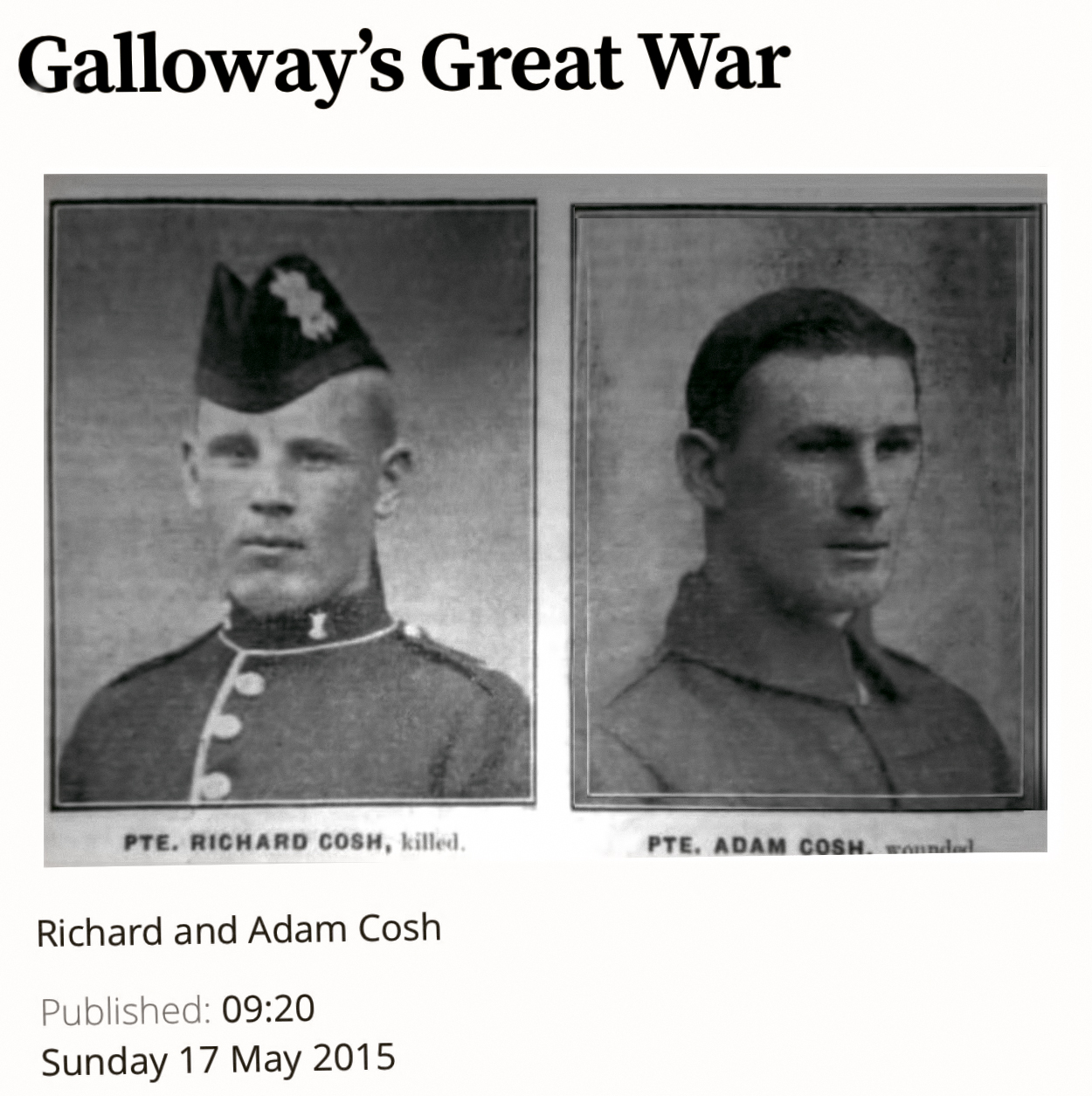
This work in the abstract, serves to commemorate family unknown to me as a child. They were never spoken of having died during the Great War, yet I knew their close relatives and I lived within the same culture of Southern Scotland. 

I detect and visualise the glow that we emit, myself and close family members and trace back into history each of our various links and this led me to special narratives of the circumstances of the land they left behind and the circumstances they met with, in France and Flanders.

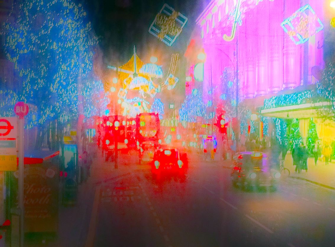
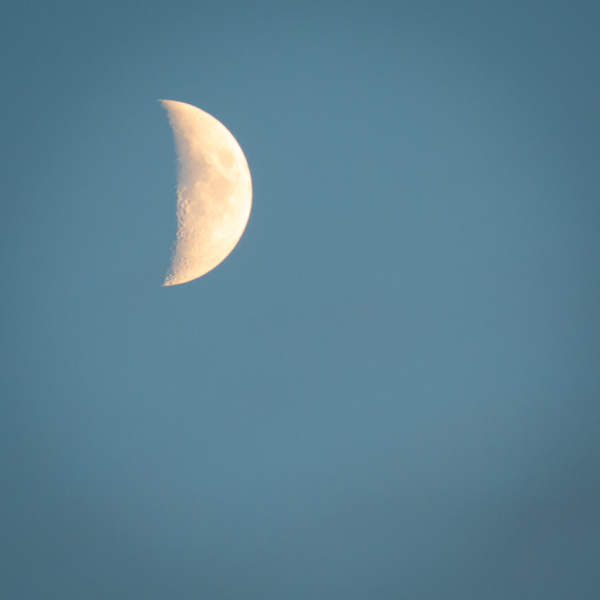
I take photographs of healing and the glow of life aided by the camera and how it detects this when the eye may not, and I remove distraction by removing detail, a kind of insect eye view perhaps just as other species tune into light and heat differently to humans. In the digital darkroom through processing I meet my intent. Detail is distraction. It is the glow I seek out. 

If I shake a hand and feel a warmth, that becomes a physical experience that links through biology to certain ancestors long past. In this way I identify with them and experience a connection. Within my project I can portray that connection as an image, and it serves to remind me of them. As a conceptual work it is replicable across other individuals and their own histories. A selfish interest becomes generic. In my experience this work has already had a uniting effect on a family as it had become widely dispersed. It has reacquired focus.  

I discovered an unintended psychological impact. In the present, a person I know well enquired then was caused to think of the recent loss of close ones. They were brave as the feeling was raw, and yet they gained solace as their own life force had propagated to ensure survival. 

There is a highly complex analysis and yet the discovery was made of a simpler connection that people can use to guide their perceptions of family. We incline to such social constructs as patriarchy for example. The work makes visible lines of social connection at variance with bonds made through close biological connection.

Unlike the work of Chloe Dewe Mathews commissioned by Ruskin College ahead of a centenary commemoration, passed in November, my work started 20 years earlier and with this conceptual work and imagery it will reach far into the future and has the power to bond people who wish to take it up. 

Branches of the work exist:

Some images I make, take on horizontals (for me of landscape) and verticals (again for me linked to environment) and there can at times be an uncanny linkage to the paintings of Rachel Howard, from Repetition is Truth via Dolorosa – Newport Street Gallery 2018.

An intent of my theme becomes subtle as it is partly lost in layering and in the development of the work but still can reoccur. These are linked to Scottish cultural themes of blue as a national colour and of tartan as worn by family today and in the past. This is becoming less obvious and less enforced in the work as time goes on.

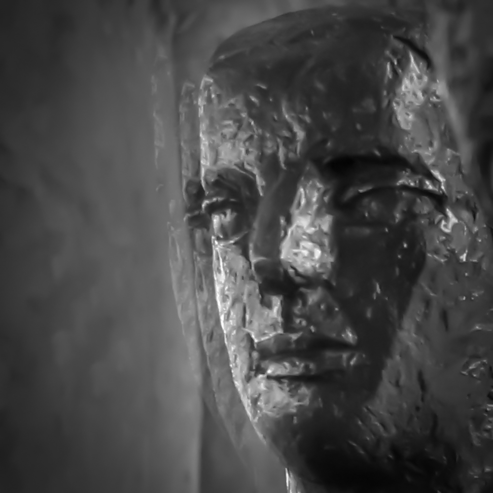
Another branch of work has become conflicted. They lived their lives in colour and colour represents in us today a vibrancy of our lives and begins to make way to more sombre tone in keeping with sad events. 

I used monochrome within a colour sequence to acknowledge moments of mental trauma. I accompany portfolio work with call and response captions and intend this be developed in a rhythmical sense almost as if chant. The interruption of the sequence with monochrome imagery was an alert to mental trauma. 

I implement such things almost as intentional hidden layers of meaning. I resist over-simplification as say demonstrated in advertising when an actor as Wordsworth scribbled down, “I went outside and walked about a bit” which after sipping the featured beverage transformed to “I wandered lonely as a cloud”. We’d have to say too that Shakespeare’s work would be a lot easier to read if written in standard Daily Mirror newspaper language. 

My visual work is not meant to be pretentious, so moderate layering of meaning only is allowed in order to add some discernment.

Another recent branch of imagery is the sombre monochrome mentioned now sees the addition of glyphs or photograms as original intent. I find now that visual consistency is created throughout when using the sombre style. Before I’d introduced consistency through a square crop which may see a return. It will take some reckoning to fully accept this divergence from original intent from “they lived out their lives in colour”. At present I’m conflicted over adoption of art as an experience, the theme in Rothko’s work. Whilst there seems to be choice, I continue to address the small markings of floor to ceiling height painting (Rothko Chapel) compared to small subject photography and limitations of clinical style photographic matter. Microscopy has been tried, then improved and consistent lighting, yet for what I am doing there are the compromises we all get in close-up work where there is movement. 

As my work is not made in camera, and I have a lot of images now comprising mild injury or latterly when injury ran out, memory of impressions on body. I can process more images for the edit (always sensible) before finally resolving the sombre versus celebration. 

A further branch of my current work are images as imaginings of faded memory. These serve several viewpoints. From home those remain look out over the sea and remember. Those in the theatre of war gain faded memories of home alongside murky imagery of the battlefield resolved in the mind of myself as author across a century elapsed.

Experience in the presence of artillery gives me special insight into this as surreal. I repeatedly saw a shell explode, then heard the explosion but then heard the gun fire. It is indeed a strange environment far removed from our normal experiences. I cannot but help this relating me to my project. Such things may intuitively help my work along, and in all hope transfer to the viewer through a feeling of authenticity. It does not have to be spelled out.

Another part of Rothko’s work compared to my own is he chose to paint in a partial monobloc style going from edge to canvas edge, right into the corners without central focus. Whereas my work adopts injury or marking as metaphor for the soldier’s experience and serves a purpose of guiding the viewers eye. 

As I engage more with the academic side of the course, I find the message I give over the motivation for the work, sometimes becomes mixed with themes of celebration of life of the healing and the glow. 

I need time to resolve my decision of sombre and consistent versus celebration and colour. As of today, I will have a portfolio of work in progress which may conflict. If I remain true to myself, I would not be overly happy to start emulating Rothko yet why reject the learning opportunity of this even if it turns out to be a temporary diversion from plan? 

I can demonstrate a consistency based on Rothko yet risk a mixed portfolio. At this moment I  show a willingness to take onboard learning. Even if it looks like a setback for now at a halfway point, full resolution is still a year away and so I take the risk and the learning opportunity. 

As always, the more recent introductions are less settled. With growing practice in making I can hone the visual language. This is true of the introduction of glyphs. They are intended as signs to guide the viewer and help create some visual narrative.

When I look back, I started with natural philosophy as a base, with ideas of the spatial and temporal with themes of information bearing and light and heat detection entering in.

I can recognise algorithm characteristics in digital and I attempt to exploit these when taking a photograph and making an image. In doing so I follow intuition as I seek to make my own art. 

I’m very committed to this work as a highly personalised family experience and hope to develop it into book form, with plans of opening it out and generalising the work as an educational piece for entry into a museum context. Here individual narratives of relatives bring to life otherwise dry historical records making any museum visit more engaging to the visitor. Already the principles established create a level of resistance to change in thinking, is what I sense, yet in winning through it soon becomes apparent there is a method here that guides further research into history. It is unique in connecting people through initial lines of enquiry that are seen to expand areas of historical research. 

The present time seems opportune for making the work as modern methods get used nowadays in the making of images and again in the support of research. Even in quite recent times, only large institutions could have afforded the means which are more widely distributed today. 

I hope you have enjoyed some or perhaps most of this presentation and in anticipation thank you for listening through to the end and I would most certainly value any insights you may be able to give to help me improve my work.

Week 11 Peer Review Video Presentations

Draft Video Presentation

and Transcript

Above is the attempt at the task I decided to submit. Ideally it would have been scheduled to happen during the week to allow a second pass edit, slide re-sequence and captioning.  


PHO704: Week 6: Draft Oral Presentations

After the fact:

That was quite a week. It started with cutting out a studio opportunity to give me some breathing space for drafting the Oral Presentation. Next, the task looked identical to the previous Oral – the wording was the same, and all that had changed was a shift in my practice. We had that resolved by the Tuesday pm, with a letter of clarification and an update to the task description. So two and a half days leftover which we were to create a bright shining new presentation.

I learn that the experience comes around once a module or twice a module if we count draft and final versions

I was on the bounce from a previous experience, which was tainted with shooting away in remote areas of Scotland. The transfer to mobile was quite sudden and unplanned (not my fault/nothing I could be but buckle down). The technology went horribly wrong. Nasty, nasty nasty. Do I want to remind myself? No. It is in the past. However, it has stayed with me and affected my approach to these Oral Presentations. In a sense, this task had become a first time experience, learning new tools on a new platform. Last time I created the whole piece, the day beforehand in – I never planned to do this but being horribly constrained, it happened that way. So this time, even the reduction of timeframe to two and a half days was a luxury.

Being the visual type, I was now really pleased to be able to collate photographs with ease. Before, every click had been painful. Next was the changeover of platform and software tools. Even what tools should I use? This I would have answered the last module, and this is why I reckon it felt like starting over, instead of building on past experience.

I had favourite methods but was not able to use them last time (mobility issue)  or even this time (change of platform). A wilderness or a stage for experimentation? Rather than dawdle, it was a case of make a decision. I went native with the supplied software, the wrong software. It was a great way of working that at last, I seemed to be enjoying. A quick test demonstrated the file should translate.

So yes I overdid the bells and whistles through unwittingly selecting a theme with too many visual elements available and that I also used. Too much for typical Photographic taste. Post review that was quickly rectified. I should have known better by now and yes I keep seeing others sites with the most minimalistic appearance designed to make the photographs sing, or something like that.

A significant part of the exercise was presented in the presence of time pressure. Now the Oral creation involves a narrative and photo narrative, but it also consists of a production task. With time for just one run through, how was this going to succeed? How do you aim and achieve a specific file size limit and speaking duration? These metrics are critical in the context of the task set.

In came a quick piece of creative thinking. Put the main punch of the presentation, the bit/content that had to be there, put it at the beginning. Then follow with the supporting development of photographic practice. I was only a few minutes over, and an edit sorted that. A massive PDF saved to a smaller size, a fraction of that allowed. At once relief but also there was some scepticism over resolution. I accepted the comfort and whether turning a blind eye or not, was happy at the superficial level that individual pixels didn’t show. This is part I deem to be the production task. Given to an expert to work on, they’d size and check and do the technical posting. As an all in one mission, that experience has to be gained.

When it came to the actual timed review, the disconnect in the timeline was noticeable – my ruse had been discovered. Post review I’ve got time to swap back into time order. It’s easy enough to change the time order – simply swipe up or down a  list of slides. However, it’s a more significant task to do than that. With alterations resulting from the review, the timings and file sizes alter, and the job has to be resized to take on board all of the changes.

In reality, and I kind of knew this from extensive experience, it’s a case of allowing time to do the Oral draft task twice with multiple practices runs being necessary to meet timing and size constraints. I must go back to completely finish that off. I’ve been somewhat distracted by my photographic reading – I went back to Susan Sontag On Camera and dived into Fashion Photography and Kinship lifestyle magazine from past and current research recommendations.

I was pleased to have gotten together a consistent look to my images and will ditch those horrible default frames that add nothing. I faltered in delivery on basically checking whether there was time left to fit in the full slide deck which marginally there was. The practice is necessary. Having time to practice is also required.

I thoroughly enjoyed the task, even if left to last in order (the creeping pressure that lasted the whole session) and heightened time pressure due to starting late. Others presentations and reviews gnawed into the available time. It was a great relief getting through it, and then as a bonus, there was clear and purposeful advice I’m able to work with.

I’ll crack on with that.

On the subject of potentially compromised image resolution, there is something to add – I certainly worried about it and was picked up on it last time. PDF file size reduction works but can be visible. For this course, a piece of work was done by the University by the software training department. I tried it out during late summer. What it means is InDesign if available, can be set up to use full resolution images and the reduction can be made there. I was shown the method called save to an interactive PDF. Small file size with uncompromised image resolution.

As I have not used any visuals here so far, I will post the updated draft when I’ve got it in order, I’ll include one photograph from my non-DSLR digital processing era. From this, a lot of my later abstract image references developed. It is a really dirty image, designed to grab attention and was photographed on a cold December night in London’s Oxford Street and taken through the misted upper deck window of a London bus.

Oxford Street

PHO701: Week 6 Draft Oral Presentations (live presentations for formative feedback)

Draft Version of my Oral Presentation

At last, my draft presentation is ready to view and is available here:: Oral Presentation

Further refinement is necessary to shorten the play length by 40 seconds and to rebuild the file with lower resolution photographs to get the filesize down.

The present draft shows an audio symbol throughout and serves to mark this for me as an early draft.

Beginnings – I came back to photography later on

Experimenting with media, a TEST ONLY file Beginnings been made ahead of the review presentations and serves to explain how I was gripped by photography.

Love is Real Not Fade AwayGreiving

IMG_0852The following link Taster is an end to end production TEST ONLY at this early stage, ahead of the review of our presentations.

Summary

Some media have been combined that provide a 30s clip relating to the project. Now I’ve tested out the tools on desktop and have worked out the linkages and controls I can now focus on incorporating salient content.
I was asked to write a related piece, a conversation recalled from many years ago about the subject of my new project. I place the text here alongside the Taster video. The length of text means it will be excluded from the Oral.

I wrote this:

Scottish Roll of Honour, Scottish National War Memorial, Edinburgh Castle
circa 1976. On the return home and now with my Father, and him talking about the visit I’d just made there. The Memorial is a great outpouring of the Scottish people for the many relatives lost in the War.

Father:
Did you see the book?
Their names are listed there.
I went with my Mother when I was just a young boy. We looked through so many pages. And found both their names, Richard Cosh death 29 Nov 1914 The Black Watch (Royal Highlanders) Pte, and Adam Cosh death 19 Jul 1918 The Black Watch (Royal Highlanders) A/Sgt.
It was a long time ago and I didn’t know them. We’d never met.
I’d only heard my Mother talk about the boys. The Brothers that died in the War.
I went back once to see them again. It was with your Mother.
The book was still there and we found them. We saw their names.

… about Richard and Adam Cosh, The Black Watch Regiment (Royal Highlanders).
Inscription:
“The souls of the righteous are in the hand of God, and there shall no torment touch them.”