PHO705: Incorrect Print Result – colour off and green cast.

Silent software updates led to issues with my Epson P800 Printer, prompting me to initiate a recovery plan and conduct a thorough analysis of the print process. Despite setbacks, including a technical issue and the COVID-19 lockdown forcing the cancellation of my exhibition, I remained adaptable and managed to complete my book within a shorter time frame.

User Resolution

1 Connect the Mac computer and printer by direct wire

2 Reinstate the link to Epson paper profiles by reinstalling the driver software. This triggers the choice of Epson driver over Apple Airprint for you to select

3 Select Printer Manages Colors

By filming the required page-turning video and creating a 3D model of the exhibition space, I demonstrated resilience in overcoming challenges. My experience highlighted the importance of being prepared for the unexpected and staying flexible when faced with unforeseen events.

However, the problem with ICC paper profile selection on the Epson P800 Printer persisted in the years that followed, as automatic software updates caused the printer to lose the link to the folder containing Epson ICC paper profiles. The default connection became AirPrint, which only recognized generic profiles supplied by Apple, rather than specific Epson paper types.

Advice

It sounds like you had a lot of challenges to overcome in order to complete your FMP. I’m glad that you were able to persevere and produce a high-quality piece of work.

I understand your frustration with the Epson P800 printer. It sounds like the software updates are causing problems with the ICC paper profiles. I’ve done some research, and it seems like this is a known issue with the printer.

There are a few things you can do to try to fix the problem. First, you can try uninstalling the printer driver and then reinstalling it. You can also try disabling the automatic software updates for the printer.

If those steps don’t work, you may need to contact Epson support for help. They may be able to provide you with a newer version of the printer driver that fixes the problem.

I hope this helps!

References in case required:

https://www.redrivercatalog.com/infocenter/tips/how-to-fix-missing-paper-media-type-selection-OSX.html

https://community.adobe.com/t5/color-management/printer-profiles-missing-for-epson-sc-p800/m-p/10870908#M3033

PHO705: Fonts

Supporting Discussion

The choice of font for FMP submission remains firm as Granville Light. A return to inspect the style after a cooling-off period only confirms this. The use of a Typography Insight App allowed a detailed comparison with a standard sans serif font. The Granville Light style is very much being enjoyed.

Original Post

Time has been spent researching san serif fonts for the FMP assignments and two fonts have shortlisted and have been installed and are being trialled:

  • Granville
  • Auster

Both fonts are very clear and Granville is being preferred on several counts including style which is more apparent on the lower case letters f and t, but also for being from a French designer at a Paris foundry given the project theme of loss in the Great War. The slight dagger-like flourishes in the lowercase letters f and t, also act as a metaphor for me as references to the Dirk and the Sgian Dubh, sheathed pointed daggers carried in Scottish national dress.

I won’t install the Granville font in this blog but provide a PDF example here:

Looking at this example a reservation emerges to do with font width, even as something that makes it more readable. Is it too wide? The answer becomes clear when the font is viewed at the required 1.5 line spacing where indeed it looks fresh and clean as seen in th ePDF above.

PHO705: Creating Draft Critical Review of Practice

Two items have been held up pending 10 weeks of illness then need to create portfolio work.

These are the Video that should have been made over the break and the Critical Review of Practice CRoP.

These have been taken together, but oddly manage to support the work. The following PDF is the mind map. A CRoP is a CRoP but it has to be about something so the overview of working practice and methodology is given as a mind map. The CRoP requirement (or part of) has been mapped onto it and requires further development like issuing a draft. However, there is some referencing to other practitioners still in research. Despite having this for earlier incarnations of the work (in earlier study Modules) the work has progressed on so time for the update.

To an extent I can argue about originality and a need to mask off external influences as the work is quite unique in its standing as a branch of Art based on Science. As blogged previously I’m never surprised anymore to find original thought crop up in other places of which two examples could be cited.

  • Top left hand in the mind map is the Critical Review of Practice from an earlier module assignment.
  • The bottom left hand is a storyboard outline for a useful video resource that is being created. (This proved very helpful to visitors to the summer exhibition).
  • Above this is the connection to the CRoP linked to Ghost Abstract Figurative Themes. While Ghosts per se have been dropped since the review with a book designer, the landscapes remain ghost images.
  • Practice location top right is the piece being updated for this dynamic project. It does need to settle down urgently prints, book, portable exhibition and talk to be worked on.

There is quite a challenge here as none of the work has been subcontracted to printers or anyone else so all of the skills from the photography through to all branches of making have been absorbed and this alongside all of the marked assignment work. For anyone wishing to embark on an MA Photography Course they may wish to consider how much work to outsource to specialists. Personally, outsourcing the Book making to an online offering is not preferred over an artists book dummy and hiring a book designer would lose some of the original intent to someone else’s view of what the market would stand. The work is still too dynamic for this.

Bottom right is the remainder of the CRoP assignment requirement, which pertains to the public showing.

In terms of evidencing the work as mentioned here in an FMP lecture video then on the subject of gaining public feedback, there is a need to reach out to practitioners to elicit attendance or somehow provide comment on the work.

I now have a date of the Easter Weekend for showing the work over four days at Amersham Studios tradesecrets.live Only now can approaches be made by reaching out.

As image-making is fundamental and has been a major focus, work has been flooding forward and is now starting to receive critique (two critiques were missed through technology issues).

There is scope for an earlier pop-up exhibition at the same location. No promises yet. Details will be published and a campaign run via Instagram account foto_graphical and Facebook.

<placeholder> for draft CRoP

PHO705: Assessment Period Reflection

So what has been happing of late?

  • Making new work.
  • Planning going public. (which requires new work)
  • Ramping up the professional
  • Ramping up the quality of work

Overall, an exciting period of practice development.

Concluding, is the intense period of reading and learning putting substance behind research based practice. Going are the days of creating themes in support of project narratives.

For visual language development samples of themes have been created.

  • Father mitochondria layered on mother image (mitochondria as transmitter). Biological markers ready to be layered in next stage.
  • Stills dropped out of newsreel of 100 years ago montaged into project examples
  • Family archive motherline photograph layered with glow image (mitochondria)
  • graphic development of DNA and cellular imagery and text

A rather busy and very worthwhile period indeed.

Three months of work to finish off a professional portfolio of high quality to be taken public Reacquainting with the MA Photography requirements caused a close look at example work created so far.

There were then many ups and downs hinging on the practice of being fully digital in the making. With much time spent in the digital darkroom the methodology was fully re-examined and especially following the digital imaging Symposium at Westminster University.

The Symposium was good and gave access to several key scientists in skincare and medical forensics. For those that know about the project the relevance should be clear. Much was confirmed around the artist’s assumptions of biological science as applied here.

The quality of the work then came under deep scrutiny anticipating cramming a lifework into a meagre 10MB PDF file without undue loss of image quality. The answer is InDesign and the methods documented in the FMP block.

However, any signs of a borderline quality entering the process and the situation will only worsen. Were there signs in current work?

Previous bad experience of transferring to mobile working and lack of connectivity in the Scottish Highlands led to a deliverable quality issue. It was never planned to be like that – the cohort will remember those events.

In an attempt to avoid technical issues deep scrutiny was performed on the work. A solarisation filter is quick to pick up on banding faults and pixelation (not in the original but from processing).

How to resolve this? Some very detailed analysis and comparison trials showed how and where different algorithms broke down affecting an unacceptable number of images.

During the last week of the “break” or so called University Assessment Period, and to which this blog post pertains work continued urgently to sort out technical issues. A number of workshops and external resources were called upon and a growing amount of time was soaked up.

This continued into Week 13. The current blog post is a retrospective. That is how important it was to resolve quality, instigate testing and build a professional approach to practice. Time normally spent learning and researching art and photography began to make way to working the critical methodology during the FMP blocks.

It would be great to have visual examples accompanying this post but for now it is important to continue making and delivering images elsewhere. Return later when priorities resolve.

There has been much catching up to do. After 10 weeks of being slain by the aftereffects of two bouts of flu, it is sad to note the passing of two more family members in the run-up to year-end.

In a way, the losses underline the importance of the project being made complete to pass on to others. The pay-off would be in gathering the technique that others may wish to use with their own, alongside forever unfolding events on a world stage, whether that be a 9/11 or something else.

PHO705: Assessment Period Reflection

The Helter Skelter that is Making (of late)

The research period moved into the making phase within the digital darkroom.

Many up and downswings have been encountered in the making, from renewed optimism to unexpected problems arising that needed to be resolved.

More structured recording of image statuses has now been established on Evernote as a wider body of work has emerged, none of which is entirely satisfactory at present.

Direction around abstract outcomes such as landscapes for some images fell foul of image banding as well as encountering more editing suite false images on the screen versus print.

Being guarded and mindful of this resulted in changes. A solar checking layer is used to detect banding where it might not be immediately visible to the eye followed by a step by step expansion method and 100% viewing (or do and undo merge layers).

And so too, subject matter bias changed in moving to the biology theme with the development of skill in making cellular images alongside associated graphic elements. Maybe too this was an avoidance strategy as avoidance of quality issues which and it led to switching the major theme to and fro ghost/landscape/biology

The methodology has changed through this as methodology currently biases towards forms as Surrealist imagery.

Another branch in the period in between these stages meant conducting a series of trials of merging stills dropped out of newsreel video. That presents challenges with the mixed resolution, edge problems and differential lighting when integrating. Time out was taken to practice overcoming these challenges but as a major wartime theme production has stopped for now. The problems can be tackled with more confidence having gained more practice on different methods. Whether to return to this or not is the question. There are probably too many themes for a book or exhibition and so something has to go. If the biology theme of cellular imagery went ahead then maybe too many similar images result. There is no obvious solution at this stage and so work continues with the numerous themes,

Reading the course requirement for quality scanning and professional making at this level on top of evidencing this does lead towards a situation of panic in these matters.

Thinking through the image merging the experience from the Summer exhibition weighed. Separate archives (of the author in this case) and abstract expressionistic images led to triptych layouts that worked in exhibition but not as a book (the weight of paper in a signature with not enough strength in the stitching. Signatures are complicated, always looking wrong at the earlier printing stage but turn out right, where triptych became unmanageable in the handling and ended up being complex or not practicable as a dummy.

PHO705: Working up the resolved portfolio

This blog post is a mixture of items from artist research through publication planning through to misleading image editing.

Artist Research

Helen Chadwick

Tony Essler

Exhibition

In the next week, the venue and date will be confirmed with the venue owner. The last exhibition, during the summer, was presented to an audience as a learning exercise in preparation for this FMP module of the MA Photography course.

As a learning thing, it was invaluable on all fronts. It is proposed to repeat this form and improve upon areas identified from advanced ‘marketing’, through to the quality of the edit with improved visual language and narrative.

Rather than stand alone as an unmarked work – course delivery is digital, the exhibition will again avoid being a Vanity project and help build the final PDF edit.

Newspaper|Magazine| Book

Having learned to hand bind and having practised by making two books and an exhibition pamphlet, the principles of making have been acquired and will be used to guide the selection of paper medium rather than allocate time to the unmarked making which cannot be handed in.

So printed artefacts will be designed and made but will use a professional service. A candidate service is currently being looked into.

Exhibition printing and mounting can be kept ‘in-house’. A decision will be made on technique, whether or not to do as in the summer surface mount prints on 40 by 50 board. The quality of the craftsmanship can be elevated to archival print mounting using cutouts and non-destructive taping.

The idea is to act in advance and take advantage of the settled decision to use 4 by 5 print ratio at A4. This means the board can be cut-out in advance. The layout is proven to work with the exhibition physical space and a simplified display method and available studio-style lighting which has been further augmented.

The ‘deal-breaker’ is in the image edit. If necessary, any archive image used that has to be landscape 4 by 5 ratio, will break the exhibition layout not just in terms of conformity but spatially – the exhibition needs to sit well within the identified space.

The conformity can be enforced as long as it makes sense and any ‘vital” image may be re-introduced into the final PDF edit.

The main images were previously described as being in an abstract expressionist style, by creating an emotion or feeling. The project has moved ever closer to the abstract surreal.

The abstract surreal is intended to be themed with archive photographs: originals of the author, family archive or images processed from historical video footage.

Image Editing Update

Having fallen foul of an editing software fault during a previous module (Adobe Lightroom Community, 2018), during the break it became necessary to view edits at a Zoom level of 100%. Work saved radically differed from the same image displayed on-screen during the editing process. What you see is not what you get. Variation from intent does represent a problem.

Some research into the unintended change led to an answer online (Adobe Photoshop Community, 2018).

The explanation is that the processing software avoids computer processing load by interpolating any smaller representation. In the current project, this is typically when the evolving image is fitted to screen – do not rely on what you see on screen unless at 100%. This became apparent in making image comparisons of processing Method A versus Method B following last months (December) Symposium on Imaging Science.

Bibliography

Adobe Photoshop Community (2018) Merge Layers fault. Available at: https://community.adobe.com/t5/photoshop/merge-adjustment-layers/td-p/9842482.

Adobe Lightroom Community (2018) Random red blocks appear on images exported through Lightroom. Available at: https://community.adobe.com/t5/lightroom-classic/seemingly-random-red-blocks-appear-on-images-exported-through-lightroom/m-p/10134977.

Innocence (2020) innocence paris. Available at: https://www.innocence-paris.com/fr/.

PHO705: Assessment Period Reflection

This reflection is made during the break otherwise timetabled as the first of three weeks of a University assessment period. No work on the Final Major Project FMP module is under assessment at this time. It is simply a break during which work is able to be progressed.

The activities conducted have been:

  • Guest Lectures and
  • Post-processing photographs.

Guest Lectures

The (optional) lectures watched back are:

  • Christiane Monarchi Part 1
  • Christiane Monarchi Part 2
  • David Moore
  • Guy Martin

The guest lecture by Jim Mottram was viewed last year. These lectures have been very useful and represent a blogging task that competes for a limited resource (time) when working on the priority task of making work. It will be necessary for completeness to return and write up the blog posts. It is interesting blogging this point of view when it is still the break.

Post-processing

The methodology employed is to post-process photographs of healing wounds into surreal/abstract style. Subsequent to this is a choice of theme that is essential to building a narrative.

There needs to be an oversupply of candidate images for various outcomes:

  • Exhibition images (for subsequent edit/reduction for the assessment PDF)
  • Book dummy in particular for a group meeting with a Book Designer.

Progress in post-processing

From the outset, time was taken to make the project a research-based project. This has matured and could go on longer than the permitted time for the course but now is coming together as a whole and so making has resumed.

[metaslider id=4045 cssclass=””]

A mixture of figurative images or images with other referents can be seen here. In these images above the referent relates to themes of ghost, inner/outer space, landscape/seascape/mountainscape.

With research ideas in place, making by intuition took take-off once more. As this progressed, that state of flow that is spoken of returned and a variety of outcomes were generated.

Variations sprang forward as in the case of the mind interpreting the outcomes as weird and eerie then finding this feel worked its way into non-healing as you recognise the characteristics in source photographs that likely produce an aesthetic. In particular, there has been an emphasis on synthesising a project theme of inner/outer spaces.

Also, by expanding reading into the Surreal it quickly becomes apparent how geometric manipulations used appropriately can expand the scope of work produced. There is a personal appeal and education bias here. At present, more general acceptance and a decision to proceed will be down to making more geometric manipulations. The purpose is to stimulate structural interest in the original glow images from the trace of healing and life energy.

Module activity has firmly progressed from ArtSci into digital imaging, and from outcomes into how they arise in the conscious mind supported by a reading of the weird and eerie and of the unheimlich and of place.

Another branch being touched upon is a return to further artist research to aid the positioning of practice amongst contemporary photographers.

In the digital post action, it is necessary to limit change if the image becomes overprocessed. For example, banding can occur. In a project that encompasses the real and the imaginary, there is the analogous of realistic depiction and an imaginary version of the image found to be displayed sometimes on screen.

Artefacts first noticed in some processed images in an earlier module returned to haunt a number of edit in FMP. The previous observation was of fringing, now it was of banding.

Eventually, this was traced to image zoom level affecting how the software adapts. The software creates in effect, fleeting visual outcomes that do not exist in reality when saving a file or printing and image. This seemed quite ‘haunting’ until an explanation was found on a technical forum.

The software maker in its attempt to reduce the processing load for a displayed image that is zoomed interpolates the pixel data and injects impermanent changes. Surreal/abstract imagery developed for the FMP Project can be prone to showing the desired finish but it is not possible to save or print.

It is not just the camera that sees differently to the eye, but now the editing software which is deemed an integral part sees differently to the author The camera never lies can be extended to the editor software never lies?

In defence of the software manufacturer, the product is intended for general purpose use within particular specialisms. The type of processing used for the FMP project is susceptible to showing up the problem discussed. It is especially true where there is an openness towards challenging the computing limits.

Integrity checks are now performed on new images during the making. An integrity check would be defined as confirming what is intended is what you see on screen and what you get as a result. We are used to JPEG saves adding artefacts in performing destructive processing when reducing file size. We are already aware of this. It is more of a surprise to see transitional effects that exist completely within the editing software and then vanishes.

If the effect is desirable and needs to be made permanent, then this involves using a camera to photograph the screen. This may or may not be successful by individual image.

Two checks have been routinely incorporated.

First is to add a curves layer with solarisation characteristic. High contrast shows up transitions and identifies banding. Fringing, by comparison, is already directly obvious to the eye.

Curves solar characteristic makes subtle banding more obvious.

Second, as an alternative is to merge layers – the difference is immediately obvious. If editing layers have to be retained then unmerge once the check has been performed.

Finally, try to work at 100% zoom for the true image or switch zoom to check the render. Full zoom at 100%, however, is usually less desirable than fit-to-screen that allows the overall image to be viewed.

Depending on the aesthetic and theme, some forms of banding are referent of DNA testing and so may be desirable in a print.

Reprocessed Photographs

Some photographs taken before FMP have been reprocessed to use more refined techniques that have been developed.

This increases the variety of source material and is consistent with good ethics given the nature of the subject, healing wounds.

More reprocessing is in progress and as the number of outcomes increases a decision can be made.

Narrative

The decision is pending at present around the visual theme. Adding archive to the mix is felt to really strengthen the presentation making it more accessible to the viewer. One processed image has had a second processed image layer added where the still was dropped out of video footage. The combination works well. There is a judgement needed in such pairings and whilst a second paring was found it still remains at present to increase the stock of surreal/abstract images.

[metaslider id=4056 cssclass=””]

PHO705: Recombinant Rhymes and DNA Art

Project development: rhymes, art and naming of the photo project.

Oxford definition.

This post is an extension of the Recombinant Rhymes and DNA Art (McNamee, 2019) feature in the blog post, PHO705: Research Artsci, Communicating Science Visually, Computational Biology and a new Avant-Garde

The intention is to deliver something art-based (rhyme or graphic text or image titles) over the upcoming period between terms as noted in the Final Proposal. An intention is to experiment to discover if contextualisation and visual language can be built with Recombinant Rhymes or DNA Art.

The idea is to use imagination in selecting words like TELEOLOGICAL that contain DNA base letters ACGT and combine them for effect, perhaps making a video with a reading of a rhyme. Words are intended to be selected for their connection to narratives of the project.

Select from the following ACGT words for some connected meaning:

Examples:

  • Advocating 
  • Fracturing conflagrations
  • Countervailing 
  • Lethargic contagiousness

Interestingly, the validated list contains the terms Abstracting and Photographic.

Project naming

In short, “Motherline” is the name presently chosen. This is less politically charged than the earlier proposed project name “Matriarchy”.

Matriarchy like patriarchy has political overtones, so is not so attuned to the themes of the work.

Motherline is derived here from the post PHO705: Visual Language of DNA Testing and the terms:

  • Family Ancestry (autosomal DNA)
  • Motherline Ancestry (mtDNA)
  • Fatherline Ancestry (Y-DNA)

Bibliography

McNamee, A. (2019) ‘Art of Now Recombinant Rhymes and DNA Art’. A Whistledown production for BBC Radio 4. Available at: https://www.bbc.co.uk/programmes/m0002rkb

PHO705: Guest Lecture (Publication) – Christiane Monarchi Part 1

Watch this Guest Lecture video and comment.

Christiane set-up Photomonitor and explained how this was set-up from her getting involved in Pluck and Portfolio and a desire to find out what was on. across a range of areas over and above the large institutions. She would advise in how to set up a niche.

Gaps were found in the offerings of:

  • Art List – large institutions
  • Art Rabbit.com – global and no UK focus
  • New Exhibitions Guide – major mostly historic items
  • British Journal of Photography – stopped doing listings
  • Photoworks – annual, great read but infrequent

Christiane’s requirement was UK and Ireland centric, for artists and emerging writers and all in an up to date guide of what’s on now. Here need was to bring people to photography and go and see it, think about it and spread the word. All without ads and is free.

The result in 2011 was www.photomonitor.co.uk. From the front page, key links are the Portfolio link written by the artist rather than mediated, there are listings sometimes with reading more depending on the gallery and their subscription. There are Reviews including of live exhibitions. Interviews talking to artists. Essays that have been researched. Auctions cover smaller upcoming auctions. Collections are interviews. Book reviews cover self-published and large publishers.

Christiane encourages artists to take a break and listen to others.

In terms of making a publication the 5 Years’ statistics were given:

The right hand column draws funding and that pays for commissioning the items on the right as community members.

In summary there are many many opportunities to see work that is shared.

Commissioned pieces are paid at 20p a word to a maximum as a budget constraint. 500 words on a screen are practical.

Commissioning is wider than London covering Wales and Ireland. Timeliness is key as mentioned to get people to the exhibitions. Social media is important for sharing.

t: @photomonitor

Christiane talked about potential for growing Photomonitor including into streaming of live audience talks.

Some Inspiring Platforms were listed:

Anyone with new ideas is encouraged to get in contact.

Response to Online Publication.

It is always exciting to see the smaller business venture establish itself and succeed. Any personal involvement would be to read Photomonitor and assess how it stands alongside say for example, major gallery memberships.

The online element is approached as a Portfolio website and as Instagram for marketing (planned) not to mention this blog site created for the MA Photography course.

There is still more to discover in Part 2 of Christiane’s guest lecture.

Assessment Period 4

Following submission of the Surfaces and Strategies module, activity goes on during the Assessment Period prior hopefully to starting the Final Major Project. During this time my solo exhibition ran on and gathered a high quality of feedback.

Three activities conducted during this period aid learning and maintain “fuel in the tank” while the solo exhibition proved a great learning opportunity.

Only as a mention here, I’ve signed up again for competition photography although I prioritise this behind the MA Photography course. I have met with success in this by publishing work in my own inimitable humorous or quirky style but have cut right back on entries only putting in work if I’ve managed to keep up with the studies. There is one area where I’m getting a bit of bother because I’ve not been able to give it enough attention. I won the odd competition I entered but I’ve not done enough for overall success. It is a pain to manage. It will still have to wait though. Maybe during the Assessment Period I can find some time to make bulk entries. It’s not the same though.

Landings 2019 Solo Exhibition – Glow

Here is the Exhibition and Portfolio summary

Inspired by something I saw in a Gallery, I made a Your Comment board with feedback from the solo exhibition.

Your Comments

Gallery and Exhibition Visits

Two visits queued at the moment are in Amsterdam and Bristol

Unseen Amsterdam

Bristol – Martin Parr Foundation and RPS Paintworks

Meanwhile, a number gallery trips have been made. During the Assessment Period I wished to catch up on exhibitions of choice that were due to close in the short term, so I didn’t miss them. Some short term planning resolved this and plans are going in place for the medium and longer term.

For example there’s a Professional Development workshop on exhibition curation I should find useful, either as a means of refining my own work or if my interest remains, in curating other’s work.

The Photographers Gallery

Manuel Alvarez Bravo, Platinum and Gelatin Silver Prints.

The National Portrait Gallery – Cindy Sherman

The Tate Modern – Painter Natalia Goncharova

Here we have a painter working with additive processes as opposed to the photographic subtractive one. However, there is a visual language and there are signs and so an overlap in the visual.

Modernism is present as a theme yet for painting this is different to photography. Van Gogh was seen to be the master of modernism in painting where in photography it was about an honesty in recognising limitations in concentrating on the frame, exaggerating the limitations in colour that painters try to mask, and a defiance of perspective that painters so cleverly introduce to fool the eye into seeing depth in a surface.

It was fascinating to see the hanging plan for groups of work. Compared to my recent triptychs there were width variations (outer paintings uniformly narrower). I had a height variation from my archive image reuse between exhibition catalogue (black) and mounted print.

I identified through my experiences related to the subject matter. I enjoyed the simplicity of the multiportraits. I also, related to the theme of war and it’s dark portrayal as Lithoprints and content of war and religion almost forced together into a tight frame. I noted the uniformity of these images and the signs used and the implied action or movement.

I enjoyed the mixed media for example wall prints, cabinet displayed books and a reading in Russian the latter giving a chance to sense the expression of the voice as the sound of Russian speakers particularly in reflective mood has almost never been heard. I don’t know if that is part of our propaganda like at one time with Irish broadcasts where narration was heard dubbed over the original voice. Russian speakers simply are not presented in a way to empathise with perhaps as an enemy of the state.

<add example photographs from the exhibition as allowed for personal non commercial use including education>

The Tate Modern – Sculptor Takis

Takis – Tate Modern

Reading

Takis’ exhibition book. Not said in the book, that was produced ahead of time, Takis cooperated with the Tate Modern over the presentation of his work in London. Sadly he died in August before seeing the opening.

PHO702: Assessment Period 2 – Christmas 2018

Note to self on visual side: return and add photographs selected as time permits – it has been a surprisingly busy period.

I had established a way forward in my first module on a Commemorative Historical project based on ancestors and common land of upbringing and livelihood. I had lived here as a child and shared in the culture. The project with its visits created renewed cultural connection. A deep sense of emotional tie resulted that now at times borders on being overwhelming.

As my work moved towards the end of my first module it changed form from Close-up photography mixed with Conceptual work.

Why did the project change?

It was clear that by the Final Major Project FMP stage there would be difficulty in sustaining the work. That’s not to say the work cannot complete satisfactorily in its original form – an illustrated book narrative had been the plan.

A challenge related to the Conceptual work. I transformed the cultural home location colour and texture, into attempts at atmospheric scenes from a far location in the theatre of war: scenes from the trenches and memories of home.

I’d practiced a method of abstraction that gave horizontal and vertical treatment to photographs of place, of being or of artefact. Edges might be added back in, for form.

I quite enjoyed the work insofar as my own needs were concerned. It seemed quite inspired and especially creative.

I was using ideas from filmmaking that were not felt to hold true to photographic work. In filmmaking you might stage a scene near London that represents Norway. Whilst this fits in with the storyline the equivalent in photography can be challenged in terms of authenticity. Perhaps now I understand in terms of Barthes, “a photograph is a record of something that has been” or words to that effect.

Both Close-up and Conceptual work had been carefully devised to overcome constraints of resource of time, cost, travel. Originally the work being made as a way of supporting an historical text narrative.

So how did the project change?

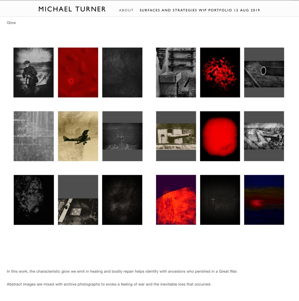
A style evolved of colour or saturation processing to create highly colourful and vivid work and sits alongside other more muted but glowing images.

The change occurred around assignment hand-in time, as these fresh ideas were sparked. This took the work to a different level. This had the purpose of connecting living individuals to specific others and narratives from the past. Given records of wounding and repeated return to action, connections are made across 100 years or more by abstracting starting photographs of minor everyday trauma.

The viewer is presented with sets of strikingly colourful images. A subset follows a red theme from my earlier Poppies are Red … project.

There is a process of identification with the past that helps to sort of bring it back to life. As descendants including the author have different degrees of connection to the particular ancestors, then we identify with specific individuals and narratives of their lives in a way that we can contrast and compare with.

This led to a Project “Poppies are Red …” and the limited trials I did on my photographs led in the direction of red themes which tied in with the theme and the project name.

The project for a while took on the title Life’s Glow.

With areas of minor trauma there is obtained a degree of visual structure to the work. The camera sensor is capable of detecting IR. In my work I bring down the colour before bringing it back in and in doing so appear to raise the level of glow within a photograph.

This uncovers visual aspects not seen by the eye alone and lead to a fascination surrounding the effects

Two methods of abstraction had resulted during the unfolding of the work. Now these can be combined where it makes visual sense. In one example this contains otherwise wildly saturated colours.

The effect of shadow:

When drawing colour back into an image, having deliberately drained it, I noticed an effect due to shadow. Shadow seems to alter the direction of the colour as it is brought back, perhaps having altered the low level hue which then goes off in its own direction.

I’m now in a position of continuing with refinement. This becomes necessary for reasons of visual consistency across the portfolio. In drawing comparisons with a painter and an abstract practitioners my work needs to to gain a level of improvement. Or at least that is what I seek.

Refinement is necessary to enable any move from a book context to a gallery context. What is acceptable in one medium may not be scalable to the other.

In retrospect it occurred to the author that a magical connection was being made that helped fill gaps in communication from those early years as a child.

In summary:

Stories of deep personal sadness and loss had been held back by surviving relatives. Individuals who were missing amongst them as contemporaries did not gain mention. Now those gaps are being filled and so their lives are not forgotten.

Where my Practice is Now

At the start of my third module I consider where my practice is now and that is in the genre of Abstract Impressionism. As new photographic work recently evolved, that remains within my chosen subject area, for me it is down to a process of refinement. I work to enhance scale, control colour and finish. I am on a trajectory of developing a personal style and I continue to match the standards of other practitioners I connect with be they painters or photographers.

Image Success

In terms of successful images and not so successful images, the early images were the most creative and tidy. Some images were made after the previous Module submission and so were new work made in the last break. However, a ruling that work had to be made from the first day of the new Module, meant some of my most creative work was out of scope, sadly. With these images my Portfolio edit may have strengthened. It would have strengthened as the reshooting and digital darkroom work did not result in the same level of creative images.

As I rely on everyday minor trauma, it would be unethical to deliberately cause damage. If there is no subject material for a while then there is no material. In these times I concentrate on portraying Life’s Force and the glow that we emit as means of identifying with those in the past.

My work is such that the steps in the digital darkroom cannot be repeated (without recording every step on video) so each image is unique. When I reshot, the out of scope photographs, this not only led to a loss of time, the results were not quite as strong. It is entirely natural to follow the flow of image creation in post but a challenge to set up a pre defined target image and try and craft it. There is a skill and learning process and it is intuitive and is made possible by knowing how to read the start image. In my very early work only one in 5 images say would yield results. Current work is more focussed in intent and more reliably creates results. But again the work is not repeatable as the techniques require destructive editing.

I’ve firmly believed the bespoke nature of this photographic work increases its ‘value’. Each edit of an image is unique. Whilst reprints can be made, the ability to process identically from the start is largely impossible.

Support to Visual Narrative

As my work moved away from illustrating a test narrative towards a stand alone work, it became important to find a way of supporting the visual narrative. Initially and for many weeks all means were open for consideration as I experimented with different approaches. I tried sound effects; thought of taking some research on a poet with cultural link and select lines of poetry as titles. In the end I decided on a Call and Response technique in titles and implemented these in my portfolio.

Contextualisation of Practice – three reviews or interviews for three visual references.

The sources I’d contextualise are painter Rachel Howard, the work of photographer Ellen Carey and the photography phase of David Hockney. My work is original and here I seek to contextualise as best I can ahead of the Module providing the scope for this research

Rachel Howard painter

Art Review (Januszczak Waldemar, 2018)

Rachel Howard in conversation with Anna Moszynska (Howard Rachel, 2018)

Ellen Carey photographer

Interview series (Carey Ellen and Lyle, 2009)

Interview for Aesthetica magazine (Barry Tim, 2016)


David Hockney as photographer

Television interviews (Hockney David, 1998)

Financial Times arts review (Hodgson Francis, 2015)

Artists website with bibliography (Hockney David, 2019)

Bibliography

Barry Tim (2016) Aesthetica Magazine – Interview with Ellen Carey, Poet With A Lens, Les années 1980, Centre Pompidou, ParisAesthetica. Available at: http://www.aestheticamagazine.com/interview-ellen-carey-poet-lens/ (Accessed: 21 January 2019).

Carey Ellen and Lyle, R. (2009) Ellen Carey: The Edge of Vision Interview Series on VimeoAperture Foundation. Available at: https://vimeo.com/5376493 (Accessed: 21 January 2019).

Hockney David (1998) David Hockney on Photography &amp; Other Matters (Secret Knowledge) – YouTubeSky Arts. Available at: https://www.youtube.com/watch?v=coGPeckNQZw (Accessed: 21 January 2019).

Hockney David (2019) Photographic Collages : Photos : Works | David Hockney. Available at: http://www.davidhockney.co/index.php/works/photos/photographic-collages (Accessed: 21 January 2019).

Hodgson Francis (2015) ‘David Hockney: Painting and Photography’ | Financial TimesThe Financial; Times. Available at: https://www.ft.com/content/dc372546-fe3c-11e4-8efb-00144feabdc0 (Accessed: 21 January 2019).

Howard Rachel (2018) Repetition is truth via Dolorosa. Edited by A. C. Beard Jason. London: Other Criteria Books. Available at: newportstreetgallery.com.

Januszczak Waldemar (2018) Art review: John Copeland and Rachel Howard at Newport Street Gallery | Culture | The Sunday Times. Available at: https://www.thetimes.co.uk/article/art-review-john-copeland-and-rachel-howard-at-newport-street-gallery-damien-hirst-kq532dbws (Accessed: 21 January 2019).

Continuity

Excuse any repetition during this edit. My work never lost continuity from its beginnings, starting at Falmouth as Poppies are Red … a Commemorative Historical piece with both close-up work and early abstract practice. The work was becoming Conceptual for reasons of practical constraint and resource. Practice is now closer to Surreal and has been throughout my second Module Sustainable Prospects. Behind the scenes I steer my work through “rules of genetic connection” which leads to specific narratives unspoken. In effect I link abstracted minor traumas to repeated woundings of my ancestors closing a gap of over a century to the Great War.

Communication Complete

Again excuse any repetition during this blog edit. There is an act of completing communication I had as a child with close others in those lands of my ancestors. Sadnesses and losses unmentioned were characterised only as gaps as is how these adults chose to communicate with me as a young child. Modern research tools show those gaps and factual narratives were derived from records. Now as an adult I identify with those I might otherwise have met or at least have heard mention of or connected to and whose losses went unmentioned. And now, I remember them. I remember them all. I have a growing sense of identity which those around me seem to also share in.

Variations in Ongoing Practice

I established above my strong intent in my endeavour to develop further and refine the finish of a work that has deep emotional significance and meaning to the author.

I also follow advice to continue shooting intuitively to see where this takes me. Developments are very interesting and yet do not engage at the emotional level I experience from the current practice.

Unease

An aspect of abstraction and in this practice, the recording of minor trauma, there develops an unease, a sense of wanting to change and take more conventional representational perspective photographs. In a sense I gain some refuge from the emotional wear and tear of the practice.

Return to Nature – Competition

And so I have done this. I have turned to several directions. I photographed nature and gained recent successes with a Highly commended print and two Advanced competition winning projected images. This tweaks the competitive side lost in studying photography. That may not be an appropriate direction for now but it was refreshing to go back to.

Return to Nature – Instagram Takeover

In photographing nature I also focussed towards the MA Photography. In a faltered attempt I started reshooting and nailing work for an Instagram Takeover. I reshot a theme of the juncture between large cultivated shrubs and the vital mechanical support introduced by park gardeners. To me there was a metaphor here of supporting the weak (in human society). These were big thoughts if not a step too far. As the body of work progressed the creative compass moved the images back towards digitally processed work. I re-entered the abstract world once more. I’ve not submitted the work to my Module Leader as regardless of how much I like the effect and overall consistency across photographs, I did not consider that using a filter created by someone else unknown to be a very good way to proceed. I prefer that I make my own effects and exercise a level of practice and skill.

I’m not done with this completely as I started yet another reshoot of the same cultivated gardens. Last time out I was confronted by a dog before being befriended by the owner. We teamed up and walked a lesser route to an early show of Witch Hazel flowers before parting company. As is so often is the case, my photographic intention was distracted. On that day light conditions which had been important began to pass then I was in danger of being locked in. I still have to return if I’m going to nail some conventional photography to my chosen narrative.

Street Photography – and a surprise

Now this is an area of practice I could be said to specialise in. At least I’m published and have exhibited in this genre and support teaching out on the streets of London. I let go of my Street endeavours a bit while studying the MA Photography. In the break. I went back but found I’d lost a bit of my mojo. Instead of piling in with energy and nailing lots of shots I had slowed down, wanting to make more considered work.

As my abstract work was becoming increasingly insular, it was really refreshing on a social front to reconnect with some street buddies over the Christmas “break”. The MA does seem to be changing me. During the street shoot a full reset of the camera ditched the less conventional settings after which I started to get into my Street photography again.

Street work as a backstop has the advantage of being sustainable. Whether or not remarkable enough work would result is open to conjecture.

Shadows Within – a return to a favourite project

As described above, my main abstract practice, turns out to be sustainable. This is true also of Shadows Within an ongoing recording of a variety of shadows I have photographed around the home over a period of time. This is a regular one I go back to often. I’m always amazed how a characteristic layout leads to the walls, floors and ceilings acting as if the inside of a camera (maybe mostly without the lens).

I happily record darker images alongside ends of rainbows and moving dots and patterns. It feels so kaleidoscopic, so alive. There is joy is in the making.

The light changes progressively throughout the day as well as with the seasons. The work goes straight back to my abstract preference.

Would I continue with this in the MA Photography, maybe not? No matter how much creative fun it is, there is nowhere near the beginnings of the engagement my main practice has. Shadows Within (so far) lacks a level of social comment such as I’d expect to need to engage in. This judgement is based on personal discussions with MA graduate and also in judging the very high quality of work I see by fellow postgraduates students at Falmouth. I’ve decided I’m not here just to have fun with photography.

What I do take from this is minor digital darkroom practice and recognition that whatever I do in photography, my imagination, my eye is constantly drawn back to abstract work. This reinforces something about my style. I ought to recognise and develop further in abstract to become accomplished.

A Gathering of Some Resources and Ideas

The following was under construction ahead of the 16 week Informing Contexts Module starting on 25th/28th January 2019.

A package of work was set before the start of the Informing Contexts Module,  and just after my work for the Sustainable Prospects modules, Work was to be scheduled over the Christmas period. These work items are progressively blogged in this blog post.

This module will be based on theory and research. Books and referencing move to front on stage.

Art Reviews

On discovering a series of FT Art Review podcasts, I was drawn in. Over the Christmas break one managed to go back all the way to the earliest edition. Interest was 99% outside of photographic art, but nevertheless it is interesting to hear groups of critics and reviewers interact.

Exhibition

One exhibition was attended during the break at, the V&A Museum where they now hold the RPS collection. I tried out 10 questions to ask when analysing a photograph. With a bit of effort, the list, or actually the bare list, was committed to memory and review commenced. This analysis proved to be rather mechanical and slow. It must improve with practice. It will be necessary for discernment to weave it way into in one’s work.

Another London exhibition is being lined up.

Harvard Referencing with Mendeley and plug-in for Word

Within some technical constraints the user doesn’t control. Referencing is just about sorted or at least usable, reasonably automated and if nothing else consistent. Personally, it has been a struggle and held me back on my reading whilst bringing this under control.

I’ve practiced this more than once during the break as a recognised area of skills development. To be honest it does drive me to distraction. However, I need to master citations and bibliographies (books, website, photographs and journals mostly) and before too much more reading and researching has taken place.

The software has been set up on computer, and not without challenges (like software debug level intervention). This in part is a repercussion from the failed computer technology and change of system following a disaster during that very hot summer we had in the UK.

What with getting the tools working I still had to manually create a lot of entries putting my time at the service of the software where really it should be helping me work more efficiently.

I’m not at all confident that these tools will serve me well enough yet. It is early days whilst exploring first uses. Let’s see how it goes. Citation and Bibliography creation is now getting easier.

Up till now, I’ve gotten by using manual referencing and to a large extent my creative development has been independent of any other practitioners. No matter how original I aim to be, it is still a requirement of the course to bridge my work to photographic practices and practitioners and more so now with the start of a more highly research intensive Module, Informing contexts.

Learning Outcomes and Assessment Criteria

I did read through these during December (last month) and it is probably time to go over this all again to refresh.

Reading Lists

Module Information Form MIF

From the Module Information Form MIF is a recommended reading list. There will be other sources within Talis so the MIF list is not exclusive.:

BARKER C. (2011) Cultural Studies: Theory and Practice. London: Sage

BARTHES, R. (1980) Camera Lucida. London: Flamingo

BATCHEN, G. (2002) Each Wild Idea: Writing, Photography, History. Boston, MA: MIT Press

BURGIN, V. (1986) The End of Art Theory: Criticism and Postmodernity. London: Palgrave

DURDEN, M. (2013) Fifty Key Writers on Photography. Abingdon: Routledge

ELIKINS, J. (2007) Photography Theory. Abingdon: Routledge

EVANS, J. & HALL, S. (eds.) (1999) The Visual Culture Reader. Milton Keynes: Open University Press

FONTCUBERTA, J. (ed) (2002) Photography: Crisis of History. Barcelona: Actar

GEFTER, P. (2009) Photography after Frank. New York: Aperture

HEIFERMAN, M. (2012) Photography Changes Everything. New York: Aperture

LEVI-STRAUSS, D. (2005) Between the Eyes: Essays on Photography and Politics. New York: Aperture

STURKEN, M. & CARTWIGHT, L. (2009) Practices of Looking. Oxford: Oxford University Press

PHO702 Resources List

PHO702 Resources List

There is a good deal of referencing and citation involved with the Module so I took an action towards this early and have downloaded the available RIS file for the resources list and I’ve loaded it into the Mendeley database for use with the Word citation plugin as required. The idea is to be organised and save time later on. As deadlines eventually loom, this action should avoid panic setting if trying to retrace vital readings.

This is divided into a list of subheadings each with multiple resources linked.

Fantasy shopping. Podcast outtake from the original radio broadcast

Website

There is more than a tentative connection between advertising photography and this BBC Radio 4 Woman’s Hour feature. I was captive as it was on the radio in the car – honest.

There is an interaction between two women, both of whom suspend reality when out shopping in upmarket stores and a lady who is an ex-shop assistant. One lady feels guilt about entering a shop and suspecting the shop recognise her immediately as not intending to purchase any good and imagines security following her around. The other lady imagines the security presence as her body guard. What is revealing are the stories they make up in their minds fantasising. One even turns to a sales assistant as the phone rings, “Sorry it’s a call from Victoria Beckham”.

Photography in advertising may be designed to encourage the viewer to imagine their life with the product – reality being suspended.


PHO704: Assessment Period 1

It may still be summer and the break, but there is soon a new module to study on the Falmouth Flexible MA. Up next is the study of  Sustainable Prospects.

Adobe Certified Associate Visual Design with Photoshop

Meanwhile, I’ve put the time to reasonable use, doing some catching up from the first module. I then got myself down to the Falmouth Penryn Campus.

As a Falmouth Flexible postgraduate student studying via a virtual learning environment (Canvas), it has been good to get out, see the campus, meet other postgrads, including Alex from the second year of my course and writing and illustration and media students. We worked for our Adobe accreditation in Photoshop. We were instructed by software trainer Susannah Travis ably assisted by Lisa Wallace, who is taking on the teaching.

I wanted to broaden my skills from Photography to other areas of visual design. We studied very intensely and touched on areas of web design, illustration, page layout and video.

adobe-certified-associate-in-visual-design-using-adobe-photoshop-2

I managed to touch on the subject of InDesign PDF interactive files. I need to improve image resolution (as pixelation was evident in my experimental work in abstract expressionism).

InDesign has more control over export file size and resolution than Acrobat only.

Full print resolution files can be used at 300 PPI with great user control over file size reduction.

The (Photographer’s) Apprentice

I’ve been working with a professional photographer, and Managing Director of the Studios and Training Centre based near London (end of the Metropolitan line).

I had planned to spend a day working in support of a training course on still life but plans changed. Instead, I can readily relate to prior experiences.
Another option is to do something with other activities during the Assessment Period:

A)  Adobe certification training in Visual Design with Photoshop (mentioned above)
and/or
B) An Open Day “interview” with the marketing manager for a national charity. We established the charity would willingly use my photographic support.